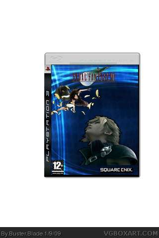
well... The renders are choppy and cut off badly, the final fantasy logo is really blurry, the dev and rating logos aren't cut out, you've got masses of white space and the whole thing is really plain and doesn't make much sense. Save it as png and just use a smaller background to get rid of the white space. Overall though you can only get better and seriously you can only get better, but I've seen worse, i guess... Keep trying! :D
It isn't THAT horrible, but the logo has an odd opaque block around it, and the characters are rendered choppily, also try not to show cut off edges of the characters.
The White space can be removed by selecting the box with the marquee tool and selecting crop somewhere within your application.
 Final Fantasy VII Box Cover Comments
Hi,
This is my first box, please comment and rate!!! X )
BTW, can someone tell me how to get rid of the white space :S
Thx!
[ Reply ]
well... The renders are choppy and cut off badly, the final fantasy logo is really blurry, the dev and rating logos aren't cut out, you've got masses of white space and the whole thing is really plain and doesn't make much sense. Save it as png and just use a smaller background to get rid of the white space. Overall though you can only get better and seriously you can only get better, but I've seen worse, i guess... Keep trying! :D
[ Reply ]
It isn't THAT horrible, but the logo has an odd opaque block around it, and the characters are rendered choppily, also try not to show cut off edges of the characters.
The White space can be removed by selecting the box with the marquee tool and selecting crop somewhere within your application.
[ Reply ]