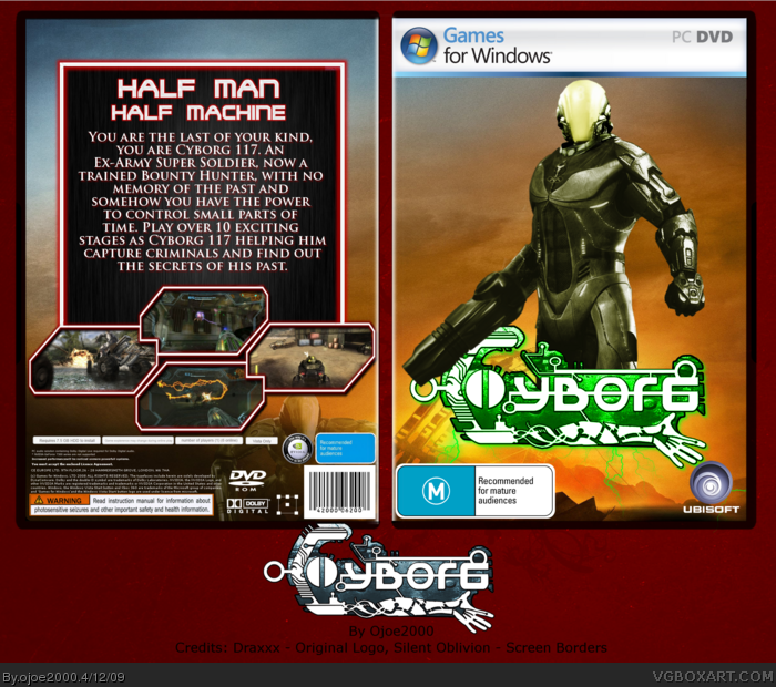
I started this a while ago but never got around to finishing it, and I was bored today so I decided to work on it some more. The whole box was an experiment, lately I have been looking for new things I can do in gimp, a few of which I used in this box. It didnÂ’t turn out as I hoped but I still like it.
The Cyborg (guy on the front and back) is made up of Samus, Master Chief, and the TimeShift and Haze guys.
I tried making a logo myself but failed so I asked Draxxx and he made an awesome one for me. I changed it for the box but you can see the original under it.
The screens are of Metroid Prime 3 and Haze, the background on the front is a Halo 3 wallpaper and the one on the back behind the Cyborg is a Gears of War wallpaper.
And finally itÂ’s on PC because I like my template. :P
I must say, that Cyborg render is awesome, and that logo looks nice. The front looks pretty nice, but I'm not a big fan of the back; I don't really like the font you used for the tagline. All and all though, this is quite a nice job.
Joel's logo looks great and the cyborg looks pretty good, but i think you should alter the color of the haze helmet, the yellow doesn't quite fit. Grey or white would look better IMO. I like the back layout, but the font choice could be better (more futuristic) and the blue drop shadow on the text doesn't look good.
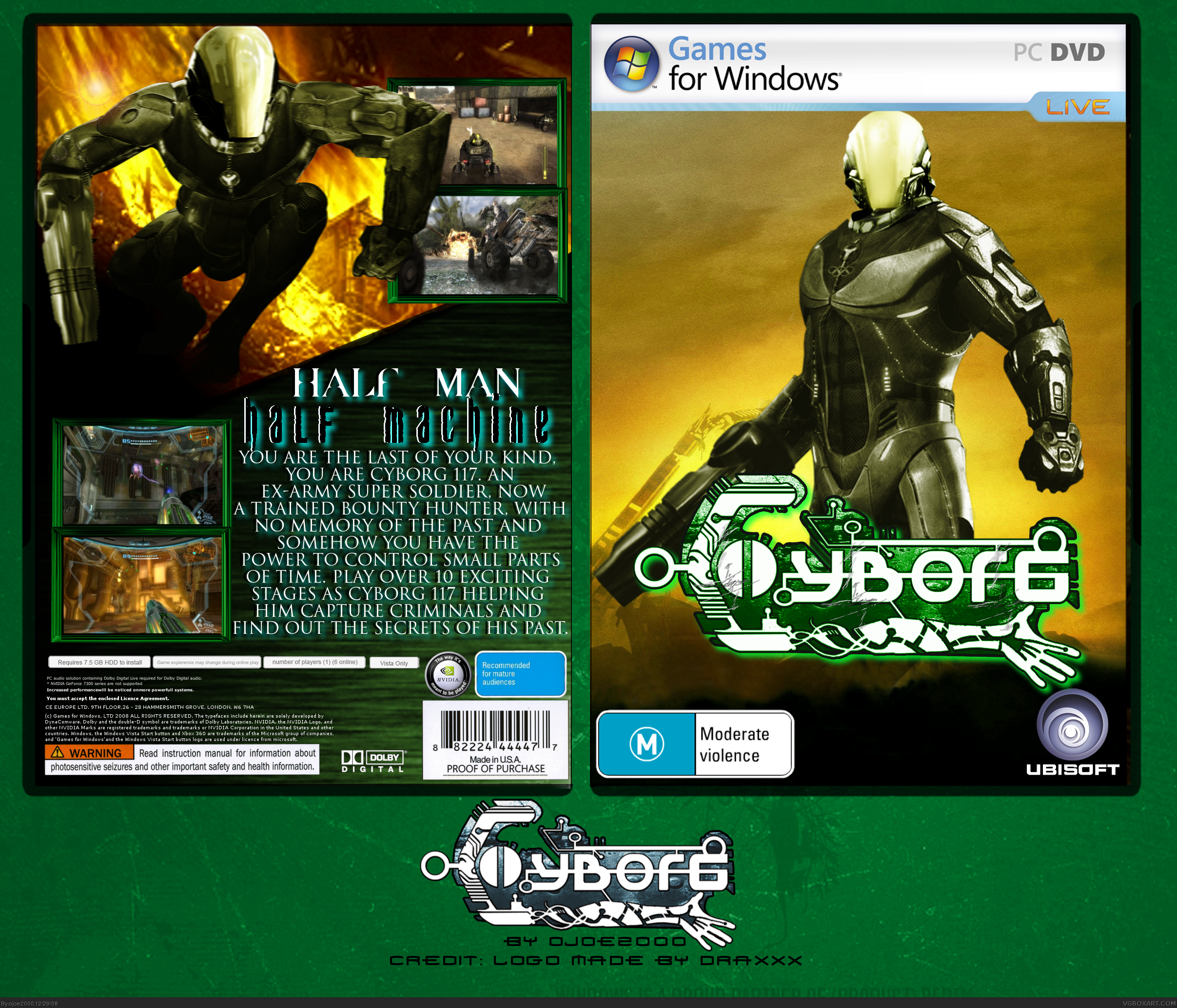
I didn't like the back for this box I thought it looked messy. So I decided to update it I lost my old xcf file so I had to remake the front as well. Theres not much difference between the updated front and old front except a few small details. The backs are very different though.
EDIT: I'm going to make the Cyborg bigger, I'll update soon
V3 - Cyborg is now bigger but it loses its quality when viewed in full. Also I forgot to mention in the other post that Silent Oblivion made the screen borders but I added the part at the top with the text on it.
 Cyborg Box Cover Comments
I started this a while ago but never got around to finishing it, and I was bored today so I decided to work on it some more. The whole box was an experiment, lately I have been looking for new things I can do in gimp, a few of which I used in this box. It didnÂ’t turn out as I hoped but I still like it.
The Cyborg (guy on the front and back) is made up of Samus, Master Chief, and the TimeShift and Haze guys.
I tried making a logo myself but failed so I asked Draxxx and he made an awesome one for me. I changed it for the box but you can see the original under it.
The screens are of Metroid Prime 3 and Haze, the background on the front is a Halo 3 wallpaper and the one on the back behind the Cyborg is a Gears of War wallpaper.
And finally itÂ’s on PC because I like my template. :P
[ Reply ]
Nice job there dude! That Cyborg looks pretty neat! Keep up the good work :)
[ Reply ]
I must say, that Cyborg render is awesome, and that logo looks nice. The front looks pretty nice, but I'm not a big fan of the back; I don't really like the font you used for the tagline. All and all though, this is quite a nice job.
[ Reply ]
The logo isn't that good, but you're improving greatly so you get a fav and an author fav :D
[ Reply ]
Joel's logo looks great and the cyborg looks pretty good, but i think you should alter the color of the haze helmet, the yellow doesn't quite fit. Grey or white would look better IMO. I like the back layout, but the font choice could be better (more futuristic) and the blue drop shadow on the text doesn't look good.
[ Reply ]
really nice editing!
[ Reply ]
Great job with the editing man, it really turned out great. I appreciate the creativity!
[ Reply ]
I like the logo, pretty awesome.
[ Reply ]
#2-#8 Thanks
[ Reply ]
I personally think that is one badass logo. The editing on the renders is great too, I appreciate the amount of effort you're put into this ;)
Edited at 1 decade ago
[ Reply ]
Amazing edit
[ Reply ]
I didn't like the back for this box I thought it looked messy. So I decided to update it I lost my old xcf file so I had to remake the front as well. Theres not much difference between the updated front and old front except a few small details. The backs are very different though.
EDIT: I'm going to make the Cyborg bigger, I'll update soon
Edited at 1 decade ago
[ Reply ]
V3 - Cyborg is now bigger but it loses its quality when viewed in full. Also I forgot to mention in the other post that Silent Oblivion made the screen borders but I added the part at the top with the text on it.
[ Reply ]