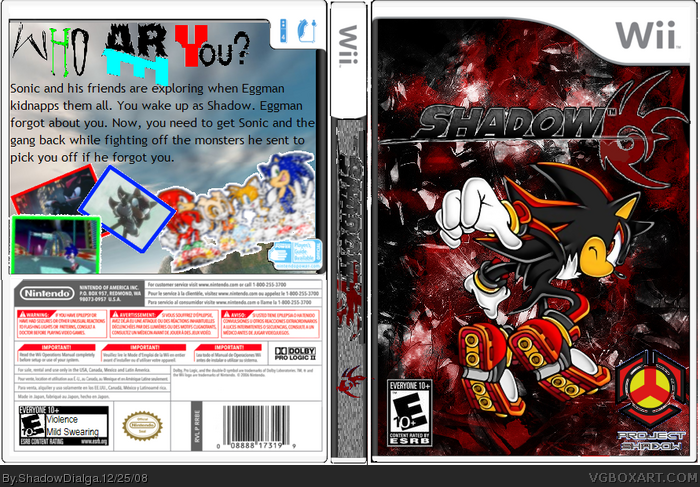
Several Things-
-I KNOW the logo says just Shadow, not Shadow:Redemption. I couldn't find a decent font and I dunno
-The spine is SUPPOSED to look choppy and static-y
-The back tagline has NO hidden message by the names of fonts or colorings (Just in case)
So enjoy! This took a total of 2.5, maybe 3 hours of hard work, so PLEASE don't be too critical.
Merry Christams! =D
1- Hot DAMN you're fast! This was about a 50/50 split of paint and paint.net. And thank you!
3- Thanks, and what font do you reccomend?
4- Thanks, yeah Ill try the presentation idea
 Shadow: Redemption Box Cover Comments
was this on paint or gimp? or both, but you are improving though.
[ Reply ]
Several Things-
-I KNOW the logo says just Shadow, not Shadow:Redemption. I couldn't find a decent font and I dunno
-The spine is SUPPOSED to look choppy and static-y
-The back tagline has NO hidden message by the names of fonts or colorings (Just in case)
So enjoy! This took a total of 2.5, maybe 3 hours of hard work, so PLEASE don't be too critical.
Merry Christams! =D
1- Hot DAMN you're fast! This was about a 50/50 split of paint and paint.net. And thank you!
3- Thanks, and what font do you reccomend?
4- Thanks, yeah Ill try the presentation idea
Edited at 1 decade ago
[ Reply ]
I suggest you perfect your fronts before you do backs, because the front is quite good but is marred by the back.
[ Reply ]
I can see the improvement Shadow, and try to work on a presentation for the box.
[ Reply ]
#2 I'm surprised you haven't done some kind of spoof christmas box.
The front's an improvement but the back needs alot of work/
[ Reply ]
#3, Agree. The front has some potential but the back could do better.
[ Reply ]
5- Alright, maybe I will :)
6- Alright
[ Reply ]
Its a big improvement good, but you need to work on more on the backs. 4.1/5
Edited at 1 decade ago
[ Reply ]
8- Yeah, backs really aren't my thang
[ Reply ]