#2 I think he should use paint.net
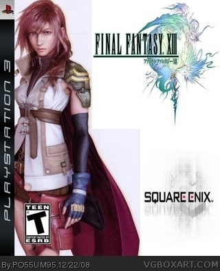
This is nice for a first. You did a good render of is it lightning? But anyway its very clean and plain like the officials. The square enix logo should be abit lower down but apart from that a nice clean job and very good for a first,
WELCOME TO THE SITE!
Really good for a first, but a little advice, the Square Enix logo is all scrunched and the FF13 logo is to. But for you I'd give a 3/5. Keep up the good work!
 Final Fantasy XIII Box Cover Comments
This is my first box. Hope you like it. It could have been better but I'm still new to Paint.net. I still gotta learn some of the features.
[ Reply ]
Not bad for a first. Have you tried gimp? I used to use it- you can do a lot with it.
[ Reply ]
#2 I think he should use paint.net
This is nice for a first. You did a good render of is it lightning? But anyway its very clean and plain like the officials. The square enix logo should be abit lower down but apart from that a nice clean job and very good for a first,
WELCOME TO THE SITE!
[ Reply ]
I'll upload another one tommorow. It will be similar to this but much better.
[ Reply ]
#3, It's not rendered. you can see the difference between the white of the background and the white on Lightning.
The Square Enix logo is badly placed.
The rest would be fine with something interesting in behind Lightning.
Not bad for a first, and at least you aren't using MS Paint.
[ Reply ]
I just uploaaded my second FFXIII box! Check it out!!!
[ Reply ]
#5 oh yeah sorry I didn't notice that, and #6 you should have updated this box if you were going to make a similar final fantasy 13 box.
[ Reply ]
Nice Job! Great for a first!
[ Reply ]
Really good for a first, but a little advice, the Square Enix logo is all scrunched and the FF13 logo is to. But for you I'd give a 3/5. Keep up the good work!
[ Reply ]