[ Box updated on December 18th, 2008 ] [ original ]
 Resident Evil: The Umbrella Chronicles Box Cover Comments
Comment on gamerking's Resident Evil: The Umbrella Chronicles Box Art / Cover.
i had alot of fun making this. lol. enjoy! :)
if there's too much of a presentation going on, i can remove the girl and the zombie and just focus on the box. :)
Edited at 1 decade ago
[ Reply ]
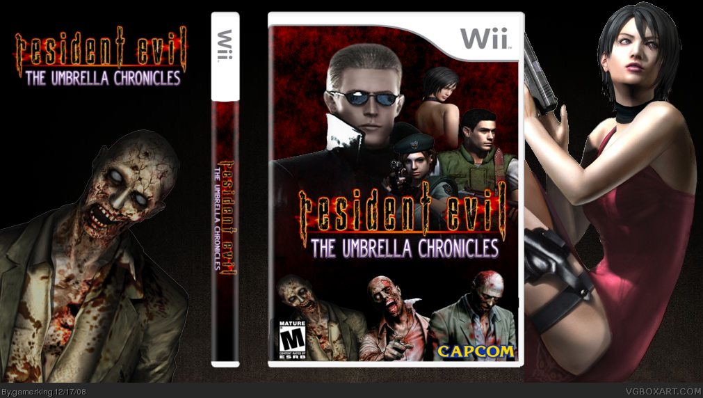
Move Wesker to the left, and make a back. Maybe do a shot of the mansion from RE 1 in the background on the front.
Fix it up and I'll fav it, this looks really good so far.
[ Reply ]
I like it, but you really should start making backs. you can't get good at them, unless you practice, but I think it looks pretty official and I could imagine buying this at a store :)
[ Reply ]
#2, will do!
but the back?...ummm...about that. lol. i've tried! i suck at backs! but i guess i'll retry. i still have a whole bunch of other backs that i have to do so my line up is pretty full right now. lol.
[ Reply ]
#3, Agreed. Look at my Kung Fu Panda box, for example. It sucked. But you gotta keep trying or else you will just always say you suck and never improve.
[ Reply ]
I agree with #5, but it still looks sick so ill still fav
[ Reply ]
you seriously need a back, NA0!!!
but the front is still worth a fav
[ Reply ]
#5, i do try! it's just that it doesn't come out good. xD
and thanks for the favs guys. :)
[ Reply ]
This needs a back! The front is kickass so you get a Fav =]
[ Reply ]
okay, okay! i'm am now officially working on the back! lol.
[ Reply ]
I added a back! =D
[ Reply ]
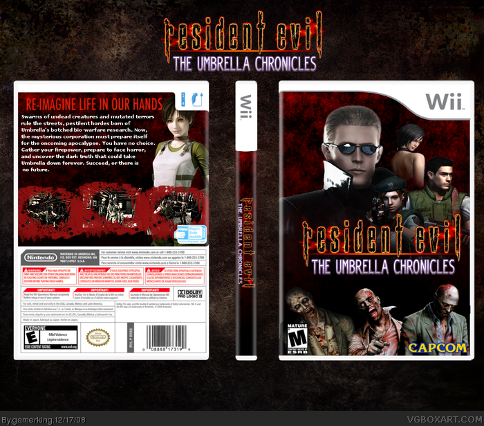
Okay, the back is not perfect, but you really tried. The blood splatter screens is perfect for your style here, just a little thick. Also, I would change the tagline to something along the lines of "Survival Horror Re-imagined." "Welcome back to the Horror." or "Dark days are returning..."
Overall, it's pretty nice.
[ Reply ]
It's a decent back Joe. I agree with #12.
[ Reply ]
well, i used that tagline because that's what the official tagline is. lol.
[ Reply ]
sorry about bumping. but i worked pretty hard on this. anybody else? lol.
[ Reply ]
The back is nice! Though I dont think I like the text.
[ Reply ]
what's wrong with the text? lol.
[ Reply ]
With the back it looks awesome and alot better 4.5/5!
[ Reply ]
this looks even nicer
[ Reply ]
thanks guys. :)
i'll be adding a disc soon too. :D
[ Reply ]
I would have to agree that this looks better than version 1.
[ Reply ]
tbh, i dont really care for the back, it just seems too plain.
[ Reply ]
Everything Bad:
-renders don't seem to mix well together (lighting)
-poorly chosen tagline
-screenshot borders look a little TOO messy
Everything Good:
-screenshot borders are kinda cool
-renders seem well placed and none are stretched or blurry
-Logo looks good and the spine seems in order
Fix at least one of the bad things and you've got my fav. :)
[ Reply ]
well, that's the real tagline soooo....
and the borders look messy because it's blood. i don't think blood is supposed to look nice. lol.
[ Reply ]
#24, you never know what blood looks like until you cut your jugular vein with a rusty cheese grater...XD
Edited at 1 decade ago
[ Reply ]
#24,my favorite bart of the back is the blood borders!
Edited at 1 decade ago
[ Reply ]
link
great box
[ Reply ]
thanks guys. :)
and that link was totally random! xD
[ Reply ]
That's pretty darn good! I think the back could have implemented more of the games elements to use as a design though.
[ Reply ]
this is pretty good just a few more things you couldve done to make it better.
i think you should post int he forums before you post here.
[ Reply ]
such as.....
[ Reply ]
like making that big guy on the front more to the left and making the other renders a bit bigger. the screenshot borders need to be smaller catches too much attention and need more on the back :D
[ Reply ]
okay. cool. :)
[ Reply ]
4.5/5 the only thing I see wrong with it is that it says rated M on the front and on the back it says Rated E.
[ Reply ]
aww. you're not gonna fav just because of that? xD
Edited at 1 decade ago
[ Reply ]