#12 Gosh, I might have to agree dude. You are easily one of the most prolific typographers I've come across during my internet endeavors in art, and this design confirms that on so...many..levels.
couple little tiny things though. full view you can see that the edges of the blue and yellow triangles on the front arent completely straight, and theres a little bit of white glow at the tip of the blue one.
aand, im not sure if theres supposed to be that A and B on the blue one either.
:P, im just being picky though and thought i would let you know. :)
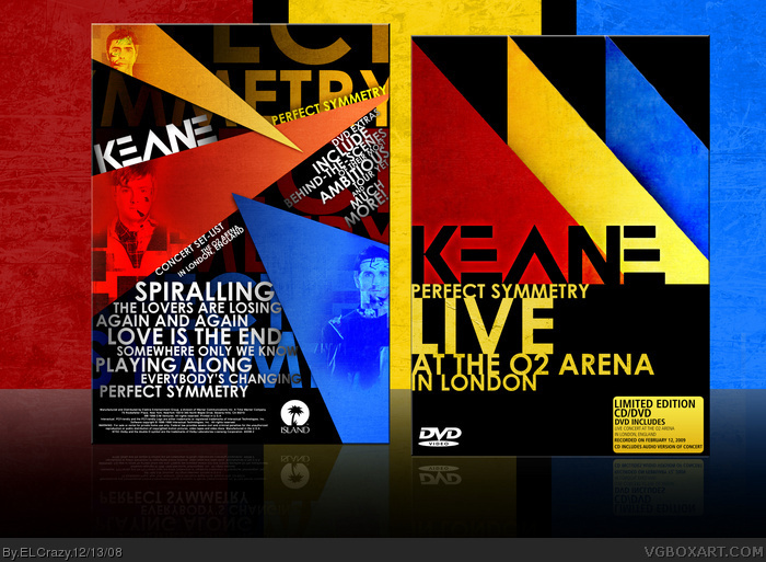
 Keane: Perfect Symmetry Live at the O2 Arena Box Cover Comments
I just got this album. It's fantastic! I love every track, and while listening, I decided to do a box for a (made-up) future live DVD.
Enjoy! (:
[ Reply ]
Amazing. I could really see this on the shelves of a shop + fav
[ Reply ]
This box is screamingly awesome. Your typography is just so modern and beautiful.
[ Reply ]
Beautiful.
[ Reply ]
Awesomely Amazingly Awesome. Love the colors. The black goes really well with the yellows, reds and blues.
[ Reply ]
Awesome, nice use of colors, it really goes well with each other. Would defenitly buy this if i saw it on a store shelf. Awesome.
[ Reply ]
Keane FTW.
I love this. Simply beautiful, amazing typography and composition.
[ Reply ]
This is amazing!! I love everything about it!
[ Reply ]
Great work.
[ Reply ]
Wow...the combinations of colours and, of course, your superb typography makes this easily the best music box on this site. Great work, dude.
[ Reply ]
Awesome, agreed with #10
[ Reply ]
Okay, seriously? This is your best box.
[ Reply ]
That the first music box that I fav (I guess)
[ Reply ]
Wow guys, I did not expect such a response! Thanks! =D
[ Reply ]
#12 Gosh, I might have to agree dude. You are easily one of the most prolific typographers I've come across during my internet endeavors in art, and this design confirms that on so...many..levels.
Dan, you have a real gift man. Seriously.
[ Reply ]
Nice Design! Man I apreciated your work.
[ Reply ]
Awesome box, awesome album.
[ Reply ]
truly sepectacular.
Edited at 1 decade ago
[ Reply ]
oh my.................
[ Reply ]
very good 10/10
[ Reply ]
These people were around with like their first hits when i was in elementary school, still dont like them :P nice box EC
[ Reply ]
Wow! This is amazing, Dan. I luvvit. =D
[ Reply ]
...this is so awesome!
couple little tiny things though. full view you can see that the edges of the blue and yellow triangles on the front arent completely straight, and theres a little bit of white glow at the tip of the blue one.
aand, im not sure if theres supposed to be that A and B on the blue one either.
:P, im just being picky though and thought i would let you know. :)
Edited at 1 decade ago
[ Reply ]
O2 areana ftw! lol nice one dude!
[ Reply ]
wow..
just wow.
You're a typography god.
[ Reply ]
#24 I agree! I love the O2 =]
[ Reply ]
You is the shit
[ Reply ]
Haha thanks a lot guys!! (:
#15, Thanks man, it really means coming from you. =D
[ Reply ]
Your typography is awesome. btw is that the HammerFall guitarist in the blue?
[ Reply ]
#29, Haha nope, it's one of the members of Keane.
[ Reply ]
#30 I no that, but he could be in more than one band
[ Reply ]
THIS... IS... AWESOME!
*kicks some random guy into the pit of death*
[ Reply ]
Nice one mate, this rules.
Btw, Lovers are Losing, amazing song, same with spiralling.
[ Reply ]
zo... zo... zomg
keane=fave
[ Reply ]
Holy Santa Claus Shit!
How haven't I faved this!?!?
[ Reply ]
very good
[ Reply ]
where can i buy it? please answer! i love keane
[ Reply ]