I can easily justify faving this, as you put together quite a creative layout for the back. the only thing I'd do is maybe move the description text in the middle of the area that it's in, and make the tagline larger, centered instead of justified to the left, and possible find a bolder font for it. As i said earlier, the front looks really nice. Good job!
 Fallout 3 Box Cover Comments
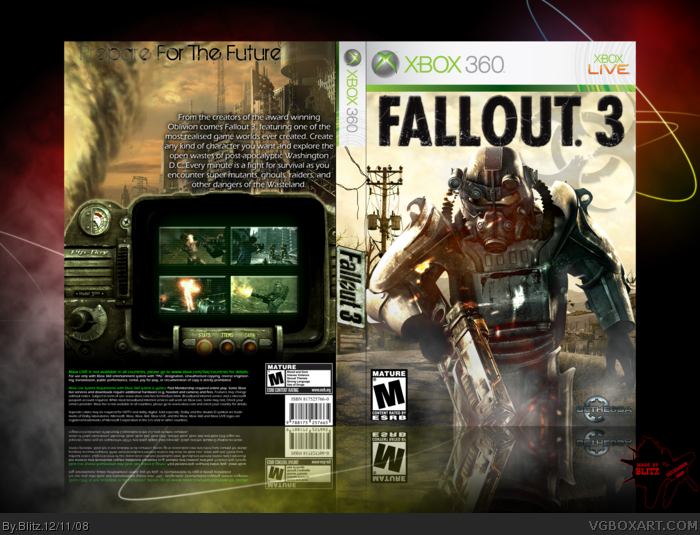
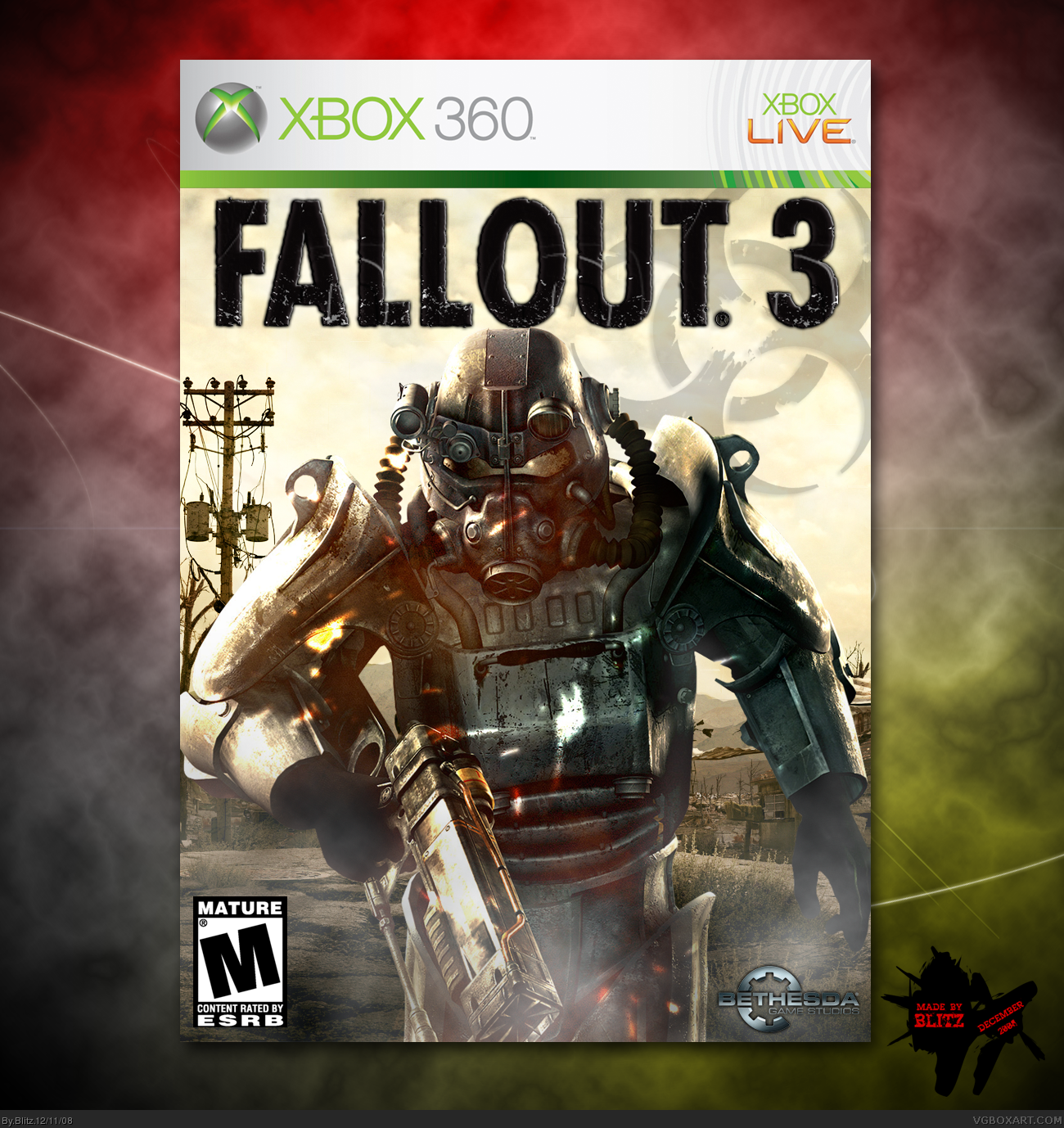
My 2nd Boxart. I think it came out ok. Tell me what you think! :D
[ Reply ]
Damn son. Make a back for this thing now!
Fav+
[ Reply ]
goooooood :P
[ Reply ]
Looks nice, especialy for a second. Keep up the good work :)
[ Reply ]
Thanks everyone! Ill start making a back today :D
[ Reply ]
great front, and with a half decent back you'll get a fav from me.:)
[ Reply ]
#6, Im making a back right now, it should be up soon! Thanks :)
[ Reply ]
I can easily justify faving this, as you put together quite a creative layout for the back. the only thing I'd do is maybe move the description text in the middle of the area that it's in, and make the tagline larger, centered instead of justified to the left, and possible find a bolder font for it. As i said earlier, the front looks really nice. Good job!
Edited at 1 decade ago
[ Reply ]
#8, Thanks alot :) Ill edit it and have a look and If I believe it looks better (Which it probally will) Then Ill update it. thanks again:)
[ Reply ]
You my good sir, have created a new standard for FO3 boxes.
AuthorFav+
[ Reply ]
#10, Thank-you very much :D
Edited at 1 decade ago
[ Reply ]
looks wonderful, a very good improvment on the actual art
[ Reply ]