![]() »
»
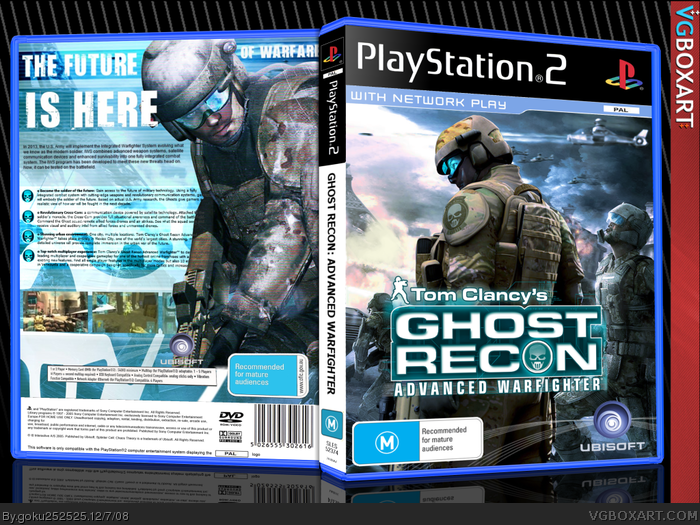
 Tom Clancy's Ghost Recon : Advanced Warfighter Box Cover Comments
Comment on goku252525's Tom Clancy's Ghost Recon : Advanced Warfighter Box Art / Cover.
![]() »
»
Comment on goku252525's Tom Clancy's Ghost Recon : Advanced Warfighter Box Art / Cover.
Thats Awsome Stuff...
[ Reply ]
Hey guys! this is my new box. And could you guys tell me what you think of my new presentation because im planning to use it in future boxes:D
Enjoy!
@hsoldier, im glad you think so mate^^
Edited at 1 decade ago
[ Reply ]
#2 i agree with you
[ Reply ]
Incredible!
[ Reply ]
Hof. Nao.
[ Reply ]
It's great. The only thing I don't really like the tagline. Still gets a fav.
[ Reply ]
Vereh nice, +Fav
[ Reply ]
Favs
[ Reply ]
Not feeling too great about that tagline, but this is excellent work!
[ Reply ]
More attention please :)
Seriously, this is amazing
[ Reply ]
Great but the spine is plain.But no one pays attention to the spine.. lol +fav
[ Reply ]
=O
[ Reply ]
Well I'll be damned!
[ Reply ]
Wow thanks for all the faves and comments guys, i still cant believe it got into the hall.
Also can i ask why some of you dont like the tagline? because i actually quite like it:)
[ Reply ]
#14, I think it's that big space in between the first 2 words and the second 2 words. IMO, it would look better if the second 2 words were in between first 2 words and the last 2 words.
Hope that makes sense...
But yeah, otherwise the box is great. Fav.
[ Reply ]
Great design sir!
[ Reply ]
I hate Ghost Recon, but this box is awesome.
[ Reply ]
#17, lol, I didn't even understand how to play it.
btw, THIS IS AWESOME. So much detail. Great color scheme. Great!
[ Reply ]
#17, I havent actually played it on ps2. Ive only played the second one on 360 and it rocked!:D
[ Reply ]
YOU WIN
For correctly using Australian ratings.
[ Reply ]
Yep, AU/NZ ratings are the best!
[ Reply ]
I'm not too sure about separating the top part of the tagline like that "The future....of warfare" but everything else looks good, (though the screens could be a bit bigger). Otherwise, great job.
[ Reply ]
hmm im not feeling the tagline like everyone else and screenshots are too small IMO and you've used endwar wallpaper for the background on the front.
[ Reply ]
it need s printable +fav
[ Reply ]
it need s printable +fav +author fav
[ Reply ]
good
[ Reply ]