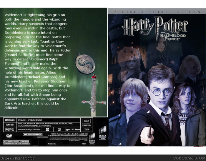
The front isn't THAT bad, but I'd say that the woman's head is badly cut. And for Ron to be looking so happy while everyone else has a dramatic look on their face is kind of offsetting. The back needs a lot of work. There's too much text, no screens, or tagline. As numerobetically said, look at other people's boxes for ideas, or just look at some official art.
honestly, i really don't like the front. it has no feel for harry potter, just normal and faded renders on a BG. also, the font on the back is extremely plain and there's no screenshots, i also hate the floating items. it isn't really the best template choice either.
what you can do to improve the box is work a little more with blending on the front of the box, it's a good Bg, i just think you can blend and fade the characters more. also, you may want to add a more purple lighting effect because that was the main color of the book. for the back, decrease the size of the text and add a drop shadow,it'll look nice. after that, you should have enough space to add screenshots. edit those however way you like. keep the BG's.
1/5, you seriously need to figure this out, you've been here long enough, put some effort into your boxes and learn the ropes. i also agree with numerobetically, observe what experienced boxartists do to make their boxes look awesome. i really don't mean to be harsh, but i'm simply telling you what i think. sorry :(
 Harry Potter and The Half-Blood Prince Box Cover Comments
Saw the Trailer...I've been working on this for about 2 days.I think its my best yet.
Cred to RayBlade for Logo.
[ Reply ]
Add some screen shots to the back.
[ Reply ]
Look at more experienced people's boxes as guidelines.
[ Reply ]
well the fronts alright but the backs just bad...
[ Reply ]
The front isn't THAT bad, but I'd say that the woman's head is badly cut. And for Ron to be looking so happy while everyone else has a dramatic look on their face is kind of offsetting. The back needs a lot of work. There's too much text, no screens, or tagline. As numerobetically said, look at other people's boxes for ideas, or just look at some official art.
[ Reply ]
honestly, i really don't like the front. it has no feel for harry potter, just normal and faded renders on a BG. also, the font on the back is extremely plain and there's no screenshots, i also hate the floating items. it isn't really the best template choice either.
what you can do to improve the box is work a little more with blending on the front of the box, it's a good Bg, i just think you can blend and fade the characters more. also, you may want to add a more purple lighting effect because that was the main color of the book. for the back, decrease the size of the text and add a drop shadow,it'll look nice. after that, you should have enough space to add screenshots. edit those however way you like. keep the BG's.
1/5, you seriously need to figure this out, you've been here long enough, put some effort into your boxes and learn the ropes. i also agree with numerobetically, observe what experienced boxartists do to make their boxes look awesome. i really don't mean to be harsh, but i'm simply telling you what i think. sorry :(
Edited at 1 decade ago
[ Reply ]