Ahh, 3rd upload, i deleted it last night because i knew all the attention would be focused on p0ker's Sonic Unleashed box please comment, for i put a serious amount of effort into this, thaanx,
R_B/HtH
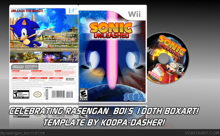
The ESRB issue, the description is a bit weak, I think that you could use some robots to "fix" what Cerium had to say about the back looking "lacking" (though I'm pretty happy with the back layout.)
You did some decent work on the original art, but it looks a little off because the lines look like they were drawn with a mouse.
It also wouldn't hurt to make the tagline a little bigger.
i really dosen't look that bad, and i don't think you should use the official logo just becuase it's the official one, but becuase i think it would improve the front immensly.
 Sonic Unleashed Box Cover Comments
Ahh, 3rd upload, i deleted it last night because i knew all the attention would be focused on p0ker's Sonic Unleashed box please comment, for i put a serious amount of effort into this, thaanx,
R_B/HtH
[ Reply ]
Well, congrats on your 100th box!
[ Reply ]
Sega logo too big
Different ESRBs on back and front
Should of used official logo
Back is lacking
Back text description is poorly written
[ Reply ]
Hot.
I kinda agree with Cerium but this looks stunning otherwise.
[ Reply ]
Hmm, okay.
Where I agree with Cerium:
The ESRB issue, the description is a bit weak, I think that you could use some robots to "fix" what Cerium had to say about the back looking "lacking" (though I'm pretty happy with the back layout.)
You did some decent work on the original art, but it looks a little off because the lines look like they were drawn with a mouse.
It also wouldn't hurt to make the tagline a little bigger.
[ Reply ]
Should have used the official logo.
[ Reply ]
very nice. :)
[ Reply ]
i really dosen't look that bad, and i don't think you should use the official logo just becuase it's the official one, but becuase i think it would improve the front immensly.
[ Reply ]