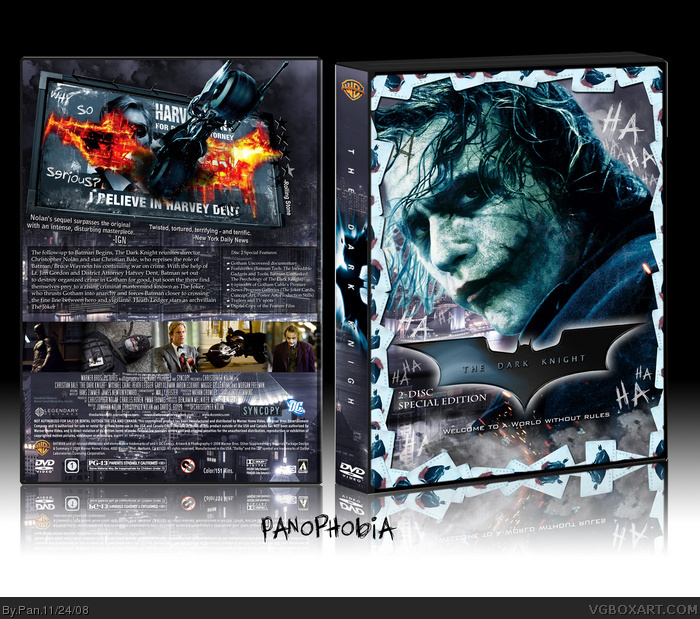
So yeah, you are all probably sick of The Dark Knight boxes by now. I tried my best to make at least the front stand out from the others, I had to edit out all the names off Joker's arm, and re-build what part of his head was missing.
This the last thing I'd visualize in my mind when you say "Dark Knight Boxart". However, it is, by far, the most outstanding vision I could possibly get.
Nice one Pan.. ermm.. Panophobia! LOL --- wasn't expecting it to look like that. Sorry, I didn't send you the 'proper' Warner Bros. temp... I didn't realise it was the one someone wanted with mainly the credits/logos on back and not the normal Warner boxes etc. However, saves you messing around - lol. Let me know if you every need the proper one. Any-who.. great box cover.. love the front close-up and the cards. Real cool.
Thanks everyone. To people who didn't like the front, like I said I wanted mine to look different then the other Dark Knight boxes, and I really liked that image of the Joker so I decided to use it as the main focus. He's the reason everyone liked this movie so much anyway. :P
I noticed that I forgot a barcode on the back, but looking at it I'm not sure if I can find a place for it. I'll try but I may just leave it off. The front I actually put a lot more editing into than the back.
Damn bro. Really nice. I love it all. I can see why KoopaDasher doesn't like the front though. I still like it though. The color of the Joker is different from the rest of the box, but it's all still ace. +Fave :)
 The Dark Knight Box Cover Comments
So yeah, you are all probably sick of The Dark Knight boxes by now. I tried my best to make at least the front stand out from the others, I had to edit out all the names off Joker's arm, and re-build what part of his head was missing.
Thanks to MARKER for the legal info on the back.
Edited at 1 decade ago
[ Reply ]
o__________o
[ Reply ]
:O
[ Reply ]
Pan, this is seriously amazing. This is by far the coolest looking Dark Knight cover design I've yet to see.
[ Reply ]
l13k w0w th15 15 t3h l33tz0rz
[ Reply ]
Wow, seriously great work.
[ Reply ]
The back, I love.... seriously, amazing editing work with the bike scene. The front.... not so crazy about it.
[ Reply ]
holy shit... great editing its amazing
[ Reply ]
Damn, nice shit right here.
[ Reply ]
This the last thing I'd visualize in my mind when you say "Dark Knight Boxart". However, it is, by far, the most outstanding vision I could possibly get.
[ Reply ]
Nice one Pan.. ermm.. Panophobia! LOL --- wasn't expecting it to look like that. Sorry, I didn't send you the 'proper' Warner Bros. temp... I didn't realise it was the one someone wanted with mainly the credits/logos on back and not the normal Warner boxes etc. However, saves you messing around - lol. Let me know if you every need the proper one. Any-who.. great box cover.. love the front close-up and the cards. Real cool.
[ Reply ]
I was sick of dark knight boxes, but this is on a whole nother level +Fav!
[ Reply ]
AWWEEESSSOOOMMEEE!!!!
[ Reply ]
I agree with Koopa. The front isn't nearly as good as the back.
[ Reply ]
I just came.
[ Reply ]
nice
[ Reply ]
Nice box i love the cover. You did a good job making the head and the back is nicely done
[ Reply ]
Wow, that got in the Hall quick!
Nicely done!
[ Reply ]
Thanks everyone. To people who didn't like the front, like I said I wanted mine to look different then the other Dark Knight boxes, and I really liked that image of the Joker so I decided to use it as the main focus. He's the reason everyone liked this movie so much anyway. :P
I noticed that I forgot a barcode on the back, but looking at it I'm not sure if I can find a place for it. I'll try but I may just leave it off. The front I actually put a lot more editing into than the back.
[ Reply ]
Amazing! The front is nice enough, it goes along well with the back.
[ Reply ]
Damn bro. Really nice. I love it all. I can see why KoopaDasher doesn't like the front though. I still like it though. The color of the Joker is different from the rest of the box, but it's all still ace. +Fave :)
[ Reply ]
:O...dude
[ Reply ]
Awesome!
[ Reply ]
#1 we're not sick of them if you make them like this! +fav
[ Reply ]
clowns are scary but your editing is awesome!
Edited at 1 decade ago
[ Reply ]
I have a printable version of the widescreen single disc version if anyone wants it, decided not to buy the 2-disc for once.
[ Reply ]
Speechless!
[ Reply ]
Wow!!
[ Reply ]
Sadly this print ain't for Blu-Ray :( I really like this.
[ Reply ]
#29, I still have the PSD file for this box, if you want a Blu-Ray version I could make one.
[ Reply ]
AMAZING!!!!
[ Reply ]
#30, If you could? that would be great, thanks :)
[ Reply ]
#32, Here is the Blu-Ray version:
link
Most of the legal info had to be cut, but it more or less still looks official.
[ Reply ]
#33, Thank you so much! I love it.
I really don't mind the actors and some of the legal info is missing,
I even think it looks a bit better this way ;)
[ Reply ]