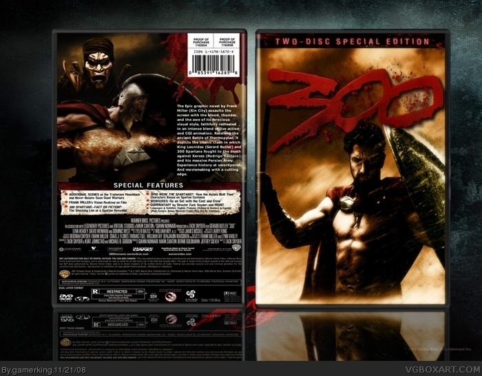
It looks pretty good layout wise, but I think I mentioned to you before that you might want to try using some filters and layer effects to make your designs pop more. You have a good eye for layout and design, but a lot of your boxes, imagery wise, are just render placements.
Also, if you experimented more with contrasts and filters, you could make the renders come together more, and not look like there from a whole bunch of different sources, like the 2 renders you used on the back of this one. Also, something light a subtle outer glow on the "300" logo on the front could possibly make a world of difference.
My best recommendation would be to assemble your renders as you normally do, then take a look at things and think about how you can bring everything together as one design, rather than a collage of neatly organized images.
You probably have the most determination out of anyone on here, and I see you getting better all the time. With a little more flare, I can see you doing some really jaw-dropping stuff.
#15 totally agree with the last part draxxx i remember your first box and then this your improving quite alot.
but for this box i like the front pretty basic but effective but the immortal on the back looks out of place with the colour as he is bluish and the spartan is got a orange feel about him.
thanks guys! and i see what you're saying about the persian and i tried to something with it, but i couldn't. and plus they're that color in the movie so why change it? >.< lol. but i'll work on it some more and thanks for the comments! :)
thanks guys, and i'm gonna start working on it now. :)
and @GrahamZ, the back is a bit blurred because i had to make the box bigger to fit the background and for some reason, everytime i submit a box the quality becomes less. lol.
sorry about a second post in a row, but update! i made the persian not bluish-gray and made him kinda blend color wise with the box. is that better now?
 300 Box Cover Comments
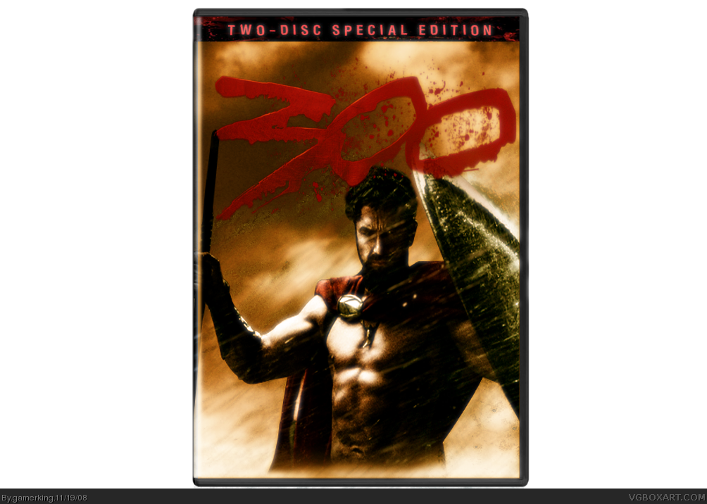
my latest box! hope you like! took a while to get the colors and such just right. lol.
[ Reply ]
As I said in the competition thread. I like it. The colors and effects are great. 3.75/5 Good job man! I would like ot see a back.
Edited at 1 decade ago
[ Reply ]
It looks sick "bra", love the logo +fav
[ Reply ]
Make...a...BACK!!!
Please?
[ Reply ]
thanks guys! and i'm gonna send you a pm tim. :)
[ Reply ]
The front looks great. I would love to see a back for this.
[ Reply ]
Love it. Definite fav.
[ Reply ]
thanks guys! working on the back now, and i'm not gonna stop til it's perfect! lol. :P
[ Reply ]
Man that IS your best back! Good job!
[ Reply ]
I would have liked to see the pic of the guys getting knocked off the cliff at the top, but this is good too!
[ Reply ]
The back makes it like twenty times better than it orignally was, and it was already amazing.
Your Score: 300 x 20 = FANTASTIC
EDIT: No pun intended.
Edited at 1 decade ago
[ Reply ]
thanks guys! and sorry tim. lol. i was thinking about putting that scene with the back. oh well. :)
[ Reply ]
Dude, love the back. Thanks for adding it
[ Reply ]
Try playing around with the colors of that guy with the mask on the back. He doesn't fit at all when it comes to colors...
[ Reply ]
It looks pretty good layout wise, but I think I mentioned to you before that you might want to try using some filters and layer effects to make your designs pop more. You have a good eye for layout and design, but a lot of your boxes, imagery wise, are just render placements.
Also, if you experimented more with contrasts and filters, you could make the renders come together more, and not look like there from a whole bunch of different sources, like the 2 renders you used on the back of this one. Also, something light a subtle outer glow on the "300" logo on the front could possibly make a world of difference.
My best recommendation would be to assemble your renders as you normally do, then take a look at things and think about how you can bring everything together as one design, rather than a collage of neatly organized images.
You probably have the most determination out of anyone on here, and I see you getting better all the time. With a little more flare, I can see you doing some really jaw-dropping stuff.
[ Reply ]
#15 totally agree with the last part draxxx i remember your first box and then this your improving quite alot.
but for this box i like the front pretty basic but effective but the immortal on the back looks out of place with the colour as he is bluish and the spartan is got a orange feel about him.
also the back seems a bit blurred!
but other than that its pretty good :) KIU
Edited at 1 decade ago
[ Reply ]
thanks guys! and i see what you're saying about the persian and i tried to something with it, but i couldn't. and plus they're that color in the movie so why change it? >.< lol. but i'll work on it some more and thanks for the comments! :)
[ Reply ]
Draxxx just threw you a world of compliments! Don't let him down!
Seriously though, this looks mega-official. Great work here!
Edited at 1 decade ago
[ Reply ]
wow this will be your 2 hof fav
Edited at 1 decade ago
[ Reply ]
2nd hof??? =D lol.
thanks guys, and i'm gonna start working on it now. :)
and @GrahamZ, the back is a bit blurred because i had to make the box bigger to fit the background and for some reason, everytime i submit a box the quality becomes less. lol.
Edited at 1 decade ago
[ Reply ]
sorry about a second post in a row, but update! i made the persian not bluish-gray and made him kinda blend color wise with the box. is that better now?
[ Reply ]
I like it, I like, it, I LIKE IT!
[ Reply ]
Amazing...
[ Reply ]
oh wow, i REALLY like this :)
[ Reply ]
thanks guys. :D
[ Reply ]
Now it works right! I love it!
[ Reply ]
thanks. :) and UPDATE!! i made the logo pop out more.
[ Reply ]
Love how the new logo looks
[ Reply ]
thanks, man. and i'm thinking about doing something else with the box, but it's not working right now, so we'll see. lol. :P
[ Reply ]