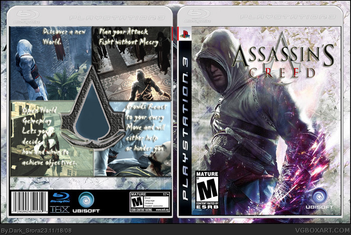
You didnt even make the front and it doesn't work well. The back is pretty bad really. Looks very bland and the writing font is awful.
sorry,
oh and the esrb logo is much to big on the front and you didnt put any of the official stuff at the bottom. 1/5
EDIT: Oh and the esbr
 Assassin's Creed Box Cover Comments
Here is my new Boxart !
[ Reply ]
i like the front but the back needs more work.
[ Reply ]
I know the back is not so good but thanks
[ Reply ]
The front looks familiar and I see why.
link
Did you make the front?
[ Reply ]
awh i thought it was a great design but someone else done it owell 2/5
[ Reply ]
You didnt even make the front and it doesn't work well. The back is pretty bad really. Looks very bland and the writing font is awful.
sorry,
oh and the esrb logo is much to big on the front and you didnt put any of the official stuff at the bottom. 1/5
EDIT: Oh and the esbr
Edited at 1 decade ago
[ Reply ]
4# I found that font in google . Here link
5# I found that in google and I thought that is good but I don´t looked
here at VGBOXART for Assassins Creed
[ Reply ]
6# in my next i will do it better
[ Reply ]
love da front luks really gd but the bck really needs work n u should add some more information
[ Reply ]