![]() »
»
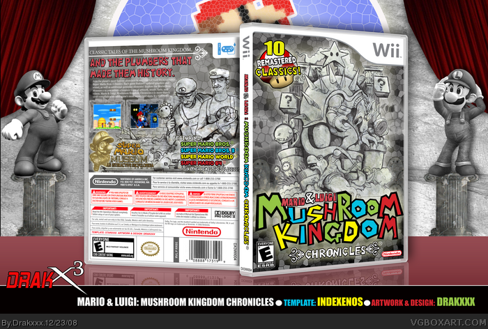
[ Box updated on December 23rd, 2008 ] [ original ]
 Mario & Luigi: Mushroom Kingdom Chronicles Box Cover Comments
Comment on Drakxxx's Mario & Luigi: Mushroom Kingdom Chronicles Box Art / Cover.
wow, i love the art on this
[ Reply ]
Hey again everyone,
My recent boxes have been products of a very artistically charged week at home due to minor illness. Though life unfortunately has to resume as normal tomorrow, I've managed to get this final piece done before hand.
Everything involved in this one is custom work, with the exception of some fonts, the gold Super Mario statue on the back, and the renders used for the box's presentation which was assembled and edited by me.
The front of this box actually existed in way of a T-Shirt design I drew for the weekly contest I enter.
You can check it out on the shirt at this link.
I did some heavy editing on the design to make it more dynamic for the box, (The design contest restricts artists to only 6 pan tone colors) - I drew the Mario Bros. statues yesterday evening to incorporate into the whole "museum and art" concept I was going for with this fictitious compilation. The depictions of the Mario characters are dramatically different than the norm, but the idea was the present them with a historical museum presence.
Thanks to everyone who gave me terrific suggestions for this piece, your recommendations and ideas made this one come out even better than I imagined! Please check this one out in full view, and I presented this one on a flat template as I really wanted to showcase the artwork and design as it is. The 3D one I first put together slightly threw off the design.
Thanks in advance guys for your comments and favs!
It's been quite a artsy week!
Edited at 1 decade ago
[ Reply ]
eh i dunno. I dont like the art you used for mario and luigi :P but at least you know how to make your own art xD so ill give you a 5/5
[ Reply ]
You know what? This isn't real. I'm dreaming.
[ Reply ]
Amazing art, but the Mario and Luigi on the back creep me out.
This one caught my attention: link
Edited at 1 decade ago
[ Reply ]
wow, your really talented man.
[ Reply ]
O_o Holy mother of... *drools*
[ Reply ]
*Loves*
[ Reply ]
w00t
[ Reply ]
Nice ! :)
[ Reply ]
Amazing!
[ Reply ]
Ugh, it disgusts me how amazing you are.
[ Reply ]
I'm reeeaaally not a fan of the template.
[ Reply ]
Screw me sideways with a pipe cleaner! That's amazing!
[ Reply ]
This came out freaking incredible. I'm not really fond of the black borders on the template but screw it, it's an excellent box.
[ Reply ]
pretty artistic!
good job!
+fav.
[ Reply ]
Its faptastic!
[ Reply ]
Thank you guys!
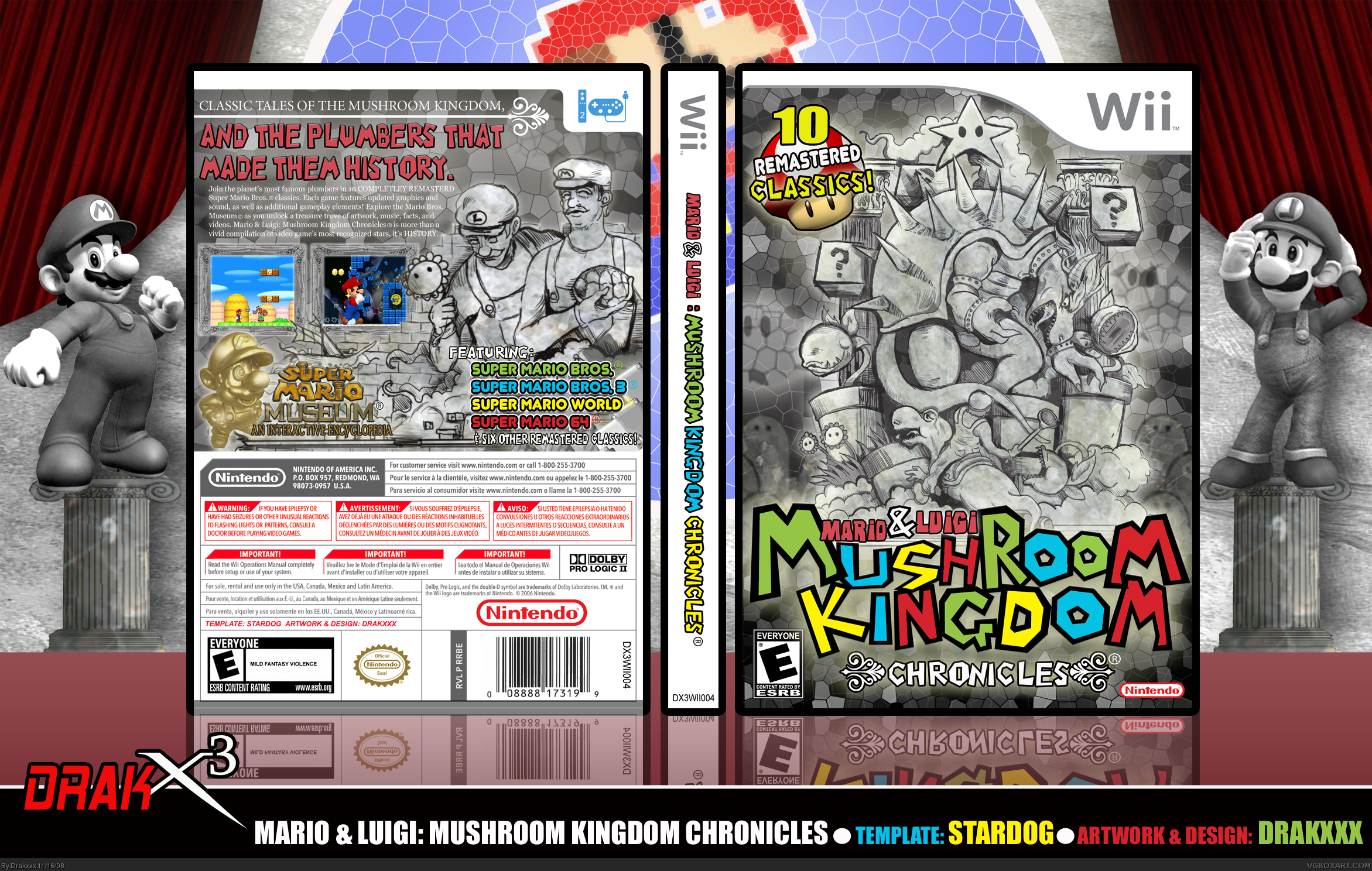
I added the black stroke around the template to make the box stand out more, but I totally agree, and don't like it much either after the fact. I'm going to put it together again on a different template and see how that comes out for a version 2.
#5 Dude, they so made that shirt for you!
[ Reply ]
You are incredible.
[ Reply ]
O_O woaaa.... that presentation is sexy
Edited at 1 decade ago
[ Reply ]
Nice one mate... another cool drawn boxart. I think Mario should have been a tad shorter and fatter! LOL -- like that Mario image at the very back too! :)
[ Reply ]
I have a few minor crits here and there...but they don't really even matter anymore especially in the presence of such awesome-ness.
You seriously need an award for this. Splendid work my friend. ;)
[ Reply ]
I find it kinda hilarious. It's so frickin' EPIC. Nintendo would never do something like this, box-wise because they would NEVER drop their official art style, but that's what makes this so interesting.
[ Reply ]
#23 Thanks sir! That reminds me, I need to change the template on this design.
[ Reply ]
Luigi's hat "L" it's not OK. Thats like... _I
[ Reply ]
#25, You could have just told him it was backwards.
[ Reply ]
#25 Oh, i see, your the first to notice! Thanks, and I'll fix it when I change the template.
[ Reply ]
OHHH hell yes it looks awsome! box fave.. and artist fave!
[ Reply ]
Finally got around to updating the template on this one!
Thanks guys.
[ Reply ]
Oh. My. GOSH!!!!!!!!!
SWEET!!!!!!!
[ Reply ]
It's amazing!
[ Reply ]
Congrats on another MasterWorks!
[ Reply ]
This is awesome! Thank you guys so much!
[ Reply ]
blobly glook furblle wooble smopine ooplie flople it a mazes me of mlople . please pinch me. ''pinches hemself''.
[ Reply ]
The artwork is breath taking.
[ Reply ]
very good, but the logo on the front seems somewhat squeezed. you should give it some more space -> make it smaller
[ Reply ]
Ack!!! When will we be able to edit comments again? >__<
noticed another "problem" why looking at it for some time: while the artwork is very good it just doesn't fit the screenshots. dunno - it would be more fitting if the game got another style too IMO.
[ Reply ]
Actually, you should make SMB and SMB 2 levels on NSMB to look more like "remade".
[ Reply ]
Sweet!!!
[ Reply ]