It looks nice! I personally think you have to use a male and female Mii because this game is for everyone and not only for males. You know, the official feeling. And I would have used another font. Something like Arial?
I agree with #4 about the reflections, but thats just a minor extra in regards to your presentation. the box is clean, sharp, and has a nice layout with good color. Very nice work my friend!
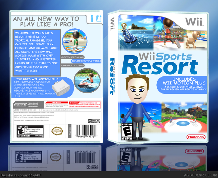
 Wii Sports Resort Box Cover Comments
ok, i know its simple but that is the way all boxes with the word "wii" in it are (wii sports, wii play, etc...
So ya, hope you like it.
[ Reply ]
It looks nice! I personally think you have to use a male and female Mii because this game is for everyone and not only for males. You know, the official feeling. And I would have used another font. Something like Arial?
[ Reply ]
This is very nice. I could see this in stores.
[ Reply ]
The Reflections are messed up, but the box looks good.
[ Reply ]
I agree with #4 about the reflections, but thats just a minor extra in regards to your presentation. the box is clean, sharp, and has a nice layout with good color. Very nice work my friend!
[ Reply ]
Thanks everyone!
[ Reply ]
This is really cool. Front is top-notch.. back could do with some tidying up, but generally, very good.
[ Reply ]
#8 Holy Crap! I am like, soooooooooo happy. Thanks a bunch Marker!
Any ideas on how i could improve the back?
Edited at 1 decade ago
[ Reply ]
I like the front!
[ Reply ]