all right guys,i worked on this one for some time and it took quite a lot of effort. please can you tell me how to improve this as well as rating out of 10
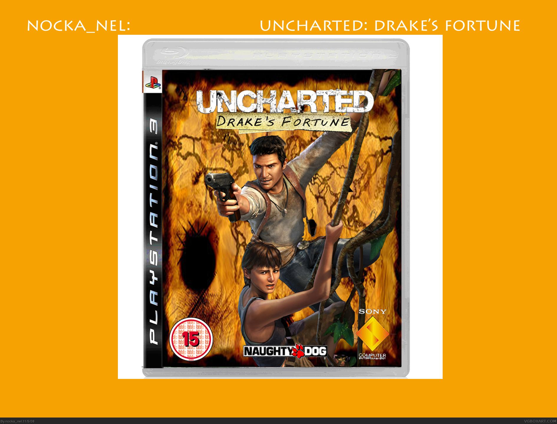
He means the background. Presentation refers to things around the box that make it stand out. FOr example Mad Spike has his submissions in a digital case. Anyway, it's pretty good, but the renders are a bit choppy. Try and combine the use of the erase tool and the line marquee tool. otherwise the cut outs will look very squareish.
The template is badly distorted color-wise, like it got turned into a GIF. The renders are good, but I think it needs either a better map image if you're going to go that route, or a little more expected jungle scene.
Layout of elements is fine, but the presentation is huge and empty. The black would be fine with a back and reflection, but neither of those are present.
It reflects the theme of the game correctly, I noticed the stretched background too and the choppiness outside the template in full size. Could do with some polish all round.
thanks for the comments and faves, #11, e g how could i make the background less streched and still make it fit the page and #10, that is how the template looked when i got it, and this was the best map i could find.
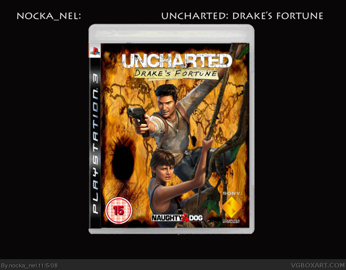
 Uncharted: Drake's Fortune Box Cover Comments
all right guys,i worked on this one for some time and it took quite a lot of effort. please can you tell me how to improve this as well as rating out of 10
[ Reply ]
it's actually pretty well done. good job.
[ Reply ]
#2, thanks gamerking, can you rate it out of ten please
Edited at 1 decade ago
[ Reply ]
i'll give this 6 out of 10. i really don't like the white box. you can try make a back for this and for your next box.
[ Reply ]
okay. i'll give it a 6.5/10.
just get rid of the white around the box. change the orange behind the box, it's annoying. lol. and try a back. :)
[ Reply ]
#4+#5 better?, il make a back later but im currently doing a new box
(which can have a back)!!!.
[ Reply ]
pretty good :) needing a better presentation though :)
[ Reply ]
#7, thanks grahamz but what do you meen by presentation and can you give a rating ot of 10?
[ Reply ]
He means the background. Presentation refers to things around the box that make it stand out. FOr example Mad Spike has his submissions in a digital case. Anyway, it's pretty good, but the renders are a bit choppy. Try and combine the use of the erase tool and the line marquee tool. otherwise the cut outs will look very squareish.
[ Reply ]
I give it a 2/5
The template is badly distorted color-wise, like it got turned into a GIF. The renders are good, but I think it needs either a better map image if you're going to go that route, or a little more expected jungle scene.
Layout of elements is fine, but the presentation is huge and empty. The black would be fine with a back and reflection, but neither of those are present.
[ Reply ]
It reflects the theme of the game correctly, I noticed the stretched background too and the choppiness outside the template in full size. Could do with some polish all round.
[ Reply ]
thanks for the comments guys, il try an d improve but im trying to figure which box i should do next, maybee a fear 2? im not sure.
[ Reply ]
thanks for the comments and faves, #11, e g how could i make the background less streched and still make it fit the page and #10, that is how the template looked when i got it, and this was the best map i could find.
[ Reply ]