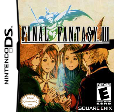
#3, It's darker around the top and middle. The logo is also a little higher. I think it's an improvement. It makes the logo more seperate from the rest of the box. :3
The logo could use a little more attention though. :b
Well I did not want to highlight the logo all in light because I do not think there is an big emphasis on light and dark and I am not the best at glowing the logo and considering it was a scan in.
But thx for the comment.

 Final Fantasy III Box Cover Comments
A quickie I like it very much though.
[ Reply ]
I remember that picture, and it would be perfect for the cover. I love it. :3
[ Reply ]
Thank you and I made some small preferable changes if you can spot em!
[ Reply ]
#3, It's darker around the top and middle. The logo is also a little higher. I think it's an improvement. It makes the logo more seperate from the rest of the box. :3
The logo could use a little more attention though. :b
[ Reply ]
Well I did not want to highlight the logo all in light because I do not think there is an big emphasis on light and dark and I am not the best at glowing the logo and considering it was a scan in.
But thx for the comment.
[ Reply ]
Nice. Well done.
[ Reply ]
sweet
[ Reply ]