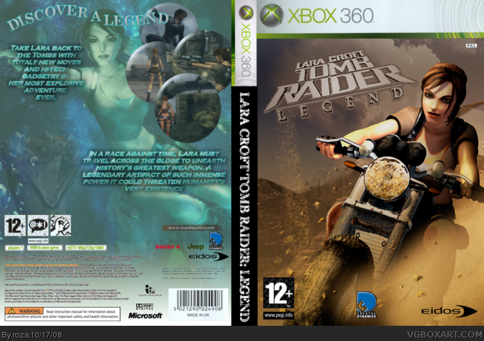
took about 5 hrs, tried to make it into two differnt aspects of the game, the front, a racing type feel, thats why the logo is slanted and the back I added bubble type screenshots and in the backgroun you can see the hydra so it gives a first look harmless feel but look all over and there is a hidden danger sense, credit to tombraiderchronicles.com(i think) for the images and renders so enjoy an peace out!
CC please
#2/3 yeah sorry, i put C&C cuz i saw other boxes with that so...you know monkey see monkey do lol anyway just thought i'd clear that up
#4 cool, thanks for the fav, ill try and fix the back it'll be done monday at the least as this is saved at my school comp and i dont have ireworks at home. I maight just get rid of a screen shot so it will be easier to arrange, also thanks for the fav Legend_Chronicles2
C&C?
Comment and...what? Sorry, kinda newby here. =P
I like the front, but the back is so different.
I love the face expression in both screens tough. =P
#2 I think he meant constructive criticism. Although that would of been Constructive & Criticism which wouldn't of made any sense. So yeah, I have no idea what he was trying to say =P
#3, Either Constructive Criticism or Comment & Criticism, but there's no &, so I go with the former.
Anyway, how is this not favorited yet? Front is great, the back needs to be spread out. I get that you're making them into bubbles, but they shouldn't be clustered like that. I'll give it a 3.75/5, and I'll go to 4.5/5 if you fix the back.
 Lara Croft Tomb Raider: Legend Box Cover Comments
took about 5 hrs, tried to make it into two differnt aspects of the game, the front, a racing type feel, thats why the logo is slanted and the back I added bubble type screenshots and in the backgroun you can see the hydra so it gives a first look harmless feel but look all over and there is a hidden danger sense, credit to tombraiderchronicles.com(i think) for the images and renders so enjoy an peace out!
CC please
#2/3 yeah sorry, i put C&C cuz i saw other boxes with that so...you know monkey see monkey do lol anyway just thought i'd clear that up
#4 cool, thanks for the fav, ill try and fix the back it'll be done monday at the least as this is saved at my school comp and i dont have ireworks at home. I maight just get rid of a screen shot so it will be easier to arrange, also thanks for the fav Legend_Chronicles2
Edited at 1 decade ago
[ Reply ]
C&C?
Comment and...what? Sorry, kinda newby here. =P
I like the front, but the back is so different.
I love the face expression in both screens tough. =P
[ Reply ]
#2 I think he meant constructive criticism. Although that would of been Constructive & Criticism which wouldn't of made any sense. So yeah, I have no idea what he was trying to say =P
[ Reply ]
#3, Either Constructive Criticism or Comment & Criticism, but there's no &, so I go with the former.
Anyway, how is this not favorited yet? Front is great, the back needs to be spread out. I get that you're making them into bubbles, but they shouldn't be clustered like that. I'll give it a 3.75/5, and I'll go to 4.5/5 if you fix the back.
[ Reply ]
Cool, though the logo is a bit choppy.
Even the Jeep and Ducati logos are on the box.
+fav
Edited at 1 decade ago
[ Reply ]