credit to gawd... y'know... i just wanted to try a package seen as how i can now use the layer feature, don't flame it, it was a try, better than my naruto box amirite? lulz (xD)
yep, i think you're getting it
only thing, you lost me with text(description and screen ones)style and placment, though i'll fav casue i see great effort here
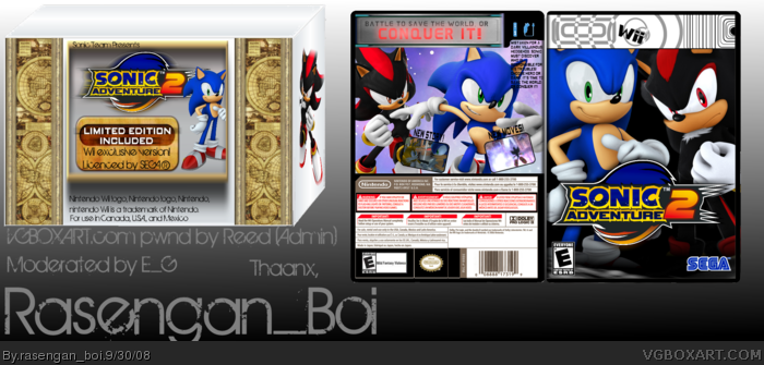
Ummm what can I say? I can see effort here, but execution needs work. The box only has graphics on two of the three visible sides, and the two of them are inconsistent with each other. I'd like to see a continuation of the artwork on the front side with the side visible on the right, and some basic info. or something similar on the top like the Wii Logo and some Special Edition info.
On the game-I'm really not a fan of the modded template, but I like that you took a chance. I would have used the official Wii logo font style and made it the aqua blue color. On the back, it's really hard to read the text, I'd make it white with a black stroke/drop shadow on it. I do like the image used for the back, though I would add some screens with little captions on them. Love the tagline and the front looks nice. I give it a 3.5/5 for its current form.
this is better than some of your other boxes, yet you are still trying to fit in images that dont belong, the text on the back is extremely hard to read and its small, and alot of your sonic renders look the same.
 Sonic Adventure 2 + Wii Combo Pack Box Cover Comments
credit to gawd... y'know... i just wanted to try a package seen as how i can now use the layer feature, don't flame it, it was a try, better than my naruto box amirite? lulz (xD)
[ Reply ]
How is it a new story if it's SA2?
[ Reply ]
#2, i based it so that it appears as if this is the first time SA2 came out
[ Reply ]
yep, i think you're getting it
only thing, you lost me with text(description and screen ones)style and placment, though i'll fav casue i see great effort here
[ Reply ]
It has some tech flaws (choppy text) and such but it's a decent box.
The screens and such are also laid out oddly.
[ Reply ]
btw, the temp is custom, i also modified TTT's disc temp, and have an empty Wii box
[ Reply ]
Ummm what can I say? I can see effort here, but execution needs work. The box only has graphics on two of the three visible sides, and the two of them are inconsistent with each other. I'd like to see a continuation of the artwork on the front side with the side visible on the right, and some basic info. or something similar on the top like the Wii Logo and some Special Edition info.
On the game-I'm really not a fan of the modded template, but I like that you took a chance. I would have used the official Wii logo font style and made it the aqua blue color. On the back, it's really hard to read the text, I'd make it white with a black stroke/drop shadow on it. I do like the image used for the back, though I would add some screens with little captions on them. Love the tagline and the front looks nice. I give it a 3.5/5 for its current form.
[ Reply ]
i can see effort but there are some choppy things, not really bad choppy but not good choppy if there is any lol.
Pretty good.
[ Reply ]
this is better than some of your other boxes, yet you are still trying to fit in images that dont belong, the text on the back is extremely hard to read and its small, and alot of your sonic renders look the same.
but other than that good job :] for a n00b XD
[ Reply ]