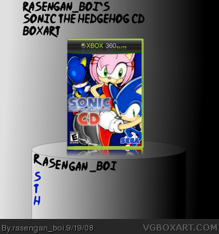
please view in full! defiantly my best box, I'm hoping that this one will be my lucky break, walking away with more than 10 fav's is my goal right now, thaanx, RB, #1, thats just you
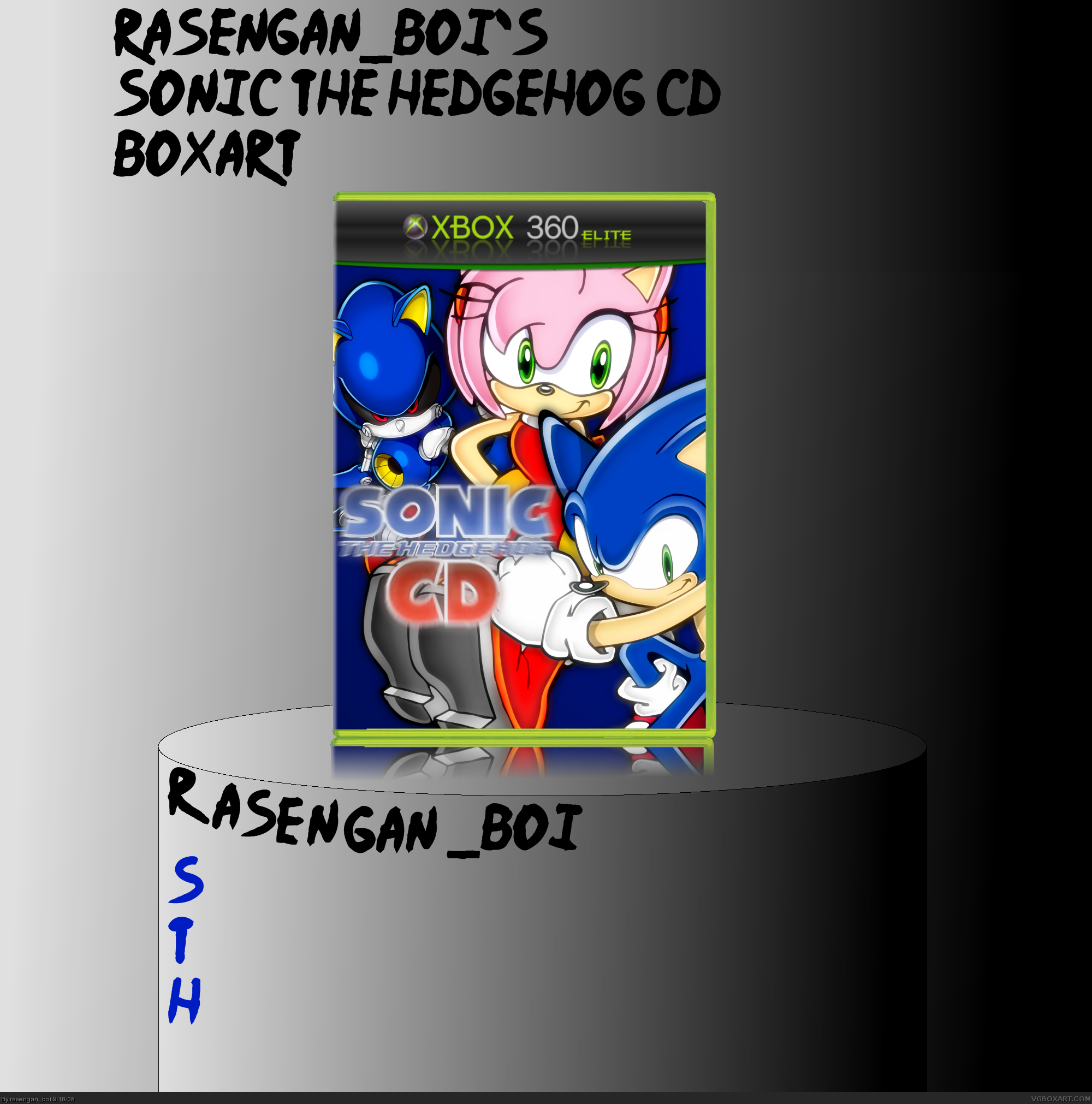
Hey buddy, Aren't you going to fix up the last box you posted? That one had a pretty good set up.
But anyways, this is ok as well, and yes, I for one can see how the quality of your boxes are improving as you are now using a better graphic program then your earlier boxes.
Just remember now that your using a program that offers a whole bunch of extra options, it's not a good idea to use every tool in your arsenal on one box! Not that that's the case with this one, I can just tell you got a little excited with the blur effects on your logo there.
Also, remember to try something other than Sonic every now and then, as it's hard to make Sonic and his buddies stand out on this site anymore, as I'm sure you know.
#4, actually, i've been using paint.net this entire time, i just learned how to use the layers feature 2 days ago, and your right, i just really like sonic boxes, they;re easy to make, and i have loads of materials, so, i'll make a battle stadium D.O.N. box next
Three (great quality) renders on a blue background with a logo, all slapped on a template with a distracting, gigantic background. There aren't even any dev logos or age ratings. It looks solid and classy, though, so I'll give this a 3/5.
It's getting there, but another thing that is bothering me is the giant stage and pedestal you have it sitting on. It's really distracting away from your box.
 Sonic the Hedgehog CD Box Cover Comments
your adding TOO MANY BOXARTS TOO FAST!! YOU HAVE TO SLOW DOWN BECUASE NOW THEY ARE STARTING TO LOOK BAD!
[ Reply ]
please view in full! defiantly my best box, I'm hoping that this one will be my lucky break, walking away with more than 10 fav's is my goal right now, thaanx, RB, #1, thats just you
Edited at 1 decade ago
[ Reply ]
post deleted, accidental double post
Edited at 1 decade ago
[ Reply ]
Hey buddy, Aren't you going to fix up the last box you posted? That one had a pretty good set up.
But anyways, this is ok as well, and yes, I for one can see how the quality of your boxes are improving as you are now using a better graphic program then your earlier boxes.
Just remember now that your using a program that offers a whole bunch of extra options, it's not a good idea to use every tool in your arsenal on one box! Not that that's the case with this one, I can just tell you got a little excited with the blur effects on your logo there.
Also, remember to try something other than Sonic every now and then, as it's hard to make Sonic and his buddies stand out on this site anymore, as I'm sure you know.
Edited at 1 decade ago
[ Reply ]
i don't like the brightness of it other wise it o.k
[ Reply ]
#4, actually, i've been using paint.net this entire time, i just learned how to use the layers feature 2 days ago, and your right, i just really like sonic boxes, they;re easy to make, and i have loads of materials, so, i'll make a battle stadium D.O.N. box next
Edited at 1 decade ago
[ Reply ]
i have been using paint.net sense my first one,i learned the layer feature like a few months ago
Edited at 1 decade ago
[ Reply ]
#6 Keep at it man. The ability to utilize layers is what separates MS Paint from higher end graphic applications.
[ Reply ]
i viewed it in full, it really is good.
i would fave, but you wanna know why i'm not gonna? there's no ESRB or DEV logos, add them and i'll fav it for sure
(but for real, you should slow down)
[ Reply ]
It's good, but un-blur the logo.
[ Reply ]
#6, damn i was gonna make one of those:D
[ Reply ]
Three (great quality) renders on a blue background with a logo, all slapped on a template with a distracting, gigantic background. There aren't even any dev logos or age ratings. It looks solid and classy, though, so I'll give this a 3/5.
[ Reply ]
#12, ... no... dev logos or age ratings... ? *slams head against wall really hard* DAMNIT! i completely forgot about them
Edited at 1 decade ago
[ Reply ]
Fixed, now, there's an age rating and a dev logo
[ Reply ]
It's getting there, but another thing that is bothering me is the giant stage and pedestal you have it sitting on. It's really distracting away from your box.
Edited at 1 decade ago
[ Reply ]
Dude, stop advertising that you're the alt of a banned account. You're asking for a ban.
[ Reply ]
#16, how am i doing that? its not on the box, its not in any comments
[ Reply ]