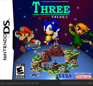
i made a sequel of my best box.i made the logo and i got every thing of google images the temp pluse the dev logos and credit to avendger for the "mushroom tales" logo part
no comments? i know where not to beg but can you comment, and rate i want to know what other people think besides me i give it a 3/5 compaered to my other one link
thank you, and BTW if sonmeone can find a pic of a (more) cartoony sonic please PM me it and i waens't sure if the toon link fit with mario i wanted to have them like circling the earth with the triforce, star, and chaos emrald, but i couldn't find any renders or know how to make them so i had to make them look more in the postion of my first one
And#3 when i see a bad box i comment trying to help on what to improve and try to help but somtimes i don't like your comment, sorry but that w\the way i will comment from now on and sorry for bumping my box.
#2, you dont have to bump your box, when i see a box i dont like i usualy ignore it, i assume the same for the most. 4/5 is quite a high rating for this. id say 1/5. No back, odd logo, charcters dont look simmialr at all (color style) and the cover is not appealing.
 The Legend of Three-Mushroom Tales 2 Box Cover Comments
i made a sequel of my best box.i made the logo and i got every thing of google images the temp pluse the dev logos and credit to avendger for the "mushroom tales" logo part
Edited at 1 decade ago
[ Reply ]
no comments? i know where not to beg but can you comment, and rate i want to know what other people think besides me i give it a 3/5 compaered to my other one
link
thank you, and BTW if sonmeone can find a pic of a (more) cartoony sonic please PM me it and i waens't sure if the toon link fit with mario i wanted to have them like circling the earth with the triforce, star, and chaos emrald, but i couldn't find any renders or know how to make them so i had to make them look more in the postion of my first one
And#3 when i see a bad box i comment trying to help on what to improve and try to help but somtimes i don't like your comment, sorry but that w\the way i will comment from now on and sorry for bumping my box.
Edited at 1 decade ago
[ Reply ]
#2, you dont have to bump your box, when i see a box i dont like i usualy ignore it, i assume the same for the most. 4/5 is quite a high rating for this. id say 1/5. No back, odd logo, charcters dont look simmialr at all (color style) and the cover is not appealing.
[ Reply ]
#2, your other one was better.
[ Reply ]