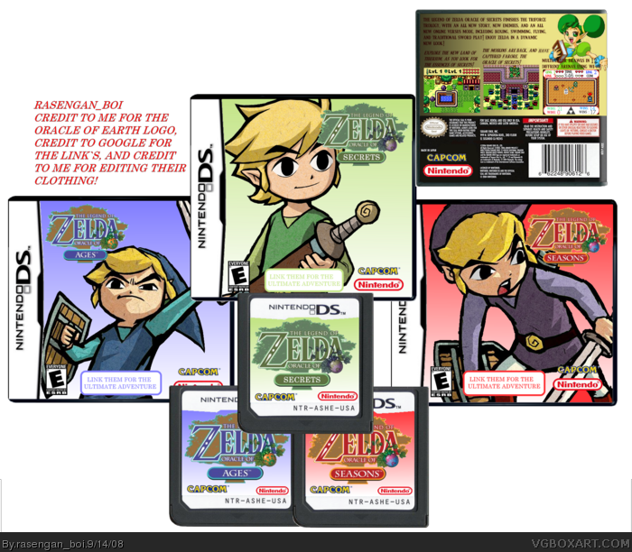
[ Box updated on September 15th, 2008 ] [ original ]
 The Legend of Zelda: The Oracle Trilogy Box Cover Comments
Comment on rasengan_boi's The Legend of Zelda: The Oracle Trilogy Box Art / Cover.
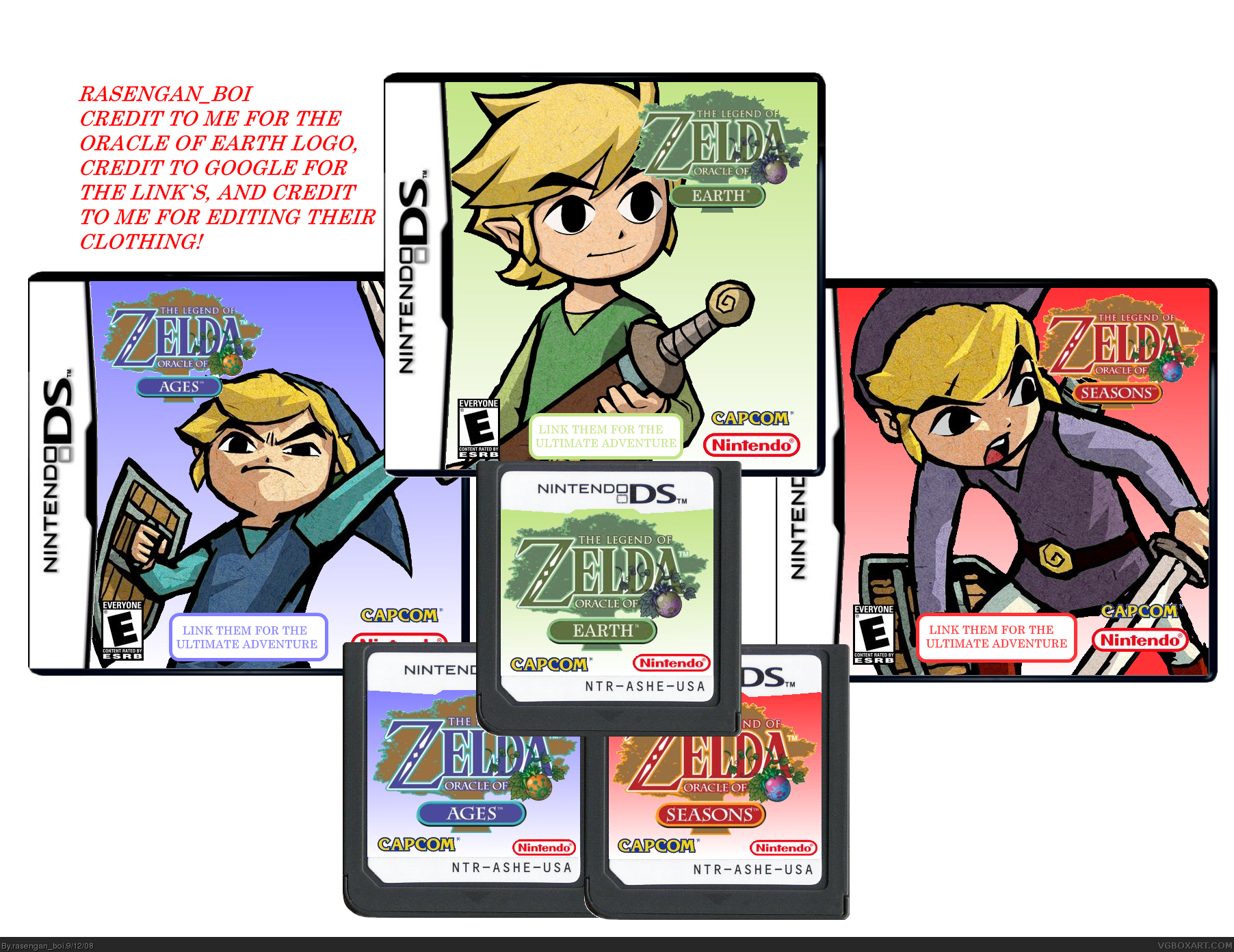
please view in full, i don't know who put the DS cards up, so no credit for now, rest of the credits, read the top please, comments wanted!
[ Reply ]
Its good. But the third game would have been called oracle of secrets.
#3, Im just saying it would sound better then "Oracle of Earth". But like I said before the boxes are pretty nice. But looks kinda plan.
Edited at 1 decade ago
[ Reply ]
#2, i know that, but if i made a logo that everybody wasn't expecting, then what? also, please comment on the flaws, pros, etc, etc.
[ Reply ]
3/5,blue is funny, but capcom? and the logo choppy
Edited at 1 decade ago
[ Reply ]
#4, Capcom made the recent GB-GBA games for Zelda.
[ Reply ]
#4, cap com crated the original ones, they created the oracle series, and links awakening i should know, thats the 2nd logo you see when you turn on yo' game boy color
c'mon people, i hate it when people work hard, and nobody sees their boxes
Edited at 1 decade ago
[ Reply ]
Credit to Google? I'm pretty sure Nintendo created those images.
[ Reply ]
#6, sorry i know now thanks
[ Reply ]
Surprisingly, I love it.
[ Reply ]
#7, i know nintendo made it, but i found the images on google c'mon, i want this to be my first box with more then 10 favs
Edited at 1 decade ago
[ Reply ]
updated, added a back for oracle of Earth, now named secrets
[ Reply ]
the firs screen shots look like link in the bottem cornor like his back side cool.the trees
[ Reply ]
nice probobly your best
[ Reply ]
oh yeah, note the 3rd gameplay picture, the green link has has pwnd the others, and is still pwning, lolz
Edited at 1 decade ago
[ Reply ]
I'm giving a 3.75 for this one too. And here's why, I have two issues.
First, you still have the third title on your image referenced as "Oracle of Earth" though you have changed it to Secrets.
Second, The little blurb at the bottom recommending linking the titles would (in my opinion) look better as a little star/flared style image in the red/green/blue.
Please don't take my crits the wrong way, just want to help you realize an even higher potential. I like your style so far, great work.
[ Reply ]
Good presentation but .... the box!
[ Reply ]