This is pretty much flawless in my mind. A few people mentioned the glow on the logo could be less thick. It COULD, but it really doesn't bother me. Overall, awesome job!!
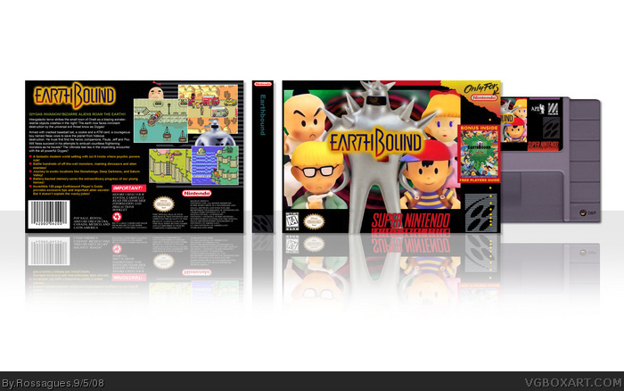
Good. Although I find the Starmen overlapping the template a bit odd. I like how you use a bonus thing with the player's guide. The beack is excellent. I like how you used the screenshot to overlap Mr. Saturn. Something about that makes it cool. Lastly, I think the faded Ness face on the Starmen's visor was very good. Did you do that yourself? 9/10 Very good.
 EarthBound Box Cover Comments
That's sweet. I like the screenshot layout.
[ Reply ]
I like it. But I think that the logo should be bigger and the outer glow should be less thick. I also don't like the guy overlapping the template.
[ Reply ]
Really good job!
[ Reply ]
#3 <------- What he said.
[ Reply ]
Everything is damn near perfect except the starman overlapping the temp, as #3 and #5 mentioned.
Earthbound is one of my most favorite games, and this box certainly does it great justice.
Edited at 1 decade ago
[ Reply ]
Just started playing this game on an emulator.. :D
[ Reply ]
sweet job dude FAV
[ Reply ]
Hey did you rip the background from my No More Heroes box? I've checked, and the your background has the exact 100% same colours as mine...
[ Reply ]
looks great but I would also fix the things that Dersnap mentioned.
#9, oh noes, he ripped a gradient. it's not that hard to make such a background. imo it looks slightly different than yours.
[ Reply ]
#10 Oh noes, I was just asking him.
[ Reply ]
#11, when a comment is only directed to the artist why dont you use PMs.
The box looks great. +fav
#13, no I would of liked to see other users reactions. In all in all that was a little uncalled for.
Edited at 1 decade ago
[ Reply ]
#12, Like your comment on my and Indexenos' collab, whic was only directed to me.
Forgot to say, pretty good retro box, worth a fav.
[ Reply ]
#14 No problem dude, ;), just a tiny suspicion.
[ Reply ]
Great box man, your snes boxes are top notch.. maybe u should stick to them, YOU PS3 FANBOY!
[ Reply ]
This looks really official. +fav
[ Reply ]
Stop it. You're embarassing me.
[ Reply ]
It's Amazing.
#23, Yeah, I love them to. They inspire me!
Edited at 1 decade ago
[ Reply ]
Schweetness.
[ Reply ]
your doing real good FAVE
[ Reply ]
Dudeman, This is probably the Best box you made, IMO. Also, Why must you be so good?
[ Reply ]
WHOA...
That's... that's amazing dude.
[ Reply ]
really good, i dont think there is any way to improve, fav! box and author!
[ Reply ]
Wow! That's cool! I wish that game will come to Virtual Console....
[ Reply ]
#30, I wish it would too.
This deserves to be in the HOF
[ Reply ]
This is pretty much flawless in my mind. A few people mentioned the glow on the logo could be less thick. It COULD, but it really doesn't bother me. Overall, awesome job!!
[ Reply ]
Congrats on the HOF
[ Reply ]
Congrats ;)
[ Reply ]
Very nice! Oh, and congrats! ^^
[ Reply ]
Awesome!
[ Reply ]
This is great! Sweet job and keep up the great work! ^^
[ Reply ]
This is amazing. I think it's the best retro box on the site.
No, really, it makes me want to play this game despite not knowing the slightest thing about it.
[ Reply ]
looks pretty cool rossagues. congrats on the hall of fame.
[ Reply ]
Good. Although I find the Starmen overlapping the template a bit odd. I like how you use a bonus thing with the player's guide. The beack is excellent. I like how you used the screenshot to overlap Mr. Saturn. Something about that makes it cool. Lastly, I think the faded Ness face on the Starmen's visor was very good. Did you do that yourself? 9/10 Very good.
[ Reply ]