"For comments not pertaining to the box in question, please use the forum. This is not your personal chat room. Do not bump your own box, and do not beg for comments and faves."
And if you didn't put any effort in (which looks like to be the case) post it in the critiques forum or not at all.
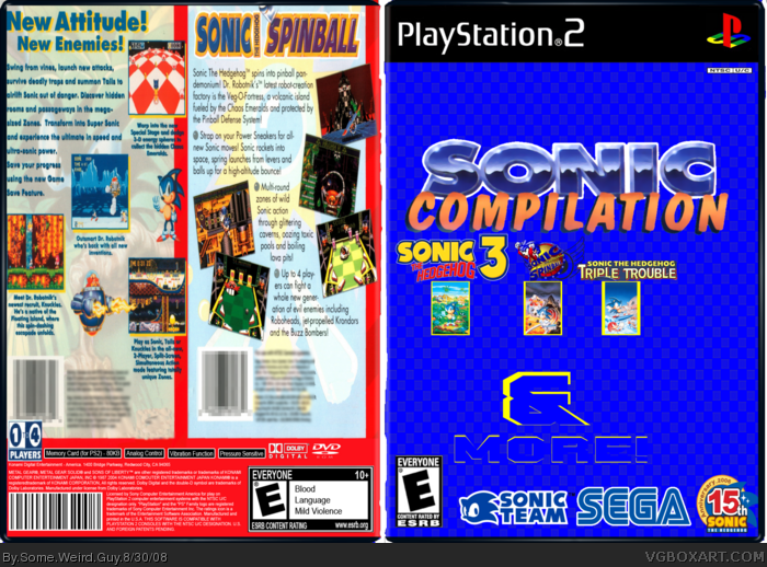
In my opinion, the front looks to generic, the logos are out of proportion and the back is the most basic of cut and paste work.
 Sonic Compliation Box Cover Comments
Yes, I suck. Oh yeah, template made by ASFD.
Edited at 1 decade ago
[ Reply ]
"For comments not pertaining to the box in question, please use the forum. This is not your personal chat room. Do not bump your own box, and do not beg for comments and faves."
And if you didn't put any effort in (which looks like to be the case) post it in the critiques forum or not at all.
In my opinion, the front looks to generic, the logos are out of proportion and the back is the most basic of cut and paste work.
Please try harder next time.
Edited at 1 decade ago
[ Reply ]
Did you make those two info boxes on the back? Or did you just copy and paste them off of the official boxes
[ Reply ]
They are obviously cut-and-pastes of the actual box backs. Note the fact that there's 3 UPCs (barcodes). :(
[ Reply ]