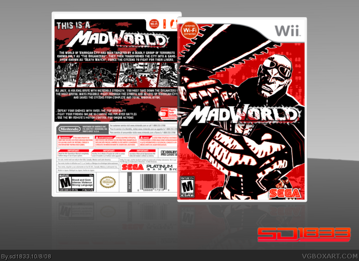
This is really cool, some of the description text blends in with the red on the background, so you might want to do more to make it stand out. The ESRB rating is pixelized as well.
MadWorld! This took me a bit, especially cutting out the dude on the front. I'm not entirely pleased with the final outcome of the back, but it was the best I could make since I couldn't find much material for this game. :)
 MadWorld Box Cover Comments
This is really cool, some of the description text blends in with the red on the background, so you might want to do more to make it stand out. The ESRB rating is pixelized as well.
[ Reply ]
MadWorld! This took me a bit, especially cutting out the dude on the front. I'm not entirely pleased with the final outcome of the back, but it was the best I could make since I couldn't find much material for this game. :)
Credit to Techne for the template.
#1, thanks E_G
Edited at 1 decade ago
[ Reply ]
I think it looks really good. The only thing I would change is where the text blends and where the NWC logo goes onto the temp on the front.
[ Reply ]
#1, I agree. I also think the logo needs more to help it stand out better.
[ Reply ]
Only problem is the logo and some of the text
Then we got the best MadWorld box yet ;)
[ Reply ]
You need, an better background...
EDIT: there alot material, on the sega.
try this: link
Edited at 1 decade ago
[ Reply ]
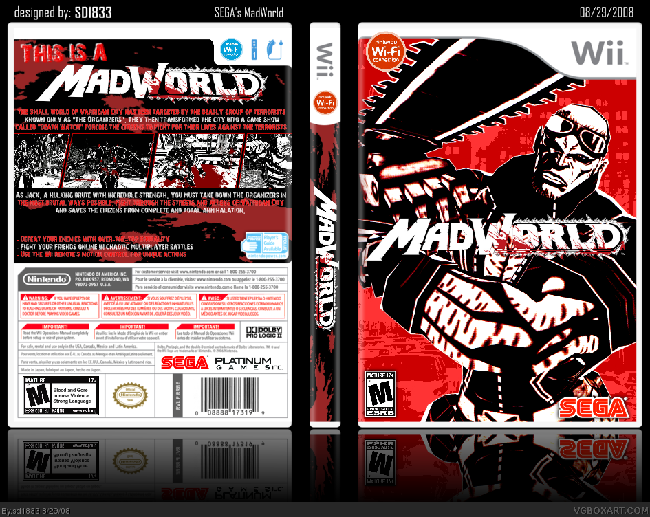
UPDATE: Made the back text easier to read. Tried to "un-pixelate" the ESRB but it always turned out the same.
[ Reply ]
Could you tell me where you got the art on the front?
[ Reply ]
#8, Magazine scans (thank you Nintendo Power).
[ Reply ]
I would change the red wifi, cause the red wifi will be for "pay to play"
[ Reply ]