Here is my latest box, Okami for the PS2. I did an Okami box for the Wii already, but I wasn't very happy with it, so here's round 2. Credit the temp to ADFD.
#12 Well no but since you joint the site on July 23rd, you have fav'd 866 boxes! Which averages at around 22-23 boxes per day since you've made your new account.
Do you ever get the feeling your faving too much? lol
"It seems like you fav every box whether you love it, loathe it or just think its midly okay..."
"Unlike me, I need to actually LOVE the box before I fav it"
#30 Thank you! You know I would never attack you Skyrunner =D
Rooney was just being an idiot... or trying to stir up an argument.... Anyway I really am going this time ^.^
#32, How am I being an idiot!? I'm just trying to stop my box being filled up with crap comments like yours. If you're gonna post on my box, make it about the box, not about the other people posting.
#39 Uh-oh... prepare to face the wrath of the rooney!!! =O
*comments the box*
Its pretty nice but the ESRB is too small and should be lower down, same with the Capcom logo. I also dont like how plain the front is, I know you were going for a simplistic style but in my opinion, you didnt really pull it off very well. Also you should of put more thought into your presentation rather than using a black template against a black background.
Ooh, very original. That's hard to find these days. :\
ANYWAYS,
The front is sophisticated, if not a bit dull. Try spicing it up a bit with some color.
The back is really cool, I love the use of black brush strokes. The tagline should fit in the white space better though, and I'd ditch the drop-shadow because it makes it look "photoshopped" (oh the horror!). xD
Also, here's a valuable tip you should know: NEVER, I mean NEVER, use all-caps for your main information paragraph. It slows down the viewers' reading tremendously. Besides, lowercase flows better and looks more natural.
Also, just a personal thing, I'd change that red bar in the middle of the back to black brush stroke, just for consistency. ;)
Overall, nice, but a few nit-picks keep me from wanting to press the fav link.
Good Update = +Fav.
By the way, mind telling me where you got those brush strokes? :O?
 Okami Box Cover Comments
Here is my latest box, Okami for the PS2. I did an Okami box for the Wii already, but I wasn't very happy with it, so here's round 2. Credit the temp to ADFD.
Comments, Suggestions?
[ Reply ]
Needs, ALOT more attention.
[ Reply ]
Dude...
[ Reply ]
Only 2 comments? This box is awesome.
[ Reply ]
Whoaaa
[ Reply ]
....i like it!
[ Reply ]
Wow, thanks for the positive comments and favs everyone!
[ Reply ]
Unique design!
[ Reply ]
Man...taht's incredible.
[ Reply ]
#9 You think everything is incredible though.
Edited at 1 decade ago
[ Reply ]
#10 That's because he generally comments on good boxes -.-
[ Reply ]
#10 Do you want me to not say your boxes are incredible? :p
[ Reply ]
Wow!
[ Reply ]
#12 Well no but since you joint the site on July 23rd, you have fav'd 866 boxes! Which averages at around 22-23 boxes per day since you've made your new account.
Do you ever get the feeling your faving too much? lol
Edited at 1 decade ago
[ Reply ]
#14 What can I say? I like boxes :p
[ Reply ]
#15 Holy shiz, that's more than two times mine =O
[ Reply ]
#15 Cleary! It seems like you fav every box whether you love it, loathe it or just think its midly okay =P
EDIT: #16 I've been here since January and only have 168 faved boxes =O
Edited at 1 decade ago
[ Reply ]
:P It has to be a little over midly ok... xD
[ Reply ]
#18 Haha! Unlike me, I need to actually LOVE the box before I fav it =]
Okay lets get back on topic now guys.
[ Reply ]
#19, now that we're on topic, would you care to say something about the box rather than attacking Skyrunner? Thanks.
[ Reply ]
#20 How was I attacking him?
[ Reply ]
#21, I think he has a right to fav as many boxes as he wants, that doesn't mean you can insult him if he favs a lot.
[ Reply ]
#22 How was I insulting him?
[ Reply ]
"It seems like you fav every box whether you love it, loathe it or just think its midly okay..."
"Unlike me, I need to actually LOVE the box before I fav it"
That says enough.
[ Reply ]
#24 Insulting him would be saying something like "You fav too much you jackass!"... I would not say that because I like Skyrunner.
Yeah so again I ask... How was I insulting him?
[ Reply ]
#25, It's the same thing. Now stop commenting on my box.
Edited at 1 decade ago
[ Reply ]
#26 But you didnt answer my question! How was I attacking or insulting Skyrunner?
[ Reply ]
I told you twice. Stop commenting.
[ Reply ]
#28 Er no you never?
But okay whatever then, im out.
[ Reply ]
Ravenrooney thanks for sticking up for me, Cerium was so mean :p
No just kidding. Thanks anyway ravenrooney but Cerium wasn't attacking me or insulting me, he just had an opinion on my opinion of boxes. xD
[ Reply ]
Thank you. Well now that that's over, who wants to say something about the box? :p
Haha, it's no problem Skyrunner. I just didn't want anyone to get offended or anything.
Edited at 1 decade ago
[ Reply ]
#30 Thank you! You know I would never attack you Skyrunner =D
Rooney was just being an idiot... or trying to stir up an argument.... Anyway I really am going this time ^.^
[ Reply ]
#32, How am I being an idiot!? I'm just trying to stop my box being filled up with crap comments like yours. If you're gonna post on my box, make it about the box, not about the other people posting.
[ Reply ]
#32 *sigh*
"Rooney was just being an idiot..."
[ Reply ]
*runs*
[ Reply ]
Try and keep this about the box.
[ Reply ]
OK, we're done with this. No more harsh comments, from me or anyone else...
Thanks, E_G.
Edited at 1 decade ago
[ Reply ]
Wow, I really like this. The back is spectacular.
[ Reply ]
-comment not pertaining this box here-
[ Reply ]
#39 Uh-oh... prepare to face the wrath of the rooney!!! =O
*comments the box*
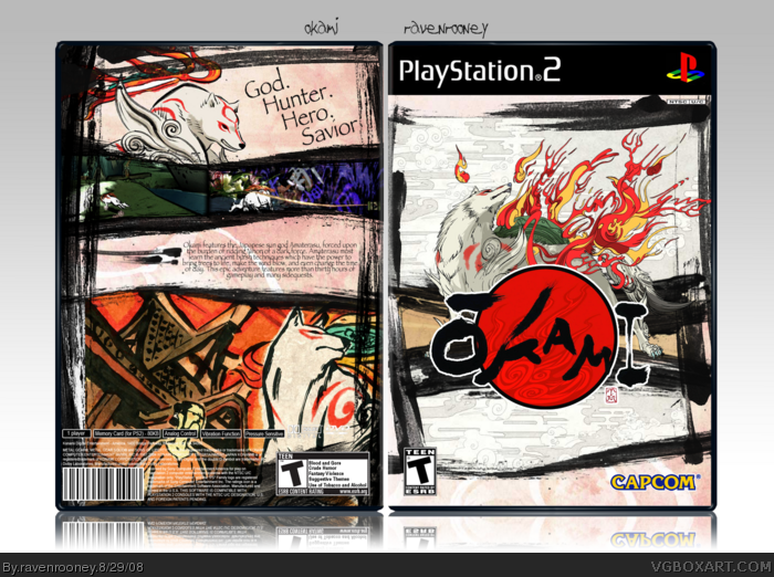
Its pretty nice but the ESRB is too small and should be lower down, same with the Capcom logo. I also dont like how plain the front is, I know you were going for a simplistic style but in my opinion, you didnt really pull it off very well. Also you should of put more thought into your presentation rather than using a black template against a black background.
[ Reply ]
Well I think it's your best.
[ Reply ]
Thanks #41.
#40, I'll see what I can do to change up the front. I just don't want to have to redo half the box, you know?
[ Reply ]
Ooh, very original. That's hard to find these days. :\
ANYWAYS,
The front is sophisticated, if not a bit dull. Try spicing it up a bit with some color.
The back is really cool, I love the use of black brush strokes. The tagline should fit in the white space better though, and I'd ditch the drop-shadow because it makes it look "photoshopped" (oh the horror!). xD
Also, here's a valuable tip you should know: NEVER, I mean NEVER, use all-caps for your main information paragraph. It slows down the viewers' reading tremendously. Besides, lowercase flows better and looks more natural.
Also, just a personal thing, I'd change that red bar in the middle of the back to black brush stroke, just for consistency. ;)
Overall, nice, but a few nit-picks keep me from wanting to press the fav link.
Good Update = +Fav.
By the way, mind telling me where you got those brush strokes? :O?
[ Reply ]
V2 is up. The front is completely redone, and the back is just altered a little bit.
#43, the strokes are just a part of a Photoshop brush set that I found, unfortunately I can't remember the site I got them from.
[ Reply ]
Wow. I like this new front better than the original. Is it possible to double fav? Haha
[ Reply ]
FANTASTIC update! :D
You definitely have an eye for design.
[ Reply ]
Thanks qwerty. Oh, and I found the strokes: link
[ Reply ]
Very unique and great use of the brush strokes. Sweet work! ^^
[ Reply ]
Thanks, LK.
Any other suggestions?
[ Reply ]