Its nice but there are a number of things that has gone a bit wrong here?
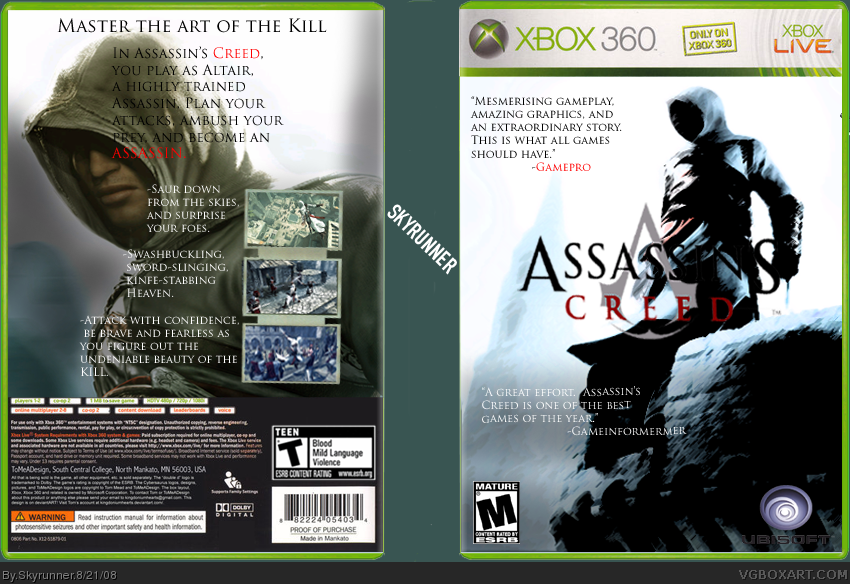
the qoutes on the front are toooo long normally it would be something way shorter. You cant see half of the AC logo because of the render. The screenshots are really small and the layout of the back is pretty messy. And you cant see the ubi logo try making the text white? :D
 Assassin's Creed Box Cover Comments
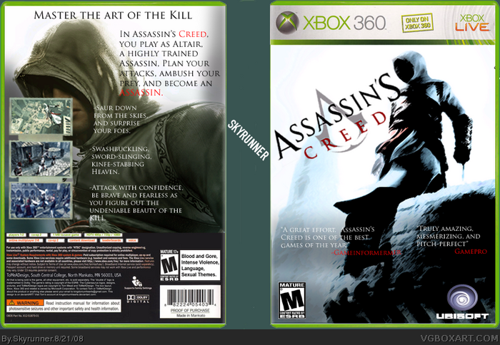
Ehh.. i dont know if it's my best box, and some of you may not like it, but I like the way it turned out. I dont really have much to say.
Credit to Star for temp, creativeuncut for artwork, and Soundwave for screenshot borders. Enjoy.
[ Reply ]
Its nice but there are a number of things that has gone a bit wrong here?
the qoutes on the front are toooo long normally it would be something way shorter. You cant see half of the AC logo because of the render. The screenshots are really small and the layout of the back is pretty messy. And you cant see the ubi logo try making the text white? :D
Edited at 1 decade ago
[ Reply ]
K, I'll fix it up :D
#4 Uh, dude don't advertise.
Edited at 1 decade ago
[ Reply ]
i love it it's pretty good
PLEASE PLEASE PLEASE CHECK MY UPLOADS AND COMMENT
thank you
[ Reply ]
Updated. The layout of the back might still be a little messy, and you might not like the positioning of the logo, but I tried my best.
edit: Ok, I'll make the text white. :D
K, updated again. Made it white.
Edited at 1 decade ago
[ Reply ]
Nother update! Surprised no one noticed the T esrb on back :P
Edited at 1 decade ago
[ Reply ]
JBone, thank you for the fav. Nice to know somebody noticed my work xD
[ Reply ]
I say get rid of the comments on the front cover. and the borders around the pics on the back don't seem right.
[ Reply ]
#8 I like the quotes there. And what doesn't seem right about the borders?
Edited at 1 decade ago
[ Reply ]