Yay! its fially done!
i worked all day on this
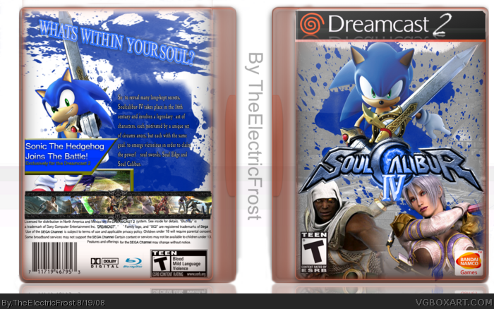
Credit to JBone and RawrJoey for the sonic render on the front.
everything slse was made by me. :)
enjoy! :D
Hawt 5/5
I don't see why people don't like the dreamcast 2 template that people use i find it very attractive. What program do you use cuz if you use gimp how do you do the splatter effect?
#10, Well I disagree with that! I find that there's plenty of room for new ideas in this community. There's a massive library of games that haven't been done yet. There's plenty of options for new, creative directions. Sadly, when you try something that's bold and different, it often gets shot down here. I say, "so what? I'm going to do it anyway." Be true to yourself and your art and don't be afraid to try something daring.
It's a really nice box, but i really feel it's kind-of-a letdown from the first one. The logo is really,really, tóo blue. and kinda feels out of place due to that.
Also, the blending on ivy's a bit off, and the background really doesn't flow.Try something more dark red-ish.
the template is nice, but red/blue doesn't flow AT ALL!. [yeah im a flow-sucker]
Besides that, the back is not as good as i would expect from you. it's a solid concept, but feels lacking in some way.
Still,the effort shows, and allthough it's a bold design,it doesn't quite work imo.
Keep it up, and i hope you can work with the criticism.
 Soul Calibur IV Box Cover Comments
Yay! its fially done!
i worked all day on this
Credit to JBone and RawrJoey for the sonic render on the front.
everything slse was made by me. :)
enjoy! :D
[ Reply ]
lol. it actually fifts too because its dc2 xD touch up the back render and ill fave
[ Reply ]
Cool.
[ Reply ]
Hawt 5/5
I don't see why people don't like the dreamcast 2 template that people use i find it very attractive. What program do you use cuz if you use gimp how do you do the splatter effect?
Edited at 1 decade ago
[ Reply ]
It's a little hard to read the text on the back, but other then that its pretty AWESOME! And you used my favorite color(Blue)! lmao
[ Reply ]
#2, you dident fav! :P
#4, no i use PhotoShop Cs3
[ Reply ]
meh I still think hes comiting suicide :P
[ Reply ]
This kinda looks like my SCIV Wii box, why do people copy me? Anyways, its nice but i suggest you fix the back text, it looks stretched
[ Reply ]
#8 Yeah, it looks REALLY similar. Points for style, but none for originailty, sorry.
[ Reply ]
#9, its pretty hard to be origanal when the year is 2008. :l
[ Reply ]
anybody else? :)
[ Reply ]
Heheh. Clever.
[ Reply ]
haha the idea of sonic in the dreamcast version was a nice idea.
[ Reply ]
#13, Thanks :)
[ Reply ]
Great job, but it's hard to read the text.
[ Reply ]
#15, stabge i can read it just fine
[ Reply ]
#10, Well I disagree with that! I find that there's plenty of room for new ideas in this community. There's a massive library of games that haven't been done yet. There's plenty of options for new, creative directions. Sadly, when you try something that's bold and different, it often gets shot down here. I say, "so what? I'm going to do it anyway." Be true to yourself and your art and don't be afraid to try something daring.
[ Reply ]
I'm really getting tired of two things: Soulcalibur IV and Dreamcast 2, and you just combined those two things into one box.
It's decent but not very original.
[ Reply ]
A pretty good effort.
Edited at 1 decade ago
[ Reply ]
It's a really nice box, but i really feel it's kind-of-a letdown from the first one. The logo is really,really, tóo blue. and kinda feels out of place due to that.
Also, the blending on ivy's a bit off, and the background really doesn't flow.Try something more dark red-ish.
the template is nice, but red/blue doesn't flow AT ALL!. [yeah im a flow-sucker]
Besides that, the back is not as good as i would expect from you. it's a solid concept, but feels lacking in some way.
Still,the effort shows, and allthough it's a bold design,it doesn't quite work imo.
Keep it up, and i hope you can work with the criticism.
[ Reply ]
#6, i saied touch up the back render first
[ Reply ]
Banned. Shouldn've messed with my thread ^____-
[ Reply ]
read in mr burns voice "excellent"
[ Reply ]
cool^_^
[ Reply ]