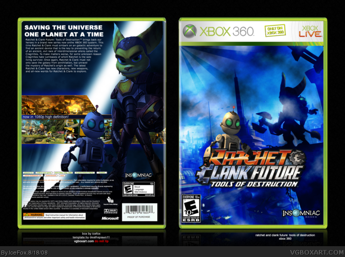
It's nice, but I don't think the rising sun effect in the top left corner on the front is necessary. Also I think having 2 Clanks on the front is a little strange. But other than that I like it :)
Why is Deadlock Ratchet on a Ratchet and Clank Future box.
Any way the back is a little plain, maybe you could fill in the empty spots with the features of the game and I do no like the blue color scheme background. The Radiating stripes on the front seems unnecessary also.
Edit.
I can be blind sometimes, why is it on a 360?
Sorry but I don't like it. The effects are too overdone and the Clank on the front is too random. Deadlocked Ratchet shouldn't be on the back and overall the back is very plain.
And thanks for the comments. The idea was to make a sort of simplistic box that showed the scope of the game. As for the deadlocked Ratchet, I was actually going to point out it was an unlockable but I forgot :/ (yes, this is my excuse. Deal with it =p)
 Ratchet and Clank Future: Tools of Destruction Box Cover Comments
Enjoy and stuff please comment full view, etc etc, the same ol' crap :)
[ Reply ]
It's nice, but I don't think the rising sun effect in the top left corner on the front is necessary. Also I think having 2 Clanks on the front is a little strange. But other than that I like it :)
Edited at 1 decade ago
[ Reply ]
Why is Deadlock Ratchet on a Ratchet and Clank Future box.
Any way the back is a little plain, maybe you could fill in the empty spots with the features of the game and I do no like the blue color scheme background. The Radiating stripes on the front seems unnecessary also.
Edit.
I can be blind sometimes, why is it on a 360?
Edited at 1 decade ago
[ Reply ]
I actually like the different approach
[ Reply ]
I hate it when people try to pass off rising sun brushes as realistic beams of light.
[ Reply ]
5, That wasn't the idea
3, I like the 360 template better. Also, I was too lazy to find my PS3 template...
Edited at 1 decade ago
[ Reply ]
Sorry but I don't like it. The effects are too overdone and the Clank on the front is too random. Deadlocked Ratchet shouldn't be on the back and overall the back is very plain.
[ Reply ]
#6, What was?
[ Reply ]
Yeah... plus you used the same Clank image twice on the box.. and the text on the back is too small.
[ Reply ]
I really like the color scheme.
+fav
[ Reply ]
Pretty sweer!
[ Reply ]
The text is a bit small but I'm not one to nitpick.
[ Reply ]
#12, exactly. ;D
[ Reply ]
8, A cartoony beam of light =p
And thanks for the comments. The idea was to make a sort of simplistic box that showed the scope of the game. As for the deadlocked Ratchet, I was actually going to point out it was an unlockable but I forgot :/ (yes, this is my excuse. Deal with it =p)
[ Reply ]