 Shadow The Hedgehog 2 Red dawn version Box Cover Comments
Comment on MachHedgehog's Shadow The Hedgehog 2 Red dawn version Box Art / Cover.

Comment on MachHedgehog's Shadow The Hedgehog 2 Red dawn version Box Art / Cover.
(LOOK IN FULL VEIW)
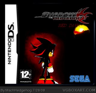
the other day i was looking at a Xbox shadow game and it hit me what ending was the real ending(the hero actually because sonic and eggman are still alive) so i made a "pokemon" type game(diamond/pearl/ ect.) red dawn is the evil and (SPOILER) is the good one. if your wondering why it's dawn, it's because it's a new day to be evil. all characters and products belonde to saga. i got the template form photo bucket so creadit to whoever. and shadow and the sun from google.
I say i'm realy improving.
Edited at 1 decade ago
[ Reply ]
WHAT HAVE WE DONE TO DESERVE THIS!? the front page is floooded with this stuff, please stop posting and at least try the Critiques..
#3, I guess I should also post on the box while im at it, just to avoid a stupid post..
Ok, so the box isn't really that great, there is no background, the logo is really small, the "Red Dawn" part doesnt look good, ... is that a sun below it? Doesn't look good.. and the PEGI is stretched, SEGA is not all the way cut out
Edited at 1 decade ago
[ Reply ]
#2, o.k
Edited at 1 decade ago
[ Reply ]
Ok I really don't get what the hell a sun is doing there. Or half sun...
All you did was poorly cut out a logo, type in RED DAWN throw some fanart onto a plain old boring background, and slap dev logos on it. C'mon... A little effort would be nice.
[ Reply ]
#4, actually i did put efert into this the logo is just shruken down a lttle. and there's a mountin in frount of the sun i had to edit shadow because he kept having the white spot turned balck i had to srink it down and edit the streatch part. i fix the red around shadow to look more evil than the the stuip glow around it originally!
)btw IF YOU READ MY FIRST COMMENT IT EXPLAINS WHAT THE SUNS FOR!)
Edited at 1 decade ago
[ Reply ]
I'm sorry but this is pretty bad its just Shadow in a black background with some logos
[ Reply ]
then i'm mad about is that every on is complainig about it being bad but no one will tell me how to improve!
[ Reply ]
Mach, I'll help. Ah, lets see...
1. Get a better Shadow Pic
2. Get a background (preferably doom-esque or from the real game *like just the stages, not gameplay, but from the game*)
3.Try harder with the 'Red Dawn bit'
But nice attempt. But...I don't wanna be mean...so...Try again.
[ Reply ]
#5 *facepalms*
So your effort is shrinking a logo down a little? And the sun still looks terrible either way. Im not trying to be mean, but I mean take Jevangod for an example. His boxes have great backgrounds and amazing features. Heck, I'm not one to put in LOADS and TONS of effort, but I've been waiting for people to critique in my WIP thread. Oh, and I read your first comment. No offense, it's a bad idea.
[ Reply ]
people stop telling me it's bad because untill 150 days are over you are just gonig half to live with it
Edited at 1 decade ago
[ Reply ]
#4, it's better than my logo for shore and the box is better than mine
[ Reply ]