#14 No Basically, I used a MGS4 font and typed MGS4, and added a dark red to light red gradient to it. I then used the eplitcal lasso tool and selected the top half of the logo which I just tyoed (rasterized). Then I simply added a drop shadow and a stroke, and the dark red to light red gradient. Voila.
Really nice box, especially the front... certainly different. Not too keen on the red on the back and the 3 columns of feature text should really be align the same with same width. Great job there ;)
i agree with #17. i think you went a little too far with the brushes. it does look neat and different though. i also think it might be better if snake's head was more to the left on the cover, so you dont have as much white space. and i dont like the logo with that line shine thing you did.
Oh ho ho! This looks five times better than the original box art! Judging by the special effects, you must have been all your effort into this and worked on this for over 3 weeks. Plus, you have found a hell of a lot of screenshots! Congratulations!!
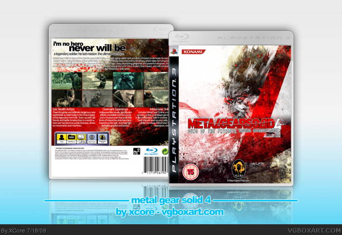
 Metal Gear Solid 4: Guns of the Patriots Box Cover Comments
looks awesome. Just add a 15 rating box on the back. +fav
[ Reply ]
It looks simply amazing.
I love the colour scheme and the layout!
EDIT: Ninty, Or not.
Edited at 1 decade ago
[ Reply ]
nd Holy Phuck...
Edited at 1 decade ago
[ Reply ]
That looks sick! Awesome job+fav
[ Reply ]
Magnificently beautiful +fav
[ Reply ]
Very sleek, Nice Job +fave
[ Reply ]
Full View Please
Woah, this one was a killer. The front took a long time, editing and rendering Yoji Shinkawa's art, and making a grunge type texture.
The back was a edited wallpaper from NeoGAF, and a artwork render put ontop with a soft light enabled.
Credit goes to Sens for both temps, and DMS for insipration.
Edited at 1 decade ago
[ Reply ]
Nice, though now try to do a different box than GTA4 and MGS4
[ Reply ]
I havn't even done MGS4 yet Master #8 :P
[ Reply ]
Awsome i love the front
[ Reply ]
Will your masterpieces never end? 10/10!! Where did you get the cool MGS4 logo?
+fav
Edited at 1 decade ago
[ Reply ]
#11 Made it. Thanks for the fav.
[ Reply ]
Fine I'll comment yer box >_0
you've only been bugging me for the last hours.
It be nice but I'm not a fan of the amount of text on the back.
Edited at 1 decade ago
[ Reply ]
#12
What did you use to add the Glossy look to the Logo?
[ Reply ]
#14 No Basically, I used a MGS4 font and typed MGS4, and added a dark red to light red gradient to it. I then used the eplitcal lasso tool and selected the top half of the logo which I just tyoed (rasterized). Then I simply added a drop shadow and a stroke, and the dark red to light red gradient. Voila.
[ Reply ]
I really like this one, A LOT!
[ Reply ]
Cool, but WAY too overbrushed.
[ Reply ]
#15 Where do you get the MGS4 font? could you PM it to me?
[ Reply ]
Really nice box, especially the front... certainly different. Not too keen on the red on the back and the 3 columns of feature text should really be align the same with same width. Great job there ;)
[ Reply ]
i agree with #17. i think you went a little too far with the brushes. it does look neat and different though. i also think it might be better if snake's head was more to the left on the cover, so you dont have as much white space. and i dont like the logo with that line shine thing you did.
[ Reply ]
#15, i can has it too pleash?
[ Reply ]
nice job
[ Reply ]
Oh ho ho! This looks five times better than the original box art! Judging by the special effects, you must have been all your effort into this and worked on this for over 3 weeks. Plus, you have found a hell of a lot of screenshots! Congratulations!!
[ Reply ]
#20 I didnt use any brushes and #23, it took me 2 hours :P
Edited at 1 decade ago
[ Reply ]
Now iv'e seen your box fool.
Congratz
[ Reply ]
#24 - what's all that crazy stuff on the cover then?
[ Reply ]
Double Post
Edited at 1 decade ago
[ Reply ]
#24, The what?
Edited at 1 decade ago
[ Reply ]
#26 Is just my scribbles I made using a art tablet.
[ Reply ]
The colors and overall design really made this box look unique. I love it!
[ Reply ]
The best Metal Gear Solid 4 box on the site +fav
[ Reply ]
Congwatulations on the HOF XCore.
[ Reply ]
The design and everything is done very well.+fav
[ Reply ]
this is ultimately great! I would really appreciate if i have a copy on this one. LOTS OF RESPECT FROM A FILIPINO FAN!!!! :D
[email protected] THANKS!
[ Reply ]