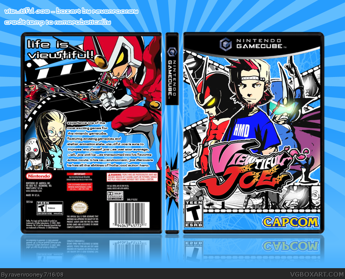
Front is epic and the reels in the background look beautiful! I really like the the way everything seems to come together. It catches your eye, but not in a harsh way. Excellent job!
The only thing I don't like very much is the text on the back, it could look more exiting. Maybe if you moved the black director thing(don't know what that's called) to hold the text that might look nicer.
Everything else looks good, especially the screen shots.
#11, the temp is numerobetically's, so it wasn't my choice to put the gamecube logo up there. I tried to make the clapper hold the text, and the whole thing just looked strange, didn't flow very well. I'll see if I can improve the look though.
 Viewtiful Joe Box Cover Comments
My first GameCube box, for Viewtiful Joe. This game has a great art style, and I think the box was just awesome to make.
Comments, suggestions?
[ Reply ]
I don't like the template, the text should be a bit larger and higher up and Joe's girlfriend is choppy. Other than that I really like this box.
[ Reply ]
I dislike the template, but the box is mad.
[ Reply ]
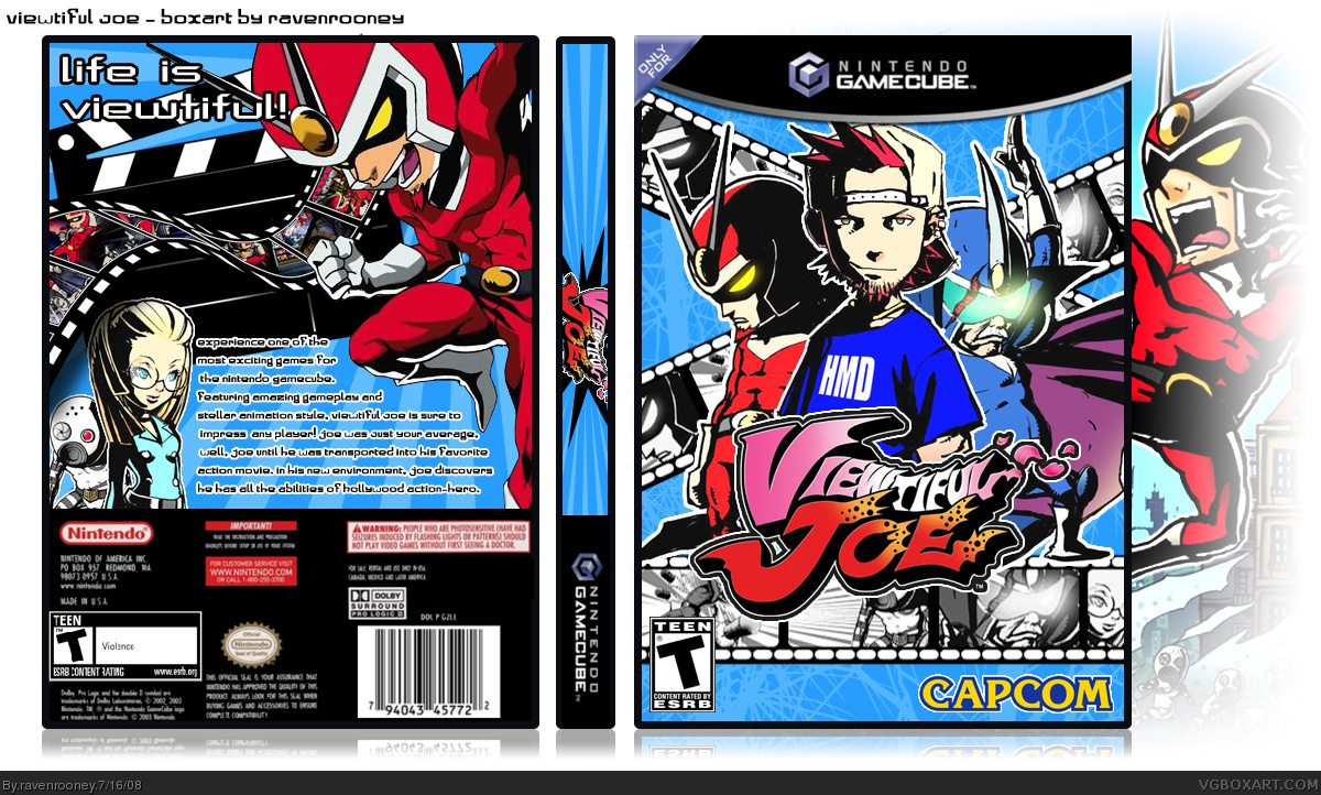
#2 and #3, thanks for the input. I had to make the template myself, because I couldn't really find anything I liked, so that's why the template sucks.
I'll work on the suggestions, though.
Edited at 1 decade ago
[ Reply ]
Oohh. Here link I just made it for you. Feel free to edit it.
Edited at 1 decade ago
[ Reply ]
Wow, thanks Numerobetically! I changed the temp. Looks much better, thank you.
[ Reply ]
Love it, especially the front. Good work.
[ Reply ]
Front is epic and the reels in the background look beautiful! I really like the the way everything seems to come together. It catches your eye, but not in a harsh way. Excellent job!
-FAV
[ Reply ]
-____-
[ Reply ]
The only thing I don't like very much is the text on the back, it could look more exiting. Maybe if you moved the black director thing(don't know what that's called) to hold the text that might look nicer.
Everything else looks good, especially the screen shots.
[ Reply ]
Also, on GC games the bar goes on the bottom of the spine, not the top.
[ Reply ]
#11, the temp is numerobetically's, so it wasn't my choice to put the gamecube logo up there. I tried to make the clapper hold the text, and the whole thing just looked strange, didn't flow very well. I'll see if I can improve the look though.
Thanks for the input, everyone!
[ Reply ]
Looks awesome. ^^
[ Reply ]
#11 Oh I'm sorry. I was very tired. I can fix it though really quick if ravenrooney wants to have another update.
Here's the new version: link
#15 I didn't type it. Later today I'm planning on making it bigger and typing the info myself. This was just a quick fix for him
Edited at 1 decade ago
[ Reply ]
The nintendo text doesn't look right...
I mean the text on the spine.
Edited at 1 decade ago
[ Reply ]
Very nice. And for a first one you truly showed me up with my first. =]
[ Reply ]
Thanks for the input and the favs everyone!
[ Reply ]
i like it alot, it flows and has great composition, however i would like to have seen it bigger and in better quality :)
[ Reply ]