Don't be ignorant and say how mine sucks. Though this website goes on a critique of guidelines, it doesn't make you the critic to brag about how you make better ones than I do. Just like it states in the Comment Rules, saying how ones boxart sucks will just get frowned upon and deleted.
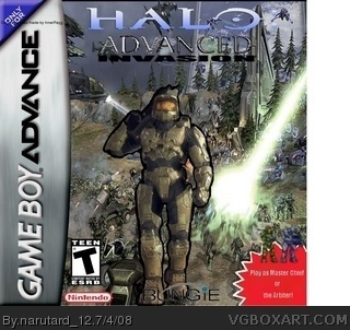
#1 ignorant? That's a rather cocky impression. The concept is nice, but the logo could use some work. Halo on a nintendo console? I can't see bungie, and the nintendo logo is blurry and too small.
Play as such and such is pretty bad, I think you should get rid of it. the box overall 2.8/5.
Oh, and ignore the "Original sprites made by InnerRayg" portion at the top left corner. I never noticed that until I flattened the layers and I never did save this where I could edit it, except in Paint
#2, Exactly the reaction I see on every boxart that is not perfect and such. Get rid of it? Just because you don't like the idea, doesn't mean I can't improve on it. Besides, it's alright for someone to make a Halo boxart for the DS, but it's not alright for me to make one for the Gameboy?
#1, I like how you automatically assume people are going to say it sucks, which makes me think that YOU believe it sucks... So why bother submitting it?
#4 prove me wrong. Improve it then we'll talk. I have the same problem ones for the DS. Have you ever seen me comment on a Halo box for the DS? I prefer to critique newbies who PLAN on getting better.
#7 idiot. I made a bad comment huh? READ THE FIRST 4 WORDS OF THE THIRD SENTENCE.
#5, It's because I see too many comments of people trying to give advice in an innapropriate way. If someone made one that could use some improvement, I would just nicely point out the errors. While I've seen a comment that was horrible like this:
"bad logo
tons of white space
no dev logo
no pub logo
no rating
pic from halo 2
template cut out bad
no wi-fi logo
1/5"
see, they point out the negatives right away without first pointing out some of the positives. And at the end they just blandly put 1/5
#6, And how can I perform that with only having a freeware Paint.NET program that i have only used for approx. a week? If you always expect a submission that is perfect in every way, then I guess I have to improve greatly to become like the Photoshop master.
#9, Well not really, but it's only my second one. A positive I would have to say is showing sprites of Master Chief and the Arbiter in the corner and showing the viewers that you can play the game with those characters. But that's just my opinion.
#8 We understand your new here but just cool the attitude down a bit okay? You dont need to be so angry/stressed with your comments.
Anyway the box is a nice idea but Master Chief doesn't look right compared to the background. I suggest find a better background which makes MC stand out more.
Also I agree with #2, the little red star in the corner does not look good. I suggest you remove it. Anyway nice, effort 2/5
#10, you can't see anything positive in your own creation. so how should we find something postive? if you aren't confident about your own work than don't submit it.
post it in the critique forum so people can help you to improve it.
ok, i'll follow your guys' advice and remove it. Heck, i'll remove my other one as well. I'll do some research on boxart making and look at some more professional pieces of work.
#15, and your comments ARE? Seriously? All you do is whine about how bad and "immature" we are and how useless our comments are, and how you'd rather do something productive with your time. Why the hell wouldn't we want you to leave?
#16, of course not...try 3 numbers higher than that.....i plan on deleting this, but as a newbie, I have no clue how. any suggestions besides leaving like #14 said?
#18 Well if you dont want to leave, dont let anyone drive you out. I suggest searching Google or Youtube for some help or turtorial guides? Thats what I did with GIMP. It gave me loads of advice on using layers, cutting tools and other techniques.
Also can I suggest that if you are not happy or satisfied with your finished box art, dont post it. Use the forums first to post your Works In Progess and get some feedback :)
 Halo: Advanced Invasion Box Cover Comments
Don't be ignorant and say how mine sucks. Though this website goes on a critique of guidelines, it doesn't make you the critic to brag about how you make better ones than I do. Just like it states in the Comment Rules, saying how ones boxart sucks will just get frowned upon and deleted.
[ Reply ]
#1 ignorant? That's a rather cocky impression. The concept is nice, but the logo could use some work. Halo on a nintendo console? I can't see bungie, and the nintendo logo is blurry and too small.
Play as such and such is pretty bad, I think you should get rid of it. the box overall 2.8/5.
Edited at 1 decade ago
[ Reply ]
Oh, and ignore the "Original sprites made by InnerRayg" portion at the top left corner. I never noticed that until I flattened the layers and I never did save this where I could edit it, except in Paint
[ Reply ]
#2, Exactly the reaction I see on every boxart that is not perfect and such. Get rid of it? Just because you don't like the idea, doesn't mean I can't improve on it. Besides, it's alright for someone to make a Halo boxart for the DS, but it's not alright for me to make one for the Gameboy?
[ Reply ]
#1, I like how you automatically assume people are going to say it sucks, which makes me think that YOU believe it sucks... So why bother submitting it?
Kids these days...
[ Reply ]
#5 exactly.
#4 prove me wrong. Improve it then we'll talk. I have the same problem ones for the DS. Have you ever seen me comment on a Halo box for the DS? I prefer to critique newbies who PLAN on getting better.
#7 idiot. I made a bad comment huh? READ THE FIRST 4 WORDS OF THE THIRD SENTENCE.
Edited at 1 decade ago
[ Reply ]
#5, It's because I see too many comments of people trying to give advice in an innapropriate way. If someone made one that could use some improvement, I would just nicely point out the errors. While I've seen a comment that was horrible like this:
"bad logo
tons of white space
no dev logo
no pub logo
no rating
pic from halo 2
template cut out bad
no wi-fi logo
1/5"
see, they point out the negatives right away without first pointing out some of the positives. And at the end they just blandly put 1/5
[ Reply ]
#6, And how can I perform that with only having a freeware Paint.NET program that i have only used for approx. a week? If you always expect a submission that is perfect in every way, then I guess I have to improve greatly to become like the Photoshop master.
Edited at 1 decade ago
[ Reply ]
#7, Do you see any positives in this box?
[ Reply ]
#9, Well not really, but it's only my second one. A positive I would have to say is showing sprites of Master Chief and the Arbiter in the corner and showing the viewers that you can play the game with those characters. But that's just my opinion.
[ Reply ]
#8 We understand your new here but just cool the attitude down a bit okay? You dont need to be so angry/stressed with your comments.
Anyway the box is a nice idea but Master Chief doesn't look right compared to the background. I suggest find a better background which makes MC stand out more.
Also I agree with #2, the little red star in the corner does not look good. I suggest you remove it. Anyway nice, effort 2/5
[ Reply ]
#10, you can't see anything positive in your own creation. so how should we find something postive? if you aren't confident about your own work than don't submit it.
post it in the critique forum so people can help you to improve it.
[ Reply ]
ok, i'll follow your guys' advice and remove it. Heck, i'll remove my other one as well. I'll do some research on boxart making and look at some more professional pieces of work.
[ Reply ]
#13, please leave.
Edited at 1 decade ago
[ Reply ]
#14, Ok, now that comment was unnecessary. And no I will not leave.
[ Reply ]
#15 How old are you? I sure hope the number in your username is NOT your age >.<
[ Reply ]
#15, and your comments ARE? Seriously? All you do is whine about how bad and "immature" we are and how useless our comments are, and how you'd rather do something productive with your time. Why the hell wouldn't we want you to leave?
[ Reply ]
#16, of course not...try 3 numbers higher than that.....i plan on deleting this, but as a newbie, I have no clue how. any suggestions besides leaving like #14 said?
[ Reply ]
#18 Well if you dont want to leave, dont let anyone drive you out. I suggest searching Google or Youtube for some help or turtorial guides? Thats what I did with GIMP. It gave me loads of advice on using layers, cutting tools and other techniques.
Also can I suggest that if you are not happy or satisfied with your finished box art, dont post it. Use the forums first to post your Works In Progess and get some feedback :)
Edited at 1 decade ago
[ Reply ]
damm!!! 1.8/5
[ Reply ]
#20, no no no
DYUUUUUM! 2/5 for your second
[ Reply ]
good for a low quality edit
[ Reply ]
2# I Agree
[ Reply ]