An attempt to drag myself out of the recent drag.
Hopefully, it's successfull...
I sincerely listened and tried EVERY improvement you guys told me to do [ in WIP thread ].. and i personally like this box.
Credit to ELC for template!!
#23, because it's not that great. Better than your last two, definitely, but not amazing. The text is too light and there's some blank space on the front that ought to be filled up by making the logo bigger. While the box, on the whole, is pretty good, it's just not very interesting.
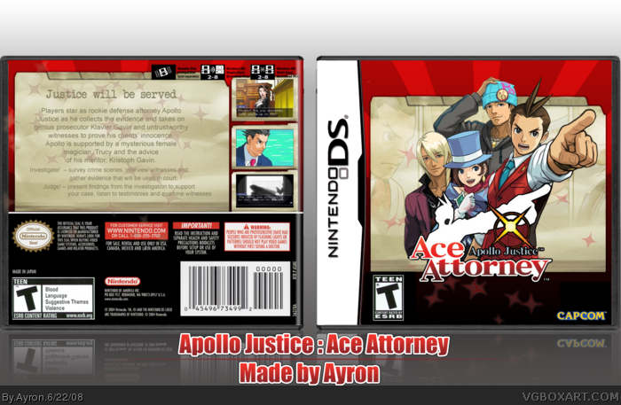
 Apollo Justice : Ace Attorney Box Cover Comments
Lovely, simply beautiful
Edited at 1 decade ago
[ Reply ]
An attempt to drag myself out of the recent drag.
Hopefully, it's successfull...
I sincerely listened and tried EVERY improvement you guys told me to do [ in WIP thread ].. and i personally like this box.
Credit to ELC for template!!
Thanks everyone, and enjoy.
[ Reply ]
Professional!
[ Reply ]
Im not a fan of the manilla folder. Too non-cartoonish(?) for the actual game.
[ Reply ]
Yay
[ Reply ]
#4, odd...
i mean, it's from the official site =S?
Thanks guys ;)
[ Reply ]
Simple but awesome
[ Reply ]
Like I said before, the smaller text should be darker or something, but still gets a fav from me ;)
[ Reply ]
Ayron!
[ Reply ]
#8, sorry...my PSD got corrupted... =[
Thanks for favs everyone ;)..Also thanks,icefox, simplicity is the key ;)
#9, Kirby22!!!
Edited at 1 decade ago
[ Reply ]
This is pretty nice, good job. There's random black spaces at the bottom of the front, they look a bit messy.
[ Reply ]
#11, Odd.. i hope i can fix it --- thanks for pointing it out,E_G.
[ Reply ]
Looks great, love the concept and execution. ;) +fav
[ Reply ]
I luvs it, but you used screens from Phoenix Wright Ace Attorney
[ Reply ]
I know, second pic, is OF Phoenix Wright just as he does "OBJECTION!"
[ Reply ]
Success.
Post our box...
NAO!
I mean, if you wanna.
Edited at 1 decade ago
[ Reply ]
#6, Oh really? That doesnt even fit the style.
[ Reply ]
Real Good.
[ Reply ]
I hope that the streak of your bad boxes stops here ;)
Awesome box. I'm glad you changed it to red.
[ Reply ]
Thanks everyone.
#15- ill post today ;)
[ Reply ]
Glad to see you've come out of your slump.
[ Reply ]
Wow.
[ Reply ]
looks clean and stylish
[ Reply ]
Uhm. Scuze me, BUT WHY ISN'T THIS IN THE HALL YET!?
[ Reply ]
#23, because it's not that great. Better than your last two, definitely, but not amazing. The text is too light and there's some blank space on the front that ought to be filled up by making the logo bigger. While the box, on the whole, is pretty good, it's just not very interesting.
[ Reply ]
#24, i was actually going for a simplistic look. but yeah.. it's your opinion,certainly.
Thanks everyone ;)
[ Reply ]
#1, good work even if it's for a game i never heard before but still not trying to be rude okay!
[ Reply ]