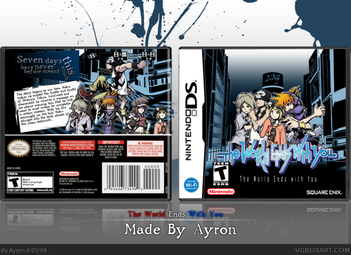
what's with that gradient on the far left? doesn't look good... and i hate how you (not you specifically, everyone does this nowadays) turned up the contrast on the characters on the back. the colour doesn't look nice or natural like on the front. and about the front, it doesn't look like the characters are rendered very well. i'm not sure if it's supposed to have a cut-out paper look, but it doesn't look that great. sorry.
#2, for one, i didn't even touch the contrast.
You mean the blue on the front? sorry if that's not your taste-- but the logo has the same color.. so..yeah.
#3, contrast, gradient, saturation, whatever the fuck it's called. but that blue colour you put on the characters on the back, it doesn't look good. and i'm not sure that splatter really fits the style of the game.
Also it says E on the reflection but T on the box, Also theres a Nintendo Seal but no Square Enix logo on the relfection? Geez are you sure you actually reflected the RIGHT box? ^_^
Anyway the box still looks awesome with those minor flaws so im gonna fav!
Both style and creativity influence each other, so I suppose you can say that they complement each other too with neither one gaining an upper hand.
And the splatters didn't really give it a more creative feel. In fact, it gave the box a totally wrong feel. I've used those brushes myself and they were originally intended to be blood brushes- which I'm sure this game doesn't have a lot of. What it needed was a slicker approach, which Ayron accomplished by getting rid of the blue splatters on the front.
 The World Ends With You Box Cover Comments
Yup. this had to be done.....
Sorry for it, but i just NEEDED to do this, as this game looks amazing! [ dutch sig ftw ]!!!
Credit to ELC for temp
[ Reply ]
what's with that gradient on the far left? doesn't look good... and i hate how you (not you specifically, everyone does this nowadays) turned up the contrast on the characters on the back. the colour doesn't look nice or natural like on the front. and about the front, it doesn't look like the characters are rendered very well. i'm not sure if it's supposed to have a cut-out paper look, but it doesn't look that great. sorry.
[ Reply ]
#2, for one, i didn't even touch the contrast.
You mean the blue on the front? sorry if that's not your taste-- but the logo has the same color.. so..yeah.
[ Reply ]
I like yours more than I like mine
[ Reply ]
#2, Yeah...I noticed the gradient too. I still like it, though.
[ Reply ]
#3, contrast, gradient, saturation, whatever the fuck it's called. but that blue colour you put on the characters on the back, it doesn't look good. and i'm not sure that splatter really fits the style of the game.
[ Reply ]
Me likey.
[ Reply ]
#6, JRPg..... splatter represents chaos,imo.. and chaos=this game.
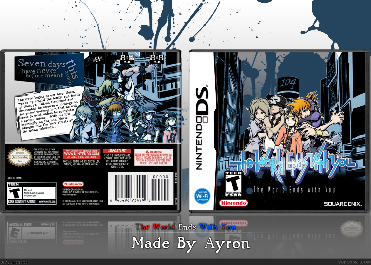
Update-ry-doo. Fixed 2/3 of the things Vengeance said, i can't fix the front chars.
[ Reply ]
The ESRB is different on the back and front, Nintendo Seal is over the Square Enix logo.
*tut tut* That is SO unlike you Ayron =D
Edited at 1 decade ago
[ Reply ]
#9, WTF--- that's stupid.. must've been the rush....
[ Reply ]
Way awesome ^_^
[ Reply ]
#10 Ye right! Blame the rush haha =P
Also it says E on the reflection but T on the box, Also theres a Nintendo Seal but no Square Enix logo on the relfection? Geez are you sure you actually reflected the RIGHT box? ^_^
Anyway the box still looks awesome with those minor flaws so im gonna fav!
Edited at 1 decade ago
[ Reply ]
#7, me likey more. ;D
Fantastic box Ayron. It kicks ass!
[ Reply ]
The back cover reflection has a different rating. Other than that it's great!
Edited at 1 decade ago
[ Reply ]
#14 We have already covered that =P
[ Reply ]
I approve.
[ Reply ]
Update.. sorry for the many updates people.. 'xcuse me.
[ Reply ]
nice work i like it!
[ Reply ]
Wow, there is alot of new TWEWY boxes.
Edited at 1 decade ago
[ Reply ]
Meh, is seems you people get sloppier with every box...haha. J/K. Or not...
I like it :) Fav+.
[ Reply ]
Looks great, very stylish. :)
[ Reply ]
#21, No fav... ahhhr?
[ Reply ]
#22, lol, I was just about to. Just take out the blue splatters on the front, they're not very fitting. ;)
[ Reply ]
#23, consider it done. update in few mins. ;)
[ Reply ]
I liked the splatters...):
But I suppose... Ladykillers opinion > Me
[ Reply ]
Perfect. :)
Has a very slick feeling now. ;)
[ Reply ]
I thought the splatters looked nice and gave the box a more creative feel.
Still Ayron, unless you consider: Style > Creativity
[ Reply ]
#27, Lol?
Style = creativity, because style + creativity=awesomeness.
[ Reply ]
Both style and creativity influence each other, so I suppose you can say that they complement each other too with neither one gaining an upper hand.
And the splatters didn't really give it a more creative feel. In fact, it gave the box a totally wrong feel. I've used those brushes myself and they were originally intended to be blood brushes- which I'm sure this game doesn't have a lot of. What it needed was a slicker approach, which Ayron accomplished by getting rid of the blue splatters on the front.
[ Reply ]
Whooaa.Keep it up :)
[ Reply ]
#29, Agreed.
Thanks Ervo ;)
[ Reply ]
Almost missed this one and im really liking it =D
[ Reply ]