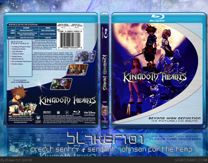
Well, the Kairi on the front doesn't blend and is a different style, Sora isn't really standing on anything, the kid on the right is really, really choppy, the text is unreadable and low quality, and is almost touching the borders, and it's way too dark.
#3, I agree, i also think that this temp should be modified or something so it doesn't look exactly like the Wall-E box or you could use a different Blu-ray temp, since there are actually a couple different ones.
I think people that have faved this just took one quick look and thought "why thats amazing, im gonna fav" without actually looking at it in depth. Thats what happened with me when I first saw it =/
#12,, agreed. these days everyone will go OMGAWESOME!!!!12 but not REALLY look at it. Despite the glaring flaws, the box isn't all bad. KH would be better as an animated TV series and not a movie.
Nice to see a movie.. its a copy of the KH1 cover..... with some good photoshoping skills.. but u need to make sora and Roxas' shadows blue (like donnald and goofy) and keep it to one style .. 3d or drawn .. Good job.
 Kingdom Hearts Box Cover Comments
superb, great job blake
[ Reply ]
This was fun to make, the idea popped in my
head and im glad how it came out. enjoy!
Thx Lenny!
Edited at 1 decade ago
[ Reply ]
Well, the Kairi on the front doesn't blend and is a different style, Sora isn't really standing on anything, the kid on the right is really, really choppy, the text is unreadable and low quality, and is almost touching the borders, and it's way too dark.
[ Reply ]
#3, You pretty much summed it all up right thur. Actually, no offense, but it's pretty much terrible. :[
[ Reply ]
Wow, you used the same exact BG for the box I am working on now lol
[ Reply ]
From a distance this looks really nice, but when zoomed in full, I pretty much have to agree with everything TTT said.
[ Reply ]
#3, I agree, i also think that this temp should be modified or something so it doesn't look exactly like the Wall-E box or you could use a different Blu-ray temp, since there are actually a couple different ones.
[ Reply ]
#7, haha I gave him the template.
[ Reply ]
Like i said, the front isnt amazing, but overall it has a nice look to it. And a original idea. +fav
[ Reply ]
This was something new :)
Great job Blaker
+fav
[ Reply ]
Very cool. Ouch, just read TTT's comment.
Edited at 1 decade ago
[ Reply ]
I think people that have faved this just took one quick look and thought "why thats amazing, im gonna fav" without actually looking at it in depth. Thats what happened with me when I first saw it =/
Disappointing from you Blaker101 =/
[ Reply ]
#12,, agreed. these days everyone will go OMGAWESOME!!!!12 but not REALLY look at it. Despite the glaring flaws, the box isn't all bad. KH would be better as an animated TV series and not a movie.
[ Reply ]
This is a really good box +fav
[ Reply ]
#12, Do me a favor and scroll down to comment 34, will you?
link
[ Reply ]
Nice to see a movie.. its a copy of the KH1 cover..... with some good photoshoping skills.. but u need to make sora and Roxas' shadows blue (like donnald and goofy) and keep it to one style .. 3d or drawn .. Good job.
4.5/5
[ Reply ]
um...Kairi doesn't belong there, and Sora is just floating in mid air, but Roxas... I have no comment.
[ Reply ]