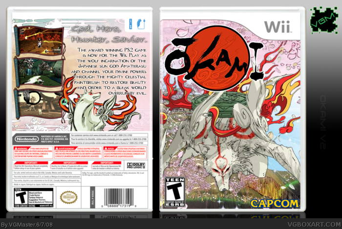
Man, I love this game! Okami rules! So I wanted to make a box for it.
Here, you can say I kinda pulled an 'Ayron' on accident. I accidentally made the 2 different sides representing different aspects of the game. Sorta. Front – More adventurous side. The bang-bam-kappow-Kershoom part! *throws fist in every which direction* The other side is the more peaceful, hopeful, life restoring part of the game. Or maybe I just made it look a little different and had to come up with an exuse?
ANYWAYS, comments and crits are welcomed. TYVM!
And BTW, Ammy is suppossed to look like she(?) is jumping.
Oops, forgot credits.
Koops - Temp.
Qwerty - Logo and back ESRB
PlanetRenders - Okami on back
#2 and 3, I know. I haven't had much inspiration.
#4, thanx
#5, What would you suggest to improve it.
#6, I don't care if everyone else has done it. I don't think that should matter. Who cares? Not me.
#7, thanx
I would suggest a different pose of Ameteratsu. If you check the background behind her, you'd know the perspectinve is way off, and that you're looking down at it from an angle. Ameteratsu looking straight at you wouldn't make sense. I'd also suggest to make the back screens a bit smaller, so Ama doesn't get cut of as much. Anyways, I know you probably won't listen to me, so I probably wasted my time, but meh.
The front is cool, though it's a little chaotic. (But that's just how the art is) I don't like the back that much. I think the text is too big, and the background is boring.
Because I like to respond to everyone, here are some older posts:
#9 and #10, Thanks.
#15, seriously, is there a box of mine you DON'T like? Lol, jk.
#16, is the chaotic style good? And I'm sorry tyou don't like the back. I wanted it to be peaceful. And big text is my style, I guess. I always have big text. I may fix it later, but overall, it's not something I'm worried about.
#17, thanks a lot! =D
 Okami Box Cover Comments
Man, I love this game! Okami rules! So I wanted to make a box for it.
Here, you can say I kinda pulled an 'Ayron' on accident. I accidentally made the 2 different sides representing different aspects of the game. Sorta. Front – More adventurous side. The bang-bam-kappow-Kershoom part! *throws fist in every which direction* The other side is the more peaceful, hopeful, life restoring part of the game. Or maybe I just made it look a little different and had to come up with an exuse?
ANYWAYS, comments and crits are welcomed. TYVM!
And BTW, Ammy is suppossed to look like she(?) is jumping.
Oops, forgot credits.
Koops - Temp.
Qwerty - Logo and back ESRB
PlanetRenders - Okami on back
Edited at 1 decade ago
[ Reply ]
Finally, you havent made a box in a while!
[ Reply ]
You need to make more baxarts, you know that?
*lectures*
=P Nicely done =]
[ Reply ]
instant fav.
[ Reply ]
Pretty nice, but definetely not your best.
[ Reply ]
Very nice, VGM, but everyone is doing this box now. I say make the back an "evil side", with all the monsters. Just my opinion. Anyhoo, +fav
Edited at 1 decade ago
[ Reply ]
very nice!
[ Reply ]
#2 and 3, I know. I haven't had much inspiration.
#4, thanx
#5, What would you suggest to improve it.
#6, I don't care if everyone else has done it. I don't think that should matter. Who cares? Not me.
#7, thanx
Thanks for the comments and faves guys.
Edited at 1 decade ago
[ Reply ]
very nice! but i agree with #3 you should make more boxes
[ Reply ]
This is cool
[ Reply ]
I would suggest a different pose of Ameteratsu. If you check the background behind her, you'd know the perspectinve is way off, and that you're looking down at it from an angle. Ameteratsu looking straight at you wouldn't make sense. I'd also suggest to make the back screens a bit smaller, so Ama doesn't get cut of as much. Anyways, I know you probably won't listen to me, so I probably wasted my time, but meh.
[ Reply ]
#11, I kinda get where you're going on the front, but that was the best render I got. I'll try with the screens tho.
[ Reply ]
#12, Here you go my friend:
link
Just white backgrounds, so you can magic wand 'em.
[ Reply ]
#13, that was the site I used. Besides, I feel more like he's jumping up and looking downward.
UPDATED: fixed back wih smaller screens
Edited at 1 decade ago
[ Reply ]
I like this. Glad to see a new box from you.
[ Reply ]
The front is cool, though it's a little chaotic. (But that's just how the art is) I don't like the back that much. I think the text is too big, and the background is boring.
[ Reply ]
Looks great!
[ Reply ]
Because I like to respond to everyone, here are some older posts:
#9 and #10, Thanks.
#15, seriously, is there a box of mine you DON'T like? Lol, jk.
#16, is the chaotic style good? And I'm sorry tyou don't like the back. I wanted it to be peaceful. And big text is my style, I guess. I always have big text. I may fix it later, but overall, it's not something I'm worried about.
#17, thanks a lot! =D
[ Reply ]
Been awhile, man.
Anyway, nice to finally see another box from you. ^^
[ Reply ]
too much going on on the front, you don`t know where to look
[ Reply ]
#20, i have to agree with wasa-bi
on that
but overall this is a nice box
Edited at 1 decade ago
[ Reply ]
#19, thanks a lot man~
#20 and 21, Hmm, I don't feel that way, but the more chaotic style was what I was going for.
[ Reply ]