Okay version 2 is the same as version 1 but it uploaded small so I just updated it to make it big. It's weird like that.
Anyway, I really like how this turned out. Let me know what you think.
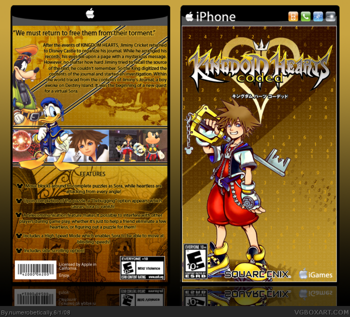
#1 & 3 - I know, I meant it to be that way because if I had it my way there would be legal info instead of blank space. But I couldn't add much down there because it looked really awful and crowded. Thanks for the comments :)
Very doubtful on the choices you made in design (empty lower back with no game info and the bland choice of front render), but otherwise, it's alright for me.
I would, but it would take away from what Sora is doing. Yeah he's just standing there but there are numbers coming out of the keyblade, which is the point I'm trying to make. Sorry it's too plain for you ;)
#13 But who? The only characters I know for a fact that are in this game are Sora, Mickey, Donald, Goofy, and Jiminy Cricket. And Pluto. But he doesn't ever do anything anyway. BTW I can't find good artwork of King Mickey that matches the art I used on this box, who was my first choice to put as a secondary character on the front, and I can't find a decent one of Jiminy either. :(
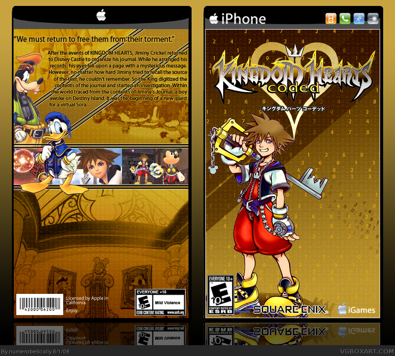
So... In the end, I decided not to do anything more to the front. I added features to the back, which took up all that empty space, and now I'm super happy with it.
It looks a bit nicer with the text filling the back, I would agree a different pic of Sora would have been better though. That one bugs me for some reason, overall it's nice though.
#24 What else can you put? I don't own many diverse video games. All my RPGs have characters on the back, and there are Xbox360 games in my house that I don't really look at because they aren't mine and I never really thought about it before. What do you usually do?
#28 What? That is really weird. Alright then. I would have never noticed if you hadn't said something. Or, I might have, but probably around three or four days from now.
 Kingdom Hearts: Coded Box Cover Comments
I dunno, it's a bit too bland. Center Sora or add more characters, and add some characters or something on the bottom of the back.
Edited at 1 decade ago
[ Reply ]
Simple yet eye pleasing. Good job.
[ Reply ]
nice, kinda empty on the back though
[ Reply ]
Okay version 2 is the same as version 1 but it uploaded small so I just updated it to make it big. It's weird like that.
Anyway, I really like how this turned out. Let me know what you think.
#1 & 3 - I know, I meant it to be that way because if I had it my way there would be legal info instead of blank space. But I couldn't add much down there because it looked really awful and crowded. Thanks for the comments :)
Edited at 1 decade ago
[ Reply ]
looks kool
[ Reply ]
awsome job! this is pretty jankty-hoopdy! +fav
[ Reply ]
Nice box, shorty. =P
[ Reply ]
lol. I'M TINY, AND I LIKE IT!
btw if anyone knows who made this template, please tell me so I can credit them. For now, all I know is that it's not mine.
[ Reply ]
#8, that narrows it down XP
[ Reply ]
Very doubtful on the choices you made in design (empty lower back with no game info and the bland choice of front render), but otherwise, it's alright for me.
[ Reply ]
I'll fav if you add another character to the front. Even if it's supposed to look bland, the front should have a little something more.
Edited at 1 decade ago
[ Reply ]
I would, but it would take away from what Sora is doing. Yeah he's just standing there but there are numbers coming out of the keyblade, which is the point I'm trying to make. Sorry it's too plain for you ;)
[ Reply ]
#12, then I would suggest to put a faded character behind the numbers coming out of his keyblade.
[ Reply ]
I'd say 8/10. It's a bit bland. There should be more 'activity' on the front.
[ Reply ]
#13 But who? The only characters I know for a fact that are in this game are Sora, Mickey, Donald, Goofy, and Jiminy Cricket. And Pluto. But he doesn't ever do anything anyway. BTW I can't find good artwork of King Mickey that matches the art I used on this box, who was my first choice to put as a secondary character on the front, and I can't find a decent one of Jiminy either. :(
[ Reply ]
#15, if I were you, I;d just use someone like Cloud or someone. Not sure if he's in the game, but...
[ Reply ]
Yeah but I want to be true to the game because you KNOW someone is going to come along and say "HE'S NOT IN THE GAME" haha
[ Reply ]
#17, eh, just put Donald and Goofy on the font as well then... it's okay to have a character on the front and back.
[ Reply ]
and i thought my kingdom hearts coded box was good! yours rules!
[ Reply ]
I have successfully updated my box.
So... In the end, I decided not to do anything more to the front. I added features to the back, which took up all that empty space, and now I'm super happy with it.
[ Reply ]
I like this version and what version of photoshop did you use to make this?
[ Reply ]
It looks a bit nicer with the text filling the back, I would agree a different pic of Sora would have been better though. That one bugs me for some reason, overall it's nice though.
[ Reply ]
#17, CLOUDS NOT IN THE GAME!!!!!!!!! =P
Very nice.
[ Reply ]
I quite like the plain front, the character montages can get a bit boring after a while and the color scheme makes it pretty eye-catchy. Good job.
[ Reply ]
Great update.
[ Reply ]
wow even better, this is great
[ Reply ]
#24 What else can you put? I don't own many diverse video games. All my RPGs have characters on the back, and there are Xbox360 games in my house that I don't really look at because they aren't mine and I never really thought about it before. What do you usually do?
[ Reply ]
Congrats on Rank 8. Not sure when it happened :) You have only been on this site for 5 months and you're rank 8 already!
Edited at 1 decade ago
[ Reply ]
Fine! Okay? You win. >:(
Haha. Nice one/
[ Reply ]
#28 What? That is really weird. Alright then. I would have never noticed if you hadn't said something. Or, I might have, but probably around three or four days from now.
Thanks to everyone who commented and faved.
[ Reply ]
Congrats on rank 8, Nikki.
[ Reply ]
Good box 5/5, Iphone Rules
[ Reply ]