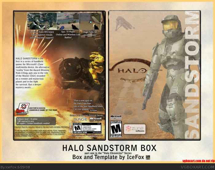
I dislike the layout of the back. The screenshots are all in the top right corner, which looks bad, and their borders are boring. Also, the screenshot to the left is bigger than the others, and it doesn't look right. I don't think the font works too well, either. I think MC on the front is too bright and I don't like how you have the Sandstorm logo. I guess it's ok, but it's cutting off at the bottom. Overall it's pretty plain.
1. The screenshot is wider...read the text to see why.
2. MC is adjusted to fit with the lighting on the front.
3. The logo cuts off at the top too...its supposed to and is important to the design of the box.
But thank you for the feedback. My next box in the series, which I'll upload either today or tomorrow, addresses many of the issues you brought up (but I doubt you'll like the logo).
 Halo Chronicles Box Cover Comments
"I'd cover my ears if I were you!" -Indiana Jones, Kingdom of the Crystal Skull
Full view please. if you opened this, please comment!
Enjoy. More coming.
Edit: Better way to view it:
link
Edited at 1 decade ago
[ Reply ]
Double post
Edited at 1 decade ago
[ Reply ]
Chronicles?
[ Reply ]
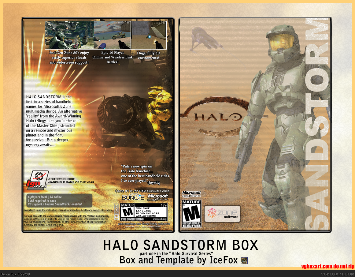
2. Version 2 updated
Edited at 1 decade ago
[ Reply ]
i dont get it...
[ Reply ]
5...it's a handheld Halo game...what else is there to get?
Can I please have some comments on the actual box?
[ Reply ]
I dislike the layout of the back. The screenshots are all in the top right corner, which looks bad, and their borders are boring. Also, the screenshot to the left is bigger than the others, and it doesn't look right. I don't think the font works too well, either. I think MC on the front is too bright and I don't like how you have the Sandstorm logo. I guess it's ok, but it's cutting off at the bottom. Overall it's pretty plain.
[ Reply ]
Dude..... THATS JUST AWESOME! =D
[ Reply ]
7. Thanks for the feedback.
1. The screenshot is wider...read the text to see why.
2. MC is adjusted to fit with the lighting on the front.
3. The logo cuts off at the top too...its supposed to and is important to the design of the box.
But thank you for the feedback. My next box in the series, which I'll upload either today or tomorrow, addresses many of the issues you brought up (but I doubt you'll like the logo).
[ Reply ]
Violence
Language
Blood and Gore
AKA Awesome
[ Reply ]
11 lol. Also, the next one is a lot more colorful...I'm just not sure if it will get enough comments if I post it now.
Edited at 1 decade ago
[ Reply ]
#11, I'll comment.
[ Reply ]
Haha woah that is pretty neat. I'd buy it :-P
Edited at 1 decade ago
[ Reply ]
The box looks decent, However I really don't like the aspect of the front, it looks a little empty for my taste, but its still pretty good.
[ Reply ]
Looks great. Donn't like screen layout tho.
[ Reply ]
o m g
[ Reply ]
Number2 posted.
[ Reply ]
really nice, I don't think Zune's would go to good with games though =/
[ Reply ]
Nice, faved.
[ Reply ]