Looks cool... as mentioned on MSN, really did the grudge - and update was worth it as I would have suggested the same (should be 18, PEGI and Spider - lol) I still think the front bottom needs something to fill that black space --- if you can find a review that loved the game so that you can put a single quote like "Stunning" or like 5 stars or something there -- it would top it off I think. :)
 HAZE Box Cover Comments
Too cool for school.
[ Reply ]
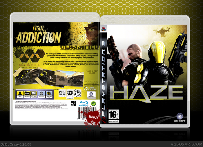
Finally done.
Cred to Sens for the amazing logo and super-amazing temp, and for DS11 for Ubisoft logo at the back and advice.
Enjoy! (:
#1, LOL
Edited at 1 decade ago
[ Reply ]
Awsome. and what TTT said.
[ Reply ]
Totally.
[ Reply ]
amzing
[ Reply ]
NO HOTLINKING! >=O Just kidding, looks nice. Not as super complex looking as some of the Haze boxes, but it still looks good.
[ Reply ]
#1 WTF?!
[ Reply ]
Damn. This is slick, Dan.
Awesome job. :)
[ Reply ]
You are el-crazy.
[ Reply ]
Lol did IGN really say that? Sweet job anyway. Really eye catching.
[ Reply ]
If you can add a pegi to the back and move the synopsis up a little i will fav for sure this is hot!
[ Reply ]
#10, possibly the australian IGN because they gave it a higher rating that the american one. BTW great box cant really see any flaws = + fav
[ Reply ]
Wow. Faved
What font did you use for the Fight The Addiction bit?
Edited at 1 decade ago
[ Reply ]
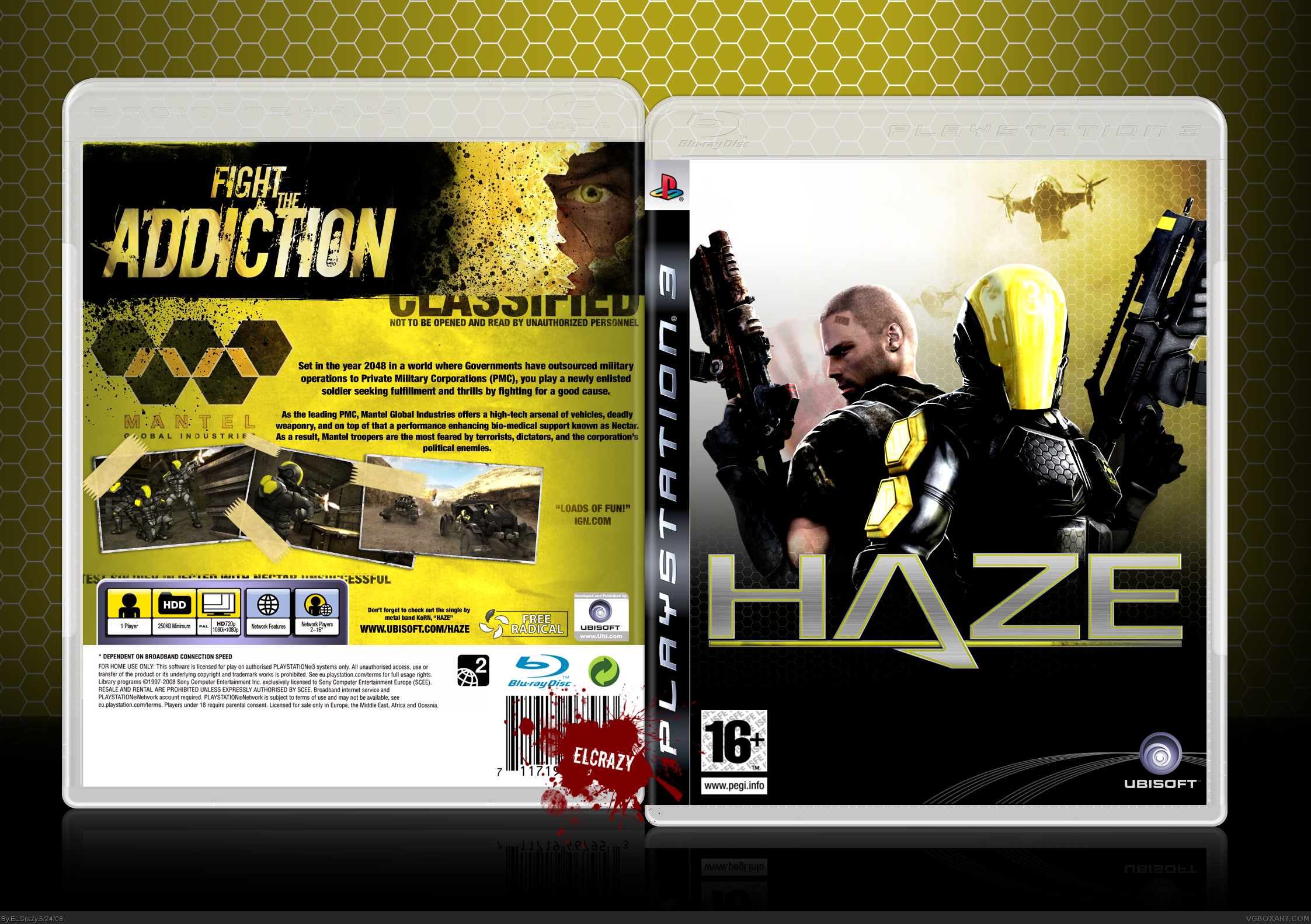
#10, Haha no, IGN did not say that. I just made it up xD
#11, PEGI logo and sypnosis change coming right up! (:
#13, The font is called Downcome. link
To everyone else, thanks for the comments and faves!
[ Reply ]
Updated!
[ Reply ]
Looks cool... as mentioned on MSN, really did the grudge - and update was worth it as I would have suggested the same (should be 18, PEGI and Spider - lol) I still think the front bottom needs something to fill that black space --- if you can find a review that loved the game so that you can put a single quote like "Stunning" or like 5 stars or something there -- it would top it off I think. :)
[ Reply ]
Like I said.
That master of taglines.
[ Reply ]
Looks good. My only complaint is the massive amount of black on the bottom of the front.
[ Reply ]
#18, Racist. =P
[ Reply ]
#1, Irony *rolls eyes*
[ Reply ]
#20, How is it ironic? I hope that's not just a snide remark.
[ Reply ]
#20, Um.....what?
[ Reply ]
Awsumz.
[ Reply ]
Looks better then the game :D LOL
Amazing box! Good Job!
+ Fav
[ Reply ]
Thanks guys! (:
[ Reply ]
HolycrapIthinkIjustshitmyselfagaingoodjobfaved.
:)
[ Reply ]
Faved!
[ Reply ]
Yay HOF!
Thanks guys!
[ Reply ]
Looks awesome dude, I especially love the back.
[ Reply ]