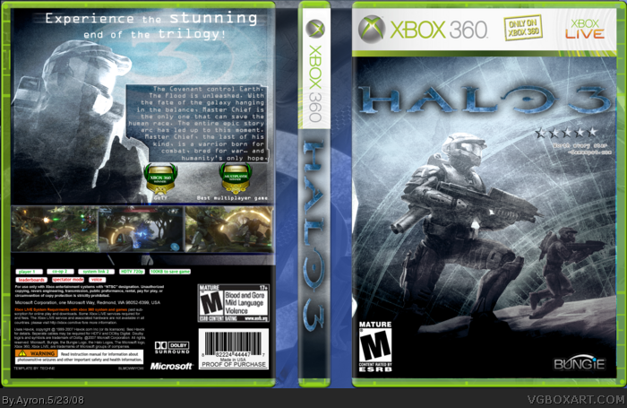
I have mixed feelings about this, the transparent Master Chief on the back looks strange. The black box with the copyright info, the award medals and the screenshot frames really don't work with the grainy worn-out feel. I like what you were going for but if you ask me the style of the box needs a lot of refining.
I'm pretty conflicted about it as well. I can spot a lottt of problems in full view. The Bungie logo looks messed up, the ESRB on the back is blurry, but the kicker for me is how much you screwed up on the template. There seems to be chunks of the box missing (i.e. on the right side of the front). I suggest using the .PSD version of the temp and just Ctrl + clicking the "workspace" layer and Shift + Ctrl + I-ing to select outside of it and going to the layer that has the bleed and deleting it that way.
Love the image on the front... but like above members, I don't think the back fits well. I like the back Master chief, but I don't understand why there's a shadow or reflection on him? As E_G mentioned, there's a few things that doesn't quite gel together. As ElCrazy said.. nice concept idea. ;)
 Halo 3 Box Cover Comments
holy crap! i love it. Its very unique and i cant really spot anything wrong with it. +fav
[ Reply ]
Yeah--I've been wanting to do this ever since ELC made his box..and now i'm almost at the level he was back then.
May i not forget to thank my mate Techne for this template..
Next box: Portal!!!
[ Reply ]
Great!
#2, i'm waiting for that portal
[ Reply ]
A-Man.
[ Reply ]
"Worth every star"
So does this box. Great job man. I love the style of it. The effects are just awesome. Keep it up! 5/5 +fave
[ Reply ]
I have mixed feelings about this, the transparent Master Chief on the back looks strange. The black box with the copyright info, the award medals and the screenshot frames really don't work with the grainy worn-out feel. I like what you were going for but if you ask me the style of the box needs a lot of refining.
[ Reply ]
I don't really like the back much, but the front is awesome. 5/5 +fav
[ Reply ]
I'm pretty conflicted about it as well. I can spot a lottt of problems in full view. The Bungie logo looks messed up, the ESRB on the back is blurry, but the kicker for me is how much you screwed up on the template. There seems to be chunks of the box missing (i.e. on the right side of the front). I suggest using the .PSD version of the temp and just Ctrl + clicking the "workspace" layer and Shift + Ctrl + I-ing to select outside of it and going to the layer that has the bleed and deleting it that way.
It's a lot more precise that way.
[ Reply ]
I agree with E_G and Ryan, although I have to say, I love the concept.
[ Reply ]
awesomalishish.
[ Reply ]
Love the image on the front... but like above members, I don't think the back fits well. I like the back Master chief, but I don't understand why there's a shadow or reflection on him? As E_G mentioned, there's a few things that doesn't quite gel together. As ElCrazy said.. nice concept idea. ;)
[ Reply ]
Here is a better ESRB box for the back link
[ Reply ]
I have ti agree with ELC,E_G and Ryan. Front looks great.
[ Reply ]
Oh man this is an awesome box! 5/5 + fav!
keep up the good work
Edited at 1 decade ago
[ Reply ]
amazing effects
[ Reply ]
gostei,diferente
[ Reply ]