While I am not particularly a fan of your work, this shows your potential.
This is excellent, I underestimated you! ;)
I especially loved the style of the front, but the back is alright. I will still favorite this though! :P
Great gold color scheme. I don't like the big white cloud on the front, you might think that's stylish but I think it ruins the gold color scheme. The description font could be better, Times New Roman is a predictable font but that should work well.
#10, Well, i know a couple of boxes haev used the cloud before me, but seeing this game Ãs about the freedom of a sky pirate, i thought it was highly suitable to keep it in the scheme i had. gold for the treasure,cloud for the skies.
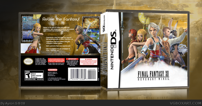
looks good dude. idk if anyone noticed, but there's no rating or dev logos on the front. =/ and is it just me, or are Vaan and the girl on the back kind of just floating? i dunno if that was intentional, but it looks a little weird. you could also make the logo on the front a bit bigger, but overall this is a nicely designed box.
Wow, Ayron! Just wow. You've improved so much since your first box art. Look where you're at now. You're at nine squares! Congratulations on that man. Keep it up. I know you'll become one of the site's better artist of your time. ;)
You do know I'm just messing around with ya, right? The only n00b around here is me. Ha ha ha... anyways, good luck with future projects. I'm just glad to know I was an inspiration to you.
 Final Fantasy XII: Revenant Wings Box Cover Comments
Well-- i LOVED ffseer's version of the box, and it inspired me to do my own
First of all, credit to koopadasher for template
second-- i didn't WANT esrb/legal stuff on front, as it REALLY broke the front's scheme.
may i present---FF12RW!
[ Reply ]
:]
[ Reply ]
Looks great.
[ Reply ]
I like =)
[ Reply ]
Thanks for the feedback ;)
[ Reply ]
While I am not particularly a fan of your work, this shows your potential.
This is excellent, I underestimated you! ;)
I especially loved the style of the front, but the back is alright. I will still favorite this though! :P
[ Reply ]
I'll fav, but it needs an esrb on the front.
[ Reply ]
Ty #6...
#7,it doesn't 'need' anything.
[ Reply ]
#7 it doesnt "need" it, its diffrent to see it without, but its original this way...
I also like this one +Fav
[ Reply ]
Great gold color scheme. I don't like the big white cloud on the front, you might think that's stylish but I think it ruins the gold color scheme. The description font could be better, Times New Roman is a predictable font but that should work well.
[ Reply ]
#10, Well, i know a couple of boxes haev used the cloud before me, but seeing this game Ãs about the freedom of a sky pirate, i thought it was highly suitable to keep it in the scheme i had. gold for the treasure,cloud for the skies.
[ Reply ]
I agree with E_G, really nice.
[ Reply ]
Real nice.. have to agree with E_G.. a serif font would look better to match the FF title.
[ Reply ]
Woot!!
[ Reply ]
So sweet, love the whole box as a WHOLE!! +fav
[ Reply ]
Thanks everyone-- and yeah, #15-- i tried making it 'flow' ;) hope it worked.
[ Reply ]
Really great. I especially love the front.
[ Reply ]
looks good dude. idk if anyone noticed, but there's no rating or dev logos on the front. =/ and is it just me, or are Vaan and the girl on the back kind of just floating? i dunno if that was intentional, but it looks a little weird. you could also make the logo on the front a bit bigger, but overall this is a nicely designed box.
[ Reply ]
Looks pretty good, no Esrb and dev logo's though. But was that on purpose?
[ Reply ]
#19, i'll post an update wÃth esrb/dev...but read post #1
[ Reply ]
Wow, Ayron! Just wow. You've improved so much since your first box art. Look where you're at now. You're at nine squares! Congratulations on that man. Keep it up. I know you'll become one of the site's better artist of your time. ;)
[ Reply ]
#21, A big part of my improvement was thanks to you. =]
[ Reply ]
#22, you can stop making me blush now...^^
Ah, you were such a n00b those days. =P
You do know I'm just messing around with ya, right? The only n00b around here is me. Ha ha ha... anyways, good luck with future projects. I'm just glad to know I was an inspiration to you.
[ Reply ]
Congratulations, Ay.
[ Reply ]
It really needs a ESRB on the front. But other than that it looks good
[ Reply ]