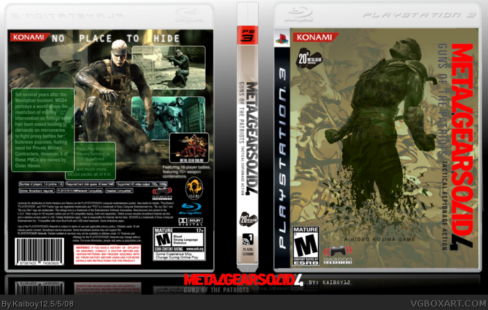
My newest box. Thanks to dmshaposv for help. Please comment and rate.
EDIT: Credit to milkyoreo for the green night vision effect. Also, credit to the LK resource thread for the Snake render (can't remember the exact person)
Looks real nice mate. Layout design is good. You just need to clean up a number of things.. have less blurry images (esp. the spec boxes on the back). better to increase the text tracking (space between characters) on the Tagline than add extra space between words, and better cutting of logos etc. I'll FAV because it looks good from a distance... and I'm hope you can clean up ;)
I don't like how you used MGS3 artwork on the front behind that Snake render and there's better quality templates going around. It's a good effort though.
#6, I didn't know the front was MGS3 artwork. I searched for MGS4, and that's what came up. The template is a one I made myself, so I will fix the boxes.
text is no good to read due to same font-color as background-color and blurry parts, specially at the logos. Dark text on the front is hard to read as well. Talking about the front: It could need some more contrast to mae the details of the omage visible. Looks like a big dark bunch of "something" this way.
Certain parts should be cut a lot better (specialy the straight parts like boxes) and the spacing of the head on the back is to much.
hell yeah! fav, i sooo want this game (aparently, kojima is releasing the second version[like substane, subsistance] onto 360 as well so all is not lost0
 Metal Gear Solid 4: Guns of the Patriots Box Cover Comments
My newest box. Thanks to dmshaposv for help. Please comment and rate.
EDIT: Credit to milkyoreo for the green night vision effect. Also, credit to the LK resource thread for the Snake render (can't remember the exact person)
Edited at 1 decade ago
[ Reply ]
Looks real nice mate. Layout design is good. You just need to clean up a number of things.. have less blurry images (esp. the spec boxes on the back). better to increase the text tracking (space between characters) on the Tagline than add extra space between words, and better cutting of logos etc. I'll FAV because it looks good from a distance... and I'm hope you can clean up ;)
Edited at 1 decade ago
[ Reply ]
#2, Thanks for the fav. I will update sometime with your suggestions.
[ Reply ]
I actually like this a lot. Good job!
[ Reply ]
#4, Thanks.
[ Reply ]
I don't like how you used MGS3 artwork on the front behind that Snake render and there's better quality templates going around. It's a good effort though.
[ Reply ]
#6, I didn't know the front was MGS3 artwork. I searched for MGS4, and that's what came up. The template is a one I made myself, so I will fix the boxes.
[ Reply ]
I really like this, especially the back design. Good work man.
[ Reply ]
#8, Thank you.
[ Reply ]
text is no good to read due to same font-color as background-color and blurry parts, specially at the logos. Dark text on the front is hard to read as well. Talking about the front: It could need some more contrast to mae the details of the omage visible. Looks like a big dark bunch of "something" this way.
Certain parts should be cut a lot better (specialy the straight parts like boxes) and the spacing of the head on the back is to much.
Edited at 1 decade ago
[ Reply ]
The majority of the back of this box is just a wallpaper.
I have it as my desktop lol.. you sould really give credit.
[ Reply ]
Thank you everyone for the favs and credit to Google Images for the wallpaper on the back.
[ Reply ]
it's cool but I only really like the back. Faved all the same.
[ Reply ]
hell yeah! fav, i sooo want this game (aparently, kojima is releasing the second version[like substane, subsistance] onto 360 as well so all is not lost0
[ Reply ]
Thanks for the favs.
[ Reply ]
cool front
[ Reply ]