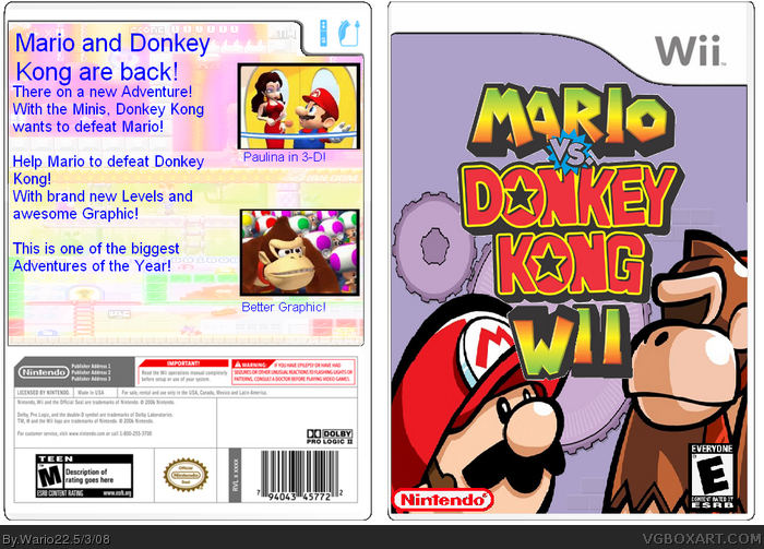
the front ok
the back uhhh i dont know bad font and whats with the Better graphic
so all in all 2/5
Edit: its your first so itll go up to 4/5 and ill give you a fav
This is actually not bad for a first box.
The ESRB logo is low quality and a bit small and the Nintendo logo is choppy. The back text is very badly written like it should be 'they're' instead of 'there' and 'better graphic' makes no sense. If you did this on paint then its a very decent effert indeed.
Anyway a nice first box so i'll give it 3/5
Welcome to the site :)
CONS:
-The Mario toy looked a little stretched.
-Even though the logo is cool, it's a bit choppy.
-Text on back is plain.
-Some grammar mistakes.
-Weird backround for the back.
Cover: 3.5/5 for a first
Back: 2/5 for a first
Overall: 2.75/5
 Mario vs. Donkey Kong Wii Box Cover Comments
My first Box... i now.... Stupid descroption.....
[ Reply ]
the front ok
the back uhhh i dont know bad font and whats with the Better graphic
so all in all 2/5
Edit: its your first so itll go up to 4/5 and ill give you a fav
Edited at 1 decade ago
[ Reply ]
This is actually not bad for a first box.
The ESRB logo is low quality and a bit small and the Nintendo logo is choppy. The back text is very badly written like it should be 'they're' instead of 'there' and 'better graphic' makes no sense. If you did this on paint then its a very decent effert indeed.
Anyway a nice first box so i'll give it 3/5
Welcome to the site :)
[ Reply ]
PROS:
-Good for a first
-Logo is good
CONS:
-The Mario toy looked a little stretched.
-Even though the logo is cool, it's a bit choppy.
-Text on back is plain.
-Some grammar mistakes.
-Weird backround for the back.
Cover: 3.5/5 for a first
Back: 2/5 for a first
Overall: 2.75/5
[ Reply ]
I forgot the S on better Graphic.
it means better graphics.
[ Reply ]
noone noticed in the back the esrb is M
Front:4/5
Back:2.6/5
Overall:3.4/5
[ Reply ]
the front rating is e, the back rating is m, and above the m rating on the back it says teen!
[ Reply ]