Okay, these are beginning to get old, this is all you do now. You need to start focusing on real box art.
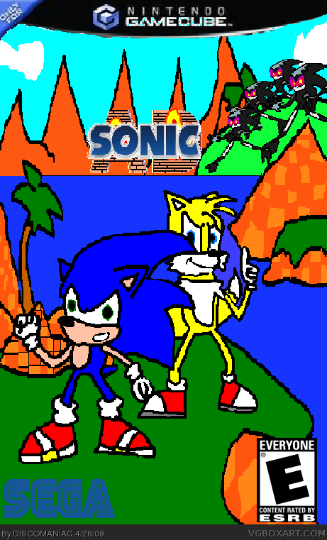
Anyways, onto the criticism. The logo is too small and choppy, bad quality. The SEGA logo is missing the white outline/stroke. The template is small, squished, bad quality and choppy and the ESRB is too big.
#3,thank you for the specifics.i haven"t figured out gimp yet and am still using paint, but some of those things you pointed out can be made better with paint. I'll work on it.
Why is Tails yellow?
And im sorry DISCOMANIAC, the first couple of times drawing your boxes on paint was funny but now its starting to tire and the logo is terrible.

 Sonic: A-D Box Cover Comments
Okay, these are beginning to get old, this is all you do now. You need to start focusing on real box art.
Anyways, onto the criticism. The logo is too small and choppy, bad quality. The SEGA logo is missing the white outline/stroke. The template is small, squished, bad quality and choppy and the ESRB is too big.
[ Reply ]
#1,what?.
[ Reply ]
#2, That was criticism, otherwise known as helpful information. link
Edited at 1 decade ago
[ Reply ]
#3,thank you for the specifics.i haven"t figured out gimp yet and am still using paint, but some of those things you pointed out can be made better with paint. I'll work on it.
Edited at 1 decade ago
[ Reply ]
Why is Tails yellow?
And im sorry DISCOMANIAC, the first couple of times drawing your boxes on paint was funny but now its starting to tire and the logo is terrible.
[ Reply ]
The ESRB logo is on the wrong spot, the drawn picture is, like Cerium said, beginning to tire me too.
[ Reply ]
#6,than cheak out my sonic vs. spyro box.
Edited at 1 decade ago
[ Reply ]
thats pretty good for drawing it all on paint.
[ Reply ]
#8,thanks!.
[ Reply ]
DISCOMANIAC, let me show you a good drawn box. link
[ Reply ]
#5, tails is yellow, and PLEASE stop drawing in paint, also, i thought you were going to take a break from Sonic DISCOMANIAC!
[ Reply ]
#11,it's a old box.
[ Reply ]
meh get paint.net its way better than regular paint
[ Reply ]
Whats the point of A.D?
[ Reply ]
#14, this box is 2 years old..
[ Reply ]