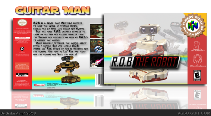
Ok guys here's my new Box. I made this for a Series of GIMP tutorials for different things on Youtube. Yes the background is a Gradient but it's an N64 box and i think this fits prety well.
Credit:
Logo: SNES
ScreenBorders: Someone
@Vengence: See those renders can be used on a box :P XD
#5 Lol cool! Yours does look really great.
I dont think the back font fits the style of the game though.
Maybe a more futuristic or sci-fi font would look better?
4/5
#6, i tried like 10 different fonts, Sci-Fi like Star Wars and stuff. but this font looked the best. not my ideal choice but hey it's better than puting Times New Roman ad the font.
i like, but I dont. i know material is limited, and you can only use renders from brawl, but it's boring due to the fact that there is no material out there. The graphics are too good for N64, and the brawl screens are also annoying.
#8, i can see why you rated it the way you did. limited resources suck. and the fact that there hasn't been a R.O.B. game just doubles with the difficulty of resources.
 R.O.B. The Robot Box Cover Comments
Ok guys here's my new Box. I made this for a Series of GIMP tutorials for different things on Youtube. Yes the background is a Gradient but it's an N64 box and i think this fits prety well.
Credit:
Logo: SNES
ScreenBorders: Someone
@Vengence: See those renders can be used on a box :P XD
Edited at 1 decade ago
[ Reply ]
Very cool. :)
[ Reply ]
Hey did you get inspiration from my ROB box? ^_^
[ Reply ]
Really nice. ;)
[ Reply ]
#3, not really. after i made it i remembered about yours. Mabey i did subconciously. :P
[ Reply ]
#5 Lol cool! Yours does look really great.
I dont think the back font fits the style of the game though.
Maybe a more futuristic or sci-fi font would look better?
4/5
[ Reply ]
#6, i tried like 10 different fonts, Sci-Fi like Star Wars and stuff. but this font looked the best. not my ideal choice but hey it's better than puting Times New Roman ad the font.
[ Reply ]
i like, but I dont. i know material is limited, and you can only use renders from brawl, but it's boring due to the fact that there is no material out there. The graphics are too good for N64, and the brawl screens are also annoying.
Front: 3/5
Back: 3/5
overall: 3/5 (duh)
[ Reply ]
#8, i can see why you rated it the way you did. limited resources suck. and the fact that there hasn't been a R.O.B. game just doubles with the difficulty of resources.
[ Reply ]
I really like the logo. +fav, I just realized that R.O.B. looks like Wall E or Wall E looks like R.O.B.(which ever way you want to put it)
[ Reply ]
I like the story on the back =D
[ Reply ]
Wow but u think N64 could play that graphics on the pic back? :P
Anyway Really good
[ Reply ]
Nice box.
[ Reply ]
Really good! Nice tutoriol!
[ Reply ]