yeah, i kinda screwed up with the borders... but i've been working on this for so long i don't even care. it's 11:12pm now... maybe tommorow i'll change them.
I actually think the logo looks nice there!
Gives the box a very interesting and unique feel.
The back is excellent and I have no problem with the borders.
Im just not too keen on the front though, its just a face.
Maybe it should be a bit more..... exciting?
I actually really like it. I love how the front is like the MGS4 boxart, and the back is great. And i noticed that was the same font on your latest and best DMC4 box. But i really like it, very interesting. +fav
The update makes this one of my favorite boxes by you. The front isn't anything new, but it is executed well.
The back is stunning. The staggering on the quote is very nice, and the background image is perfect. The screes, although they aren't in the style and are generic, somehow are very effective. The synopsis is hard to make out in several places though. Fix that and it'll be perfect
 Gears of War 2 Box Cover Comments
front was inspired by the MGS4 boxart.
EDIT: i've temporarily postponed Sonic Advance 1, due to lack of materials and inspiration. Expect it soon though.
Edited at 1 decade ago
[ Reply ]
Hmm...o.O
Edited at 1 decade ago
[ Reply ]
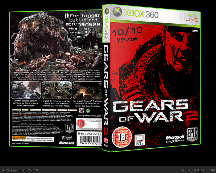
I like the back cover. Only thing I don't like it's a screenshots borders. They looks too clean for me O.O
[ Reply ]
I'm not crazy about the way you did the logo. The screen borders should be more grungy or something, and that font doesn't work for Gears of War.
[ Reply ]
#3, I agree.
#4, I thought the text worked nicely.
[ Reply ]
yeah, i kinda screwed up with the borders... but i've been working on this for so long i don't even care. it's 11:12pm now... maybe tommorow i'll change them.
#4, read post #1
[ Reply ]
#6, I know, but it doesn't look good here.
[ Reply ]
#7, i liked it, so there. i'm not going to change it just for you.
[ Reply ]
#8, Change it for me O.O
LOL :D
[ Reply ]
I actually think the logo looks nice there!
Gives the box a very interesting and unique feel.
The back is excellent and I have no problem with the borders.
Im just not too keen on the front though, its just a face.
Maybe it should be a bit more..... exciting?
[ Reply ]
I actually really like it. I love how the front is like the MGS4 boxart, and the back is great. And i noticed that was the same font on your latest and best DMC4 box. But i really like it, very interesting. +fav
[ Reply ]
That's some hot shit right there
[ Reply ]
nice job man, really. fav
[ Reply ]
The vertical logo and close-up are very effective. One of the better GOW2 boxes.
Edited at 1 decade ago
[ Reply ]
#14, diagonal? you mean vertical?
[ Reply ]
#15, Yeah.
[ Reply ]
I like how you did the front cover, its actually more interesting than the other GeoW2 boxes I've seen.
However, I agree with the others about the screenshot border. Everything else looks great.
Edited at 1 decade ago
[ Reply ]
Sweet!
[ Reply ]
#17, Agreed.
[ Reply ]
mega update!!!!!!1!!!!12
[ Reply ]
it is sooo official looking fav
[ Reply ]
This box is buttsecks...
[ Reply ]
OMG! This is really cool!
[ Reply ]
#22, xD
I'm surprised at how much I like this. That back is really tight, I love the quote from OXM. And nice use of that screenshot, it's so awesome. =D
[ Reply ]
Great update
[ Reply ]
pwnsome
[ Reply ]
The update makes this one of my favorite boxes by you. The front isn't anything new, but it is executed well.
The back is stunning. The staggering on the quote is very nice, and the background image is perfect. The screes, although they aren't in the style and are generic, somehow are very effective. The synopsis is hard to make out in several places though. Fix that and it'll be perfect
[ Reply ]
Missed this... looks fantastic! ;)
[ Reply ]
Fuck yeah, thanks for the Hall guys.
[ Reply ]
this looks awesome i under stand the screenshots since theres only been one gameplay reveal it's still cool though
[ Reply ]
#30, every image used on this box is from Gears 2. No Gears 1 material in sight.
[ Reply ]
Congrats
[ Reply ]