This would be really good, but the renders overlapping the temp and logo don't look good in this one. Maybe it would looks better if it didn't cover so much, like mine.
looks official, actually i have the game so i could tell you rrally captured the feel of the official box. I mean, it's a bit plain and boring, but ther's not much to do. Great box, Vengeance. 4.7/5 +fav
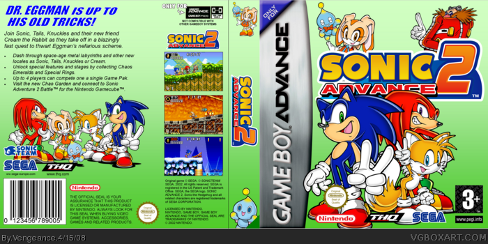
 Sonic Advance 2 Box Cover Comments
this one's for Valadmir.
[ Reply ]
woo hoo
[ Reply ]
Its very good but im not too keen on how Sonic's ear is covering up the 'D'
[ Reply ]
hmm, i guess i shoul fav, awsome, cant wait for sonic advance 1, keep up the good work V
[ Reply ]
:)
[ Reply ]
This would be really good, but the renders overlapping the temp and logo don't look good in this one. Maybe it would looks better if it didn't cover so much, like mine.
[ Reply ]
@#1, Its very well made just as your last one.
[ Reply ]
looks official, actually i have the game so i could tell you rrally captured the feel of the official box. I mean, it's a bit plain and boring, but ther's not much to do. Great box, Vengeance. 4.7/5 +fav
[ Reply ]
looks great Vengence. i wish you could see a little more of the logo but it's great.
[ Reply ]
It looks really good. Are you making more of these?
[ Reply ]
i'm kinda sprised that you made this it seems not good ennuf to be one of yours
[ Reply ]
#11, I think that's where you're supposed to explain why.
[ Reply ]
I really ike the offical look here. Very well design for a GBA package. Nice work =]
[ Reply ]