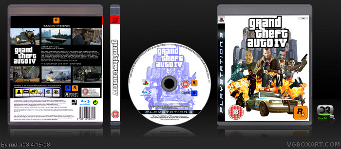
here is my full GTA IV cover, ye i know ive uploaded it again but i wanted people to see it lol, iv tried to do a similar style on the CD and back as the original GTA III, just like ive done with the front, hope you all like, please comment
P.S. finally done a back n CD lol
Front looks fine, but the mixing of art and in game models doesnt look right. Just use artwork next time. The back bit which says "THE BEST GTA YET" - EVERYONE sounds retarded. Do something like, "THE BEST GTA YET" - IGN.com
Other dan dat its good.
3/5
#6, ah crap missed that lol, i didnt want to put owt like IGN on it cause they didnt say that, so......., plus i used screenshots because there wernt any artwork of those characters in similar poses, so i used what i could find
Well I still like the front however I agree with xcore. The back seems plain, but its nicely organised. Would've been cooler if you could somehow spice it up more.
BTW whats the name of the font you used for writing the synopsis on the back cover?
It says libert c ity on the back, but other than that, nice job. I actually prefered when it was just a front. And you should hve made a version 2 for it instead of uploading it again.
 Grand Theft Auto IV Box Cover Comments
here is my full GTA IV cover, ye i know ive uploaded it again but i wanted people to see it lol, iv tried to do a similar style on the CD and back as the original GTA III, just like ive done with the front, hope you all like, please comment
P.S. finally done a back n CD lol
[ Reply ]
that is really good, i'll fav
[ Reply ]
#2, thanx
[ Reply ]
my god! why is this being ignored?
[ Reply ]
Front looks fine, but the mixing of art and in game models doesnt look right. Just use artwork next time. The back bit which says "THE BEST GTA YET" - EVERYONE sounds retarded. Do something like, "THE BEST GTA YET" - IGN.com
Other dan dat its good.
3/5
[ Reply ]
Rofl just noticed. The first screen with Niko on a bike has a website watermark in the corner :/
[ Reply ]
#6, ah crap missed that lol, i didnt want to put owt like IGN on it cause they didnt say that, so......., plus i used screenshots because there wernt any artwork of those characters in similar poses, so i used what i could find
[ Reply ]
#7 Heres a good site:
link
Promise me you will update the front man with artwork :/
[ Reply ]
#8, ill av a go m8
[ Reply ]
@#1, you could've just updated your old box. :/
Well I still like the front however I agree with xcore. The back seems plain, but its nicely organised. Would've been cooler if you could somehow spice it up more.
BTW whats the name of the font you used for writing the synopsis on the back cover?
[ Reply ]
It says libert c ity on the back, but other than that, nice job. I actually prefered when it was just a front. And you should hve made a version 2 for it instead of uploading it again.
[ Reply ]
lookin pretty good... 5/5
[ Reply ]
#10, That's BankGothic, I believe.
[ Reply ]
Might want to fix the picture on the bottom right is going off into the white.
Great box. 5/5
[ Reply ]
Edited at 1 decade ago
[ Reply ]
very nice work..mate..I see you've put allot of time into this one..and your deserve a 9/10 for effort and skill..well done ;)
Greyfox™
[ Reply ]
you know, the fron reminds me of gta3 thats probably why i like it so much
[ Reply ]
#17, cheers, thats the style i was going far, because i much prefer the GTA 3 cover style, then the ones with the sections
[ Reply ]
LOVE IT.. HOF HERE YOU COME!
[ Reply ]
hmm why has this been ignored so much?
[ Reply ]