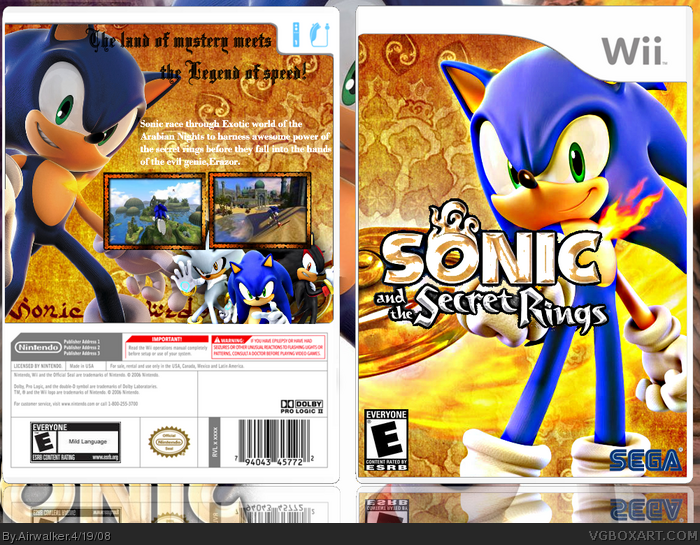
Nice, bright, bold, I like the hot, firey colour scheme there, nice composition on the front, my only complaint there is that the title is a bit messy around the edges and especially bad in between the letters.
As for the back...Not too keen on the composition, Sonic looks fine there on the left, don't like the STH06 image of Sonic,Shadow and Silver down there, I think it would look better without that, I'm also thinking the text should be closer to the top and would look better in black.
The main design is good,
 Sonic and the Secret Rings Box Cover Comments
My latest box.. credit to ttt for screenborders... please comment and rate
[ Reply ]
Logo...So...Bright...Eyes...Burn!
Edited at 1 decade ago
[ Reply ]
fav
[ Reply ]
It's nice AW. Question? Where did you find the picture of the ring in the background? If it's a wallpaper, please PM it to me.
I think to get a fave from me you should add another character on the back. Also the logo is pixely.
Edited at 1 decade ago
[ Reply ]
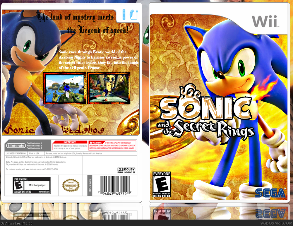
Updated!! but i think it looks bad now..
Edited at 1 decade ago
[ Reply ]
Pretty sweet, nice job. Only suggestion is that the contrast on the screenborders are a bit too high. :)
[ Reply ]
#6, thanks LK.. i'll try reducing it...
EDIT: Updated!!
Edited at 1 decade ago
[ Reply ]
Nice, bright, bold, I like the hot, firey colour scheme there, nice composition on the front, my only complaint there is that the title is a bit messy around the edges and especially bad in between the letters.
As for the back...Not too keen on the composition, Sonic looks fine there on the left, don't like the STH06 image of Sonic,Shadow and Silver down there, I think it would look better without that, I'm also thinking the text should be closer to the top and would look better in black.
The main design is good,
[ Reply ]